
Thu Apr 14, 2022 A Few Minor Changes
Recently, I applied some small changes on my website. Some of them may be relevant for you, gentle reader. Others … well, perhaps at least interesting to know.
A New Term: “My Projection Collection”
Whenever I wanted to refer to the projections that I have listed in the Comparison, and the Single View, and that are selectable in the Selection Form … now, that’s already the problem: I never knew a short and concise wording. Mostly, I used something like “in the list on my website” which isn’t short. It’s also unprecise because there’s also an actual list in tabular form, but the “list on my website” referred to all four places, not only the latter. And it sounded a bit stupid because this blog is of course a part of the website and so, it might have been confusing when I showed a projection here and noted that it isn’t listed on my website. Huh? He’s just showing it, why the heck is he claiming it isn’t here?
So. To resolve this, I finally came up with new term: My Projection Collection.
It sounds nice because of its assonance (a literary device, as in surf and turf or
wild child or Shake him! Wake him! etc.), is short and
covers all of the four resources named above.
Changes to the Categories in the Blog
There are two changes regarding the categories in the blog:
Firstly, the previous category Short Articles is now simply called Articles
– the reason is of course that some of the articles I wrote weren’t exactly sort. 😉
Secondly, I added the new category Calendars.
It contains the monthly blogposts about my map projection calendars.
I liked this better than having the calendar posts listed
in the Articles section, as hitherto done.
By the way, I’m not so happy anymore with the categorisation News and Articles any more.
It seemed a good idea when I set up the blog, but…
You see, when I add a new projection to my Projection Collection, I usually put the associated blogpost
to the News category
– after all, it is something new. And as long as I just briefly announce it, there’s no
problem with this category.
But I have often used the opportunity to talk a bit more detailed the projection in question, which
actually fits better into the Articles category. However, to visitor who just skims the News
might miss them…
Oh well, I guess I’ll have to think about this matter.
Aspect Ratio of the Projection Images
A little tool that I myself have used for some time – but now, I have unlocked it: In the list in tabular form, there’s a new column headlined x / y. It shows the aspect ratio of the respective projection image (width dived by height); in other words, the aspect ratio of the rectangle that circumscribes the projection.
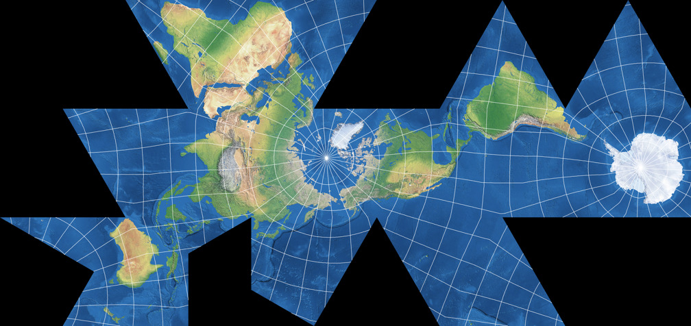
Please note that this is not the only way to tell the aspect ratio of a given projection: You can also state the aspect ratio of the main axes (which I have done often). Those two values are identical for cylindric projections (e.g. Miller Projection) and pseudocylindricals (e.g. Robinson Projection), and even some lenticular projections (e.g. Hammer Projection). However, they can differ substantially on other lenticulars, like Canters W08:


Aspect ratio of the projection image and the main axes of the projection, using Canters W08 as an example.
And for some polyhedral projections like the
Dymaxion Map
there probably is no other meaningful aspect ratio than the one of the image’s dimensions.
Well, basically I think that a projection’s aspect ratio is not that important.
But sometimes, it can be useful – and now, you can look it up on my website.
Talking about the images …
All Projection Images Reworked
Let us now turn to the changes that are
“perhaps at least interesting to know”:
All projection graphics have been reworked – using the easy way.
The labour-intensive way would’ve been to re-render them all using my map projection applications and export them again.
The easy way was to use some batch processing on the files that I exported weeks, months, or years ago.
I did this in order to reduce the website’s bandwidth usage: I carefully increased the compression rate of the
JPEG images and reduced to number of colors in the PNG images. These changes result in smaller images
(talking about the file size, not the image dimemsions) – but they also reduce the image quality to a certain degree.
But I don’t think that’s actually visible when viewing the images at 100% size (although you probably would
spot the differences when you zoom in).
And yes, i considered using WebP images instead, but for the time being, I decided to refrain from that.
New Font on the Blog
The most obvious change: The blog now uses the webfont that I have used on the website since it went live. It is a (legal!) derivate of the Bitstream Charter.[1]
Charter is one of my favorite fonts (at least, for use in non-fictional texts)
since I started to work with scalable vector fonts
in the early 1990s. I had an Atari ST, and a piece of software I used at that time included
a bunch of Speedo Fonts[2], and Charter was among them. I used it
quite a lot and severely missed it when I switched to the Mac.
So at some point, I purchased the typeface, and subsequently, it became my
own “corporate typeface”. 😉
And nowadays, an extended
variant even is included in macOS.
Now you may understand why I liked to use the font here on the blog as well.
New Favicons
Ever since my website went live, it had a Favicon – one of those teeny-weeny pixelated images you can see, for example, in the tabs of your browser (for detailed explanation, see Wikipedia: Favicon). But for several years now, these website icons are used in other places and contexts as well, so it was high time that I added images in appropriate formats. The RealFaviconGenerator was a valuable help in creating them for (hopefully) all platforms, browsers and intended uses.
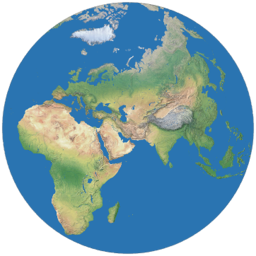
Largest version of the various Favicons
The icon uses the azimuthal equidistant projection, centered to 33°N / 55°E,
bounded by a small circle having a radius of 77° around the center.
Sorry to Australia and the two Americans for not being included,
but I was going for an image
in which, even in the smallest variant of 16 ×16 pixels
 ,
one can at least guess that it is a representation of the earth.
I couldn’t find any full-world configuration that met this condition,
and so I decided on this one that at least included my home.
,
one can at least guess that it is a representation of the earth.
I couldn’t find any full-world configuration that met this condition,
and so I decided on this one that at least included my home.
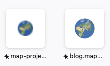
The old (both times left) and the new favicon, in tabs and in the Firefox home panel
So, this were the news for today. Next time, we’ll talk about map projections again.
Footnotes
-
↑
Wikipedia: Bitstream Charter
The webfont used here was built from XCharter by Micheal Sharpe – which turned out to bei the most suitable Charter derivate for my purposes. Other variants I tried were Khartiya by Andrey V. Panov, Veleka by Stefan Peev, Charta by “IceHand”, the Charter variant by Matthew Butterick, and Charis by SIL International. - ↑ Speedo is an obsolete font format, see Wikipedia: Bitstream Speedo Fonts. I liked it a lot because it contained more characters than the TrueType and Type1 fonts at that time; among them ligatures not only for fi and fl, but also for ff, ffi and ffl (in any Speedo font, not only in “expert” font files).
 Except where otherwise noted, images on this site are licensed under
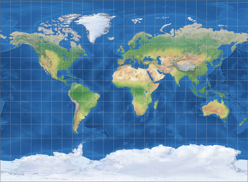
Comments
Due to spam posts, comments are now subject to moderation, which means they remain hidden until they are approved by a moderator.
More info
Be the first one to write a comment!