
Thu Oct 20, 2022 A Political Map Image for All Projections!
4 updates, last on Tue Nov 01, 2022
Today I have an important announcement to make:
All projections of my Projection Collection
are now also available with a political map image!
On of the initial ideas of my website was to help people to find
appropriate projections for their projects. Now, if the project requires
a political map, the physical map images that I’ve showed so far can
of course still be helpful – but isn’t it even better when the example
graphics use are more similar imagery to the one the final map is about to have?
I think it is.
Then I noticed something recently – when I was preparing three projections
for inclusion in my collection. I just wanted to try something out and rendered
one of them with a political map as a test. And there I saw: sometimes you don’t need
a visualization of distortions at all (like the Tissot indicatrix or the isolines
I often show) – sometimes a look at a political map is enough to discover the
flaws of a given projection.
(I’ll show an example when I, hopefully soon, present the three aforementioned
projections.)
And so, I added the political map image.
Here it is, shown on twelve randomly selected map projections:
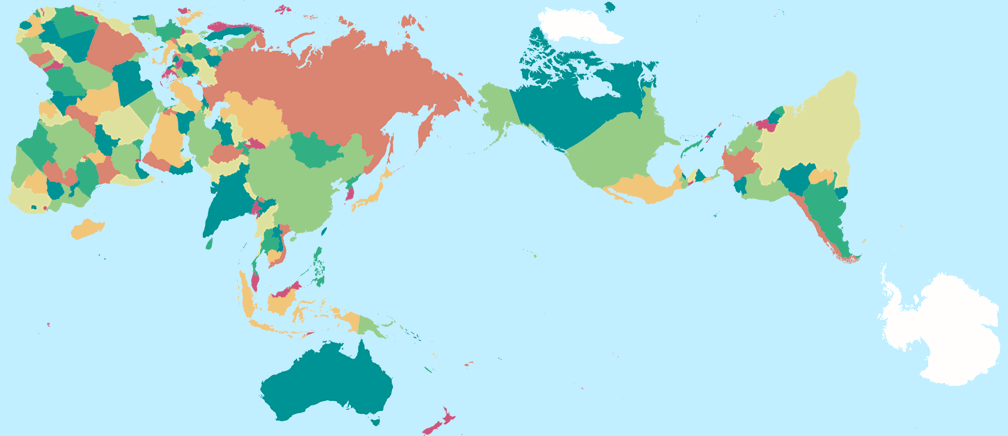
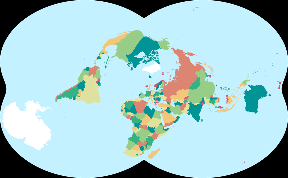
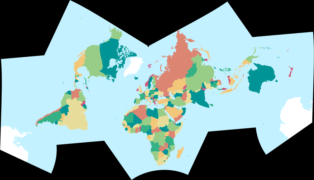
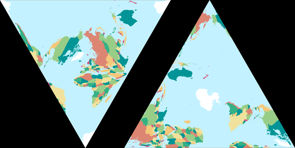

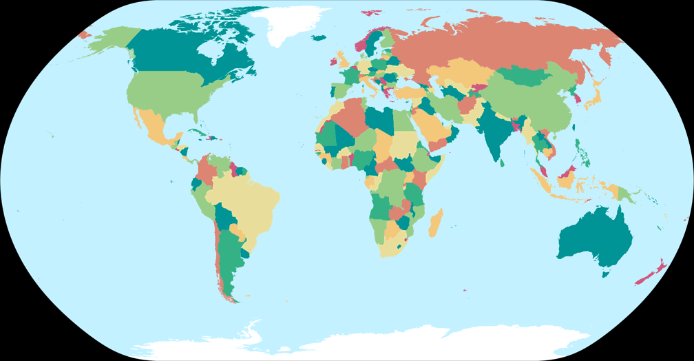

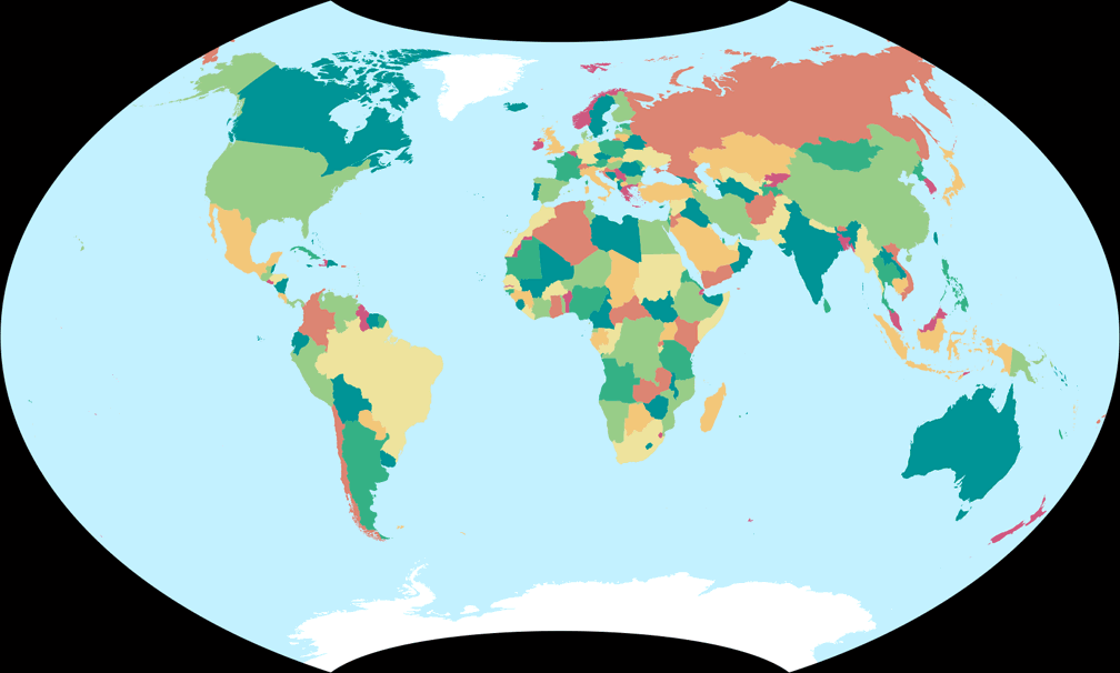
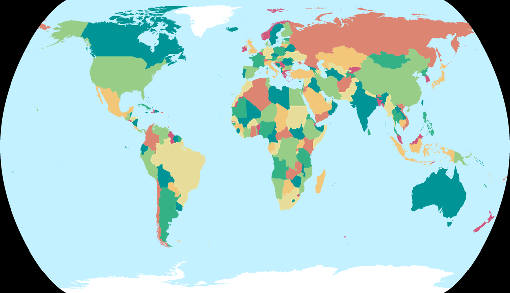
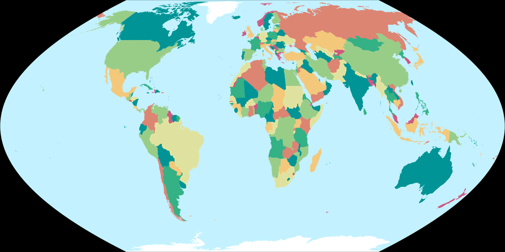
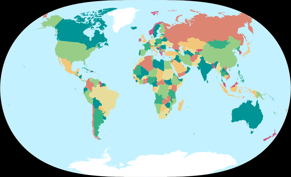
You will notice that, contrary to the physical map images, they show no graticule lines. This was done for three reasons:
- Political maps in atlases usually do have a graticule. But in a report or an article, the graticule lines are often omitted, so I thought I might as well follow that example in this case.
- Occasionally I’ve said that I would recommend a certain projection only for maps where the graticule is displayed. But that’s only my own opinion. Now, you can check for yourself: Does a given projection work without a graticule in your eyes?
-
And, ummmm… because I’m lazy.
I’m using different map projection applications (see below) to create all the images presented on my site. In some, it doesn’t matter if I render them with or without a graticule: The amount of work is the same. But for others, adding a decent graticule requires some extra work. I usually don’t mind this when I add a fistful of new projections, but now I had to create 327 political map images. Please forgive me for choosing the easiest, fastest way under these circumstances, and deciding to go without the graticule!
I would also like to state that the border lines on the images are in no way intended as a political statement! I know that there are disputed areas on Earth. That there are states that are not officially recognised by other countries, and that there are wars that change the courses of borders. The graphic division of countries on the maps, however, is meant for demonstration purposes only and does not represent any opinion regarding territorial claims.
How to find the political maps
If you now head over to my Projektion Collection and you only see the usual physical map thumbnails – don’t fret! That’s the way it’s meant to be. There are two ways to access the political maps:
-
In the Compare Map Projections section, select two projections of your choice
and hit the button Compare Selected Projections.
Or just pick this (randomly selected) example: Azimuthal equal-area (Hem.) vs. Ginzburg II.
In the following screen you will see the political maps in second place. -
In the View Map Projections section, just click
the projection you’d like to see – or click this link:
Kharchenko-Shabanova
In the following screen, scroll down to the menu Jump to different depiction of this projection. Open the menu, it’ll list two entries for the political map.
Thumbnails with political map images do exist (as you can see from the gallery of 12 examples above), but for various reasons I would like to refrain from offering them as an additional Viewing Option alongside “South up” and “Flat oceans”.
Update Oct 24, 2022: Oh No – There are Flaws!
Damn.
I noticed that the political maps images are flawed. Well, I kind of expected it,
although I did check the input file before I went into the process of generating
327 projected maps. So when I found a certain shortcoming, I thought that I can
live with that. Then I found a certain inconsistency.
That was more annoying, but still not a disaster. And, I noticed two real mistakes.
One of them is graciously hidden by the comparatively low resolution of the
images. But the other one… No, I can’t leave it like that.
So *big fat sigh* I’ll have to generate them again. 😕
Before that, I will thoroughly check the base map again to make sure there are no other errors.
Then, I’ll have to render the maps again, which is a time consuming and boring task,
so I’ll do it successively whenever I’ve got a little time to spare, which means that
it might be a while before the maps get replaced by the new version.
I’ll report back when I’m done.
And after that, I won’t do it again.
So if you see any flaws in the current versions –
now is the time to tell me
I’m afraid they will remain.
I’ve started rendering the new graphics and now I’m almost halfway through.
Note: I’m intentionally not naming the errors I’ve found. I’ll list them when the fixed version is available.
Oct 26, 2022
I haven’t started to render the new maps yet, but
I can report a small success:
The flawed versions are based on a dataset of 2018. I was reluctant to
use a newer database, because that would mean that I’d have to repeat
all the work that I’ve put into the distribution of colors.
Now, I’ve found a way to copy the assignment of certain colors
to certain countries. It still involves a bit of work but much less
than doing it manually again. So, apart from fixing the flaws the new
maps will be based on a current dataset.
🙂
Oct 31, 2022
It is done! I uploaded all political map images!
In order to see them, you may have to clear your browser cache. If you don’t see
Georgia (the country at the intersection of Eastern Europe and Western Asia, not the
U.S. state) and Somaliland on the maps, you look at the old version.
(Below, there are a few more words about the flaws.)
Credits
I’d like to credit all the good stuff that enabled me to build the political maps: The maps are based on the dataset Natural Earth 1:50m Admin 0 – Countries, version 5.1.1 (May 2022), from which I created an SVG vector graphic using Mapshaper. The distribution of colors (i.e. the assignment of certain colors to certain countries) was originally based on the mapcolor7 column of the database, but I already adjusted it in several places in 2018 (for a printed map for personal use); I transferred this distribution to the new maps and changed it a bit again. I adopted the color palette from the “Divergent palettes” example of the “Color in Map Design” tutorial on carto.com The color palette was slightly modified later, this was done in Affinity Designer. To project the map to my collection of currently 355 projections, I used my usual set of applications: Geocart, G.Projector, Flex Projector, MapDesignerRaster, d3-geo-projection. For the batch processing to create the web versions of the maps I used PhotoLine.
A big Dankeschön to all the people involved in these projects! 🙏
Flaws of the First Version
So, what was wrong with the first version of the map? As I’ve said, there was a shortcoming, an inconsistency, and two two real mistakes.
- The shortcoming: I checked whether the map is color blind safe using Sim Daltonism. When simulating Deuteranopia, I saw that the red color (used on e.g Norway and Bangladesh) was hardly distinguishable from the dark green (e.g. Sweden, India), so I slightly modified the red tint. I hope I haven’t made the situation worse, because of course the monitor settings also play a role.
-
The inconsistency: To explain this, let me present a quote
from the Natural Earth website from which I downloaded the data needed to build
the maps (see above):
Natural Earth shows de facto boundaries by default according to who controls the territory, versus de jure.
Thus, Somaliland is included as sovereign state, although it has not been officially recognised by any country or international organisation. Probably (I don’t know anymore for certain) that’s the reason why I “removed” it from my printed map in 2018, by simply applying the same color that was used for Somalia. And when I copied the color distribution from that map, Somaliland also vanished from the maps I presented a few days ago. However, since the rest of the map still follows the approach quoted above, this indeed was an inconsistency. - And the real mistakes: I applied the same color to Georgia and the neighbouring Russia. The same happened to Israel and the State of Palestine (which is a partially recognized state). In this cases, I’m certain that I just slipped.
All that has been fixed. Let me repeat that I won’t render the maps again. After all, they werde added to the website merely to give you an idea how a political map might look like using a given projection, and to check if the projection workd well without graticule lines. Absolute accuracy is not needed here.
 Except where otherwise noted, images on this site are licensed under
Comments
Due to spam posts, comments are now subject to moderation, which means they remain hidden until they are approved by a moderator.
More info
Be the first one to write a comment!