Mon June 03, 2019 Four conformal polyhedric projections and more
Today I added six projections to the list on my website.
As the title of this blogpost says, four of the belong to the group of polyhedric projections and are conformal.
But let’s start with the “and more”.
The Central Cylindric Projection
Actually, I don’t wanted to add the Central Cylindric projection to my website, because its cartographic value is…
well, let’s sigh it’s not very high. To be more precise, it is not really usable for cartographic purposes at all.
So what good is it anyway?
For one, you can use it to explain very easily the basic idea of a cylindric projektion:
- Put a light source to the center of the globe.
- Wrap a cylinder of paper around the globe which touches the globe at the equator.
- Switch on the light.
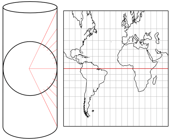
Schematic construction of the Central Cylindric Projection[1]
Voilà! The Central Cylindric will be projected to the paper!
“Wait!” someone might call, “I once heard that this is the way the Mercator projection is constructed!”
Yes, you actually might have heard or read that. But, sorry, this is wrong.
The Mercator map can not be constructed by a perspective projection.
If you don’t trust me, check Wikipedia.
If you don’t trust Wikipedia, check the
Projection List at mapthematics.com,
written by Daniel “daan” Strebe, author of a map projection software and various scientific papers on the topic of map projections.[2]
If you don’t trust Daniel Strebe and understand German, check Friedrich W. Krücken’s very extensive discourse
regarding the question how Gerhard Mercator was able to come up with his projection.
Back to the Central Cylindric itself: The projection method, easy as it is, has a serious problem: Both angular distortion and areal inflation get gargantuan as you approach the poles. So I had to truncate the projection image at 75° North/South in order to get a halfway decent pic to be used on the website:
If you care to see a larger portion of the projection image: I’ll show it at the end of the blogpost.
Having said all that, I guess you won’t be surprised to learn that there is one purpose
for which this projection is regularly used:
To show that the Mercator projection is not constructed perspectively.
Since that assertion is repeated time and again, I felt obliged to add the Central Cylindric projection.
Now, let’s talk about the new additions that are, in my opinion, more interesting.
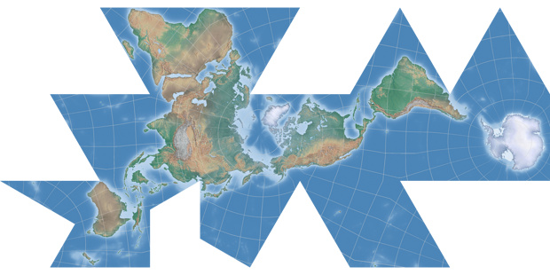
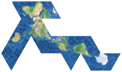
The Dymaxion map
Here’s the first polyhedric map for today, but it’s not conformal.
In 1943, the architect and designer Buckminster Fuller introduced a few world maps which could be that could be
assembled as a “three-dimensional approximation of a globe or laid out as a flat map”.
In 1954 they were followed by the variant that probably is the only one that is known to a certain degree
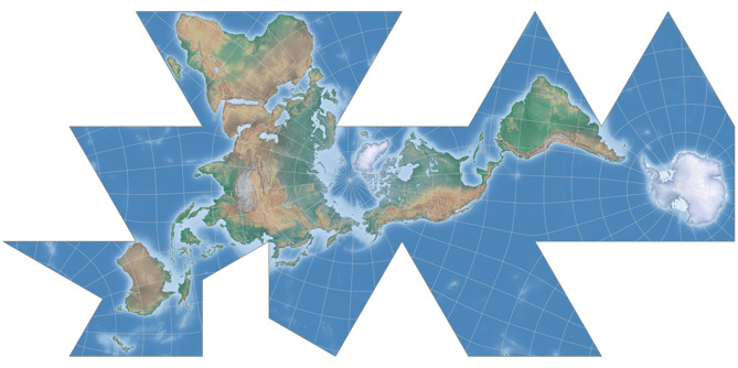
nowadays. Here, the world is projected to an Icosahedron.
Although Fuller to my knowledge used the word “Dymaxion” for all the variants, it usually
refers to the variant shown here which sometimes also is called “Fuller projection” or “Airocean map”
It reduces both angular and areal distortions but is neither conformal nor equal-area. Fuller intentionally gave up the North/South and East/West orientation of common world maps, but quite possibly that’s one of the reasons that it’s rarely used.
Sorry about the broken graticule lines near the poles. They are, of course, not a shortcoming of the Dymaxion map but merely of the way I created the projection images.
So this was the “and more” section. Now, for the four conformal polyhedric projections.
Cahill’s Conformal Butterfly
A while ago, I discussed a few polyhedric projections which referred
to the works of Bernard J.S. Cahill. Among them was the Cahill-Concialdi which is a re-arrangement of Cahill’s
conformal butterfly map, introduced at the end of the 1920ies.
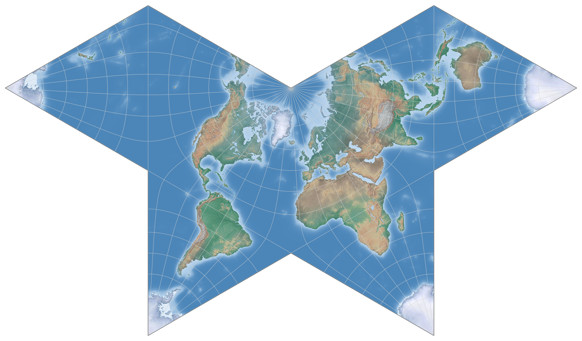
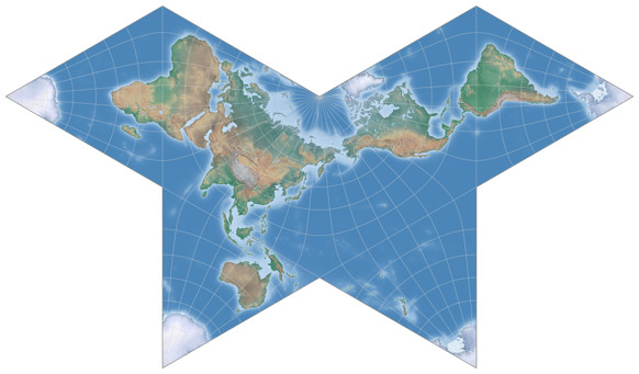
Now, here’s Cahill’s original map:
To avoid confusion: In 1909, Cahill introduced his first butterfly map which was neither conformal nor equal area
(thus being a compromise or aphylactic projection). Regrettably, I can’t show this variant because it’s not
supported by any map projection software that I know of.
The conformal variant shown here were introduced about 20 years later, the mathematical formulae were developed
on Cahill’s request by Oscar S. Adams.
It does a decent job at keeping away the worst areal inflations from the landmasses:
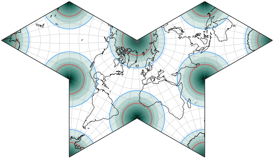
Deeper color signifies greater distortion.
The blue line indicates an areal inflation by 1.2, the red line by 2.0.
In some of his drawings, Cahill centered the projection to 157°30′ East, showing Afrika on the left lobe:
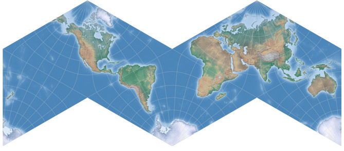
Cahill’s Conformal M-shaped Projection
Not much to say here, because this is just a rearrangement of the butterfly projection,
which can be obtained by cutting the butterfly map apart and putting it back together differently.
I prefer this arrangement because it’s closer to the world maps we are used to.
For more informations on Cahill’s conformal projection, visit
genekeyes.com/CAHILL-VARIANTS/Cahill-Conformal.html.
Dymaxion-like Conformal Projection
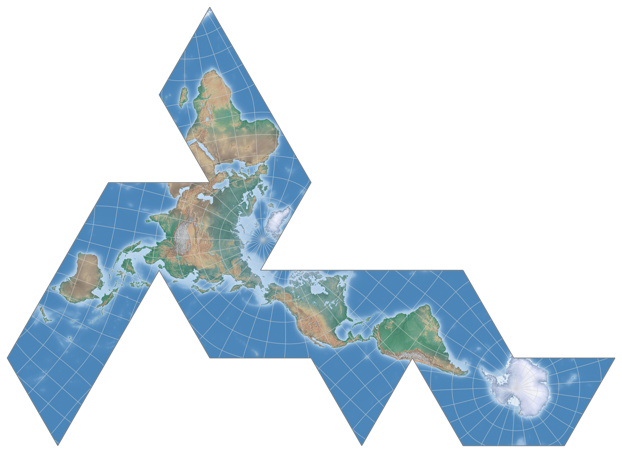
Based on the mathematics by Oscar S. Adams (1925 and onward) and L.P. Lee (1976), Daniel »daan« Strebe introduced a conformal application of Fuller’s Dymaxion arrangement (see above) in 2019.
And I have to say I prefer this variant over the original.
Why?
First off, the graticule lines do not show the kinks that are typical for the original:
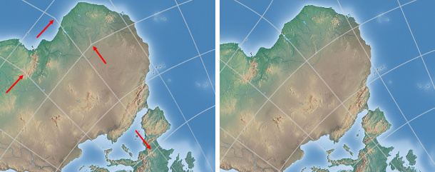
The kinks in the graticule line of the Dymaxion map (left) vs. unkinked graticule lines
in the conformal Dymaxion-like projection.
And secondly – it’s conformal.
Don’t get me wrong, I don’t think that conformal maps are superior to compromise maps per se,
but when you can choose between a projection that has a metric property (i.e. it’s either conformal or equal-area or equidistant)
and a very similar compromise projection, then the compromise projection should have a striking advantage to be preferred.
(My opinion only of course.)
And the thing is, I don’t see a striking advantage in the original Dymaxion map. It probably has a lesser
degree of areal inflation (although I can’t say that for sure because I lack the tools to compare the two projections adequately),
but is it enough to make a difference? I don’t know. What I do know is: The Dymaxion-like conformal projection already
has very low areal inflation values at the landmasses. See for yourself:
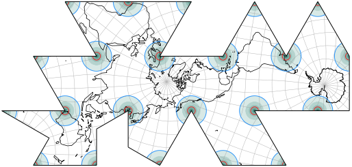
Deeper color signifies greater distortion.
The blue line indicates an areal inflation by 1.2, the red line by 2.0.
That’s really not a lot of inflation. I doubt that it makes sense to reduce it furtherly
(without reaching true equivalence) at the expense the continent’s shapes which in my eyes
do look better in the conformal variant:
Directly compare the original Dymaxion map with the Dymaxion-like conformal projection
Chaise Longe Conformal Projection
And here’s another icosahedron conformal map by daan Strebe 2019. Again, worst distortion are being kept away from the landmasses, save for the arabian peninsula it shows a good continuity.
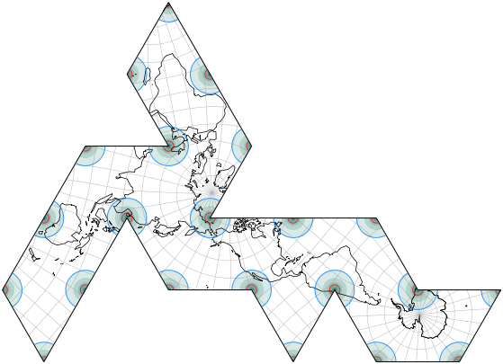
Here’s experiment of my own: Instead of cutting up the arabian peninsula, I cut through a major landmass, namely Eurasia. Gulp! But the cut is… well, (very) roughly at the conventional division of Europe and Asia. As you probably can see, it was obtained by simply doing a bit of cut & paste on the image of the Chaise Longe projection. Just wanted to show it here, it will not be added to the list on my website.
Notes on the software
The (original) Dymaxion can be rendered with Justin Kunimune’s map projection software.
The conformal polyhedric projections are available in version 3.3 of Geocart, which was released recently.
Fußnoten
- ↑ Reconstruction of an illustration in K.H. Wagner: Kartographische Netzentwürfe, 1949/1962, page 33, Abb. 19
- ↑ Some of Strebe’s papers can be found at tandfonline.com and researchgate.net.

 Except where otherwise noted, images on this site are licensed under
Comments
Due to spam posts, comments are now subject to moderation, which means they remain hidden until they are approved by a moderator.
More info
Be the first one to write a comment!