
Tue Aug 28, 2018 New Projections
Updated on Mon Sep 10, 2018
Today, I’ve added a few projections to the list on my website. There are some additional variants of projections that already were available before and some really new projections as well.
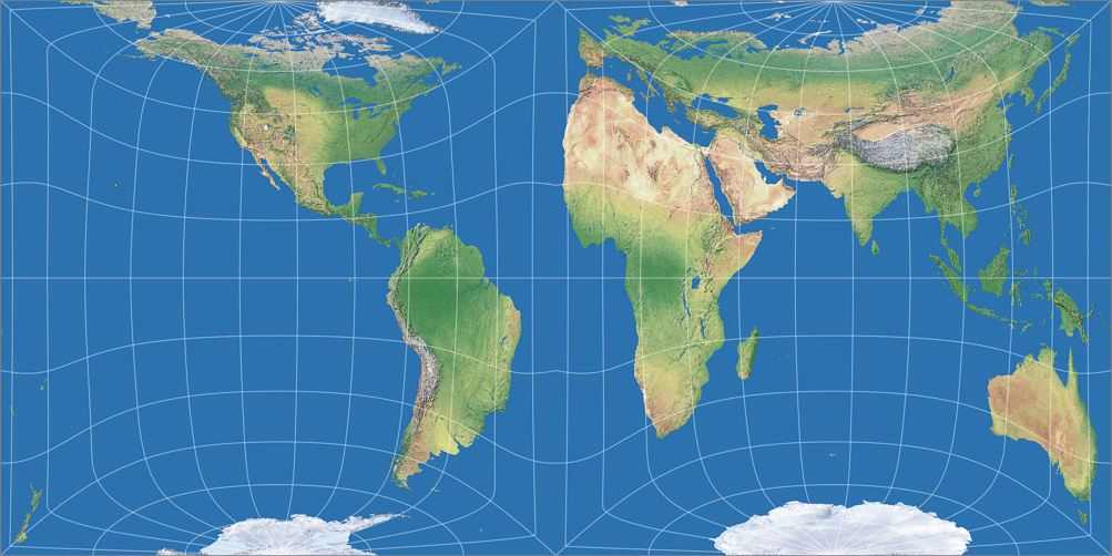
Interrupted Version by McBryde / McBryde-Thomas
The projections by McBryde and McBryde-Thomas have been listed for a while – but for some, the interrupted variant was missing. So I hand them in now: McBryde P3, McBryde Q3, McBryde-Thomas Flat-Pole Parabolic and McBryde-Thomas Flat-Pole Sinusoidal.
Update 2018-09-10: Arrggghh! I made a mistake when I updated the database, so the four projections shown above were not listed on my website. I’ve fixed this now.
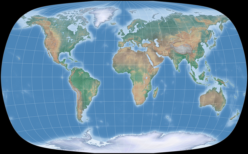
Two more projections by Frank Canters
In 2002, Frank Canters introduced a series of low error projections.
His method consist of the optimization of scale errors, based on the theory that the reduction of scale errors
also affects angular and areal distortions advantageously.
10 projections of this series have already been on my website before, all but one are compromise projections.
But Canters also worked on equal-area projections, so here are two of them. Their full name is:
Low-error equal-area transformation of the sinusoidal projection with twofold symmetry, equally divided, straight parallels
and a correct ratio of the axes
… the first one with the addition not including Antarctica in the optimisation, and the other one (you might guess it)
including Antarctica in the optimisation.
For obvious reasons, I prefer to use the notation suggested by Dr. Böhm and call them Canters W33 and Canters W34.
Being descendants of the sinusoidal projection, both are pointed-pole projections (i.e. the meridians converge at the poles), but they (especially W33) look more like pole-line projections – a consequence of Canters’ optimisation. In this regard, he noted: »This can be interpreted as the ultimate justification for the introduction of a pole line« but also didn’t neglect to mention that the W33 also suffers from all deficiencies of pseudocylindricals with a pole line, namely the stretching of North-South distances in the lower latitudes and the E-W stretching in the higher latitudes.
Well, aesthetically speaking, I prefer the W34 anyway – which, by the way, is a bit similar to Hufnagel 3 (compare Canters W34 to Hufnagel 3); and the striking similarity to projections with a real pole line can nicely be observed in comparison to Eckert IV – and even better in comparison Hufnagel 10.
The resemblance to the Hufnagel projections is not very surprising, though, since both Canters and Hufnagel tried to reduce distortions in their series of projections, so it seems quite logical that their results on equal-area pseudocylindricals don’t differ very much.
Two additional variants of Gringorten
In 1972, climatologist Irving I. Gringorten published an equal-area projection that was meant to be used in reports and articles. [2] Thus, he decided to create a square map that efficiently uses printed space. I added his original design to my website long time ago, but there are alternative arrangements – for example, you can set each hemisphere in a square. The result is a rectangular equal-area map that shows a distribution of angular distortions which is completely different from the one we know in cylindric equal-area maps.
As I’ve said before, I’m not very fond of the idea of forcing an equivalent projection into a rectangular map, but if you feel that’s necessary – well, the Gringorten does look unfamiliar, but remember that the distortions actually aren’t worse than in cylindric projections like e.g. the Smyth equal-surface (which has the same aspect ratio as the Gringorten alternative arrangement). Unfortunately, you can’t get a decent arrangement that places land masses in the areas with the lowest amount of distortion without severe interruptions or unacceptable distortions of other parts of the earth (see example below).
I’ve added two configurations: One is an equatorial aspect, centered to 20°W, which (as I’ve said) looks somewhat strange but not totally absurd. The other one looks really strange… but somehow, I like it. To me, it comes across very dynamically and might be a real eye-catcher.


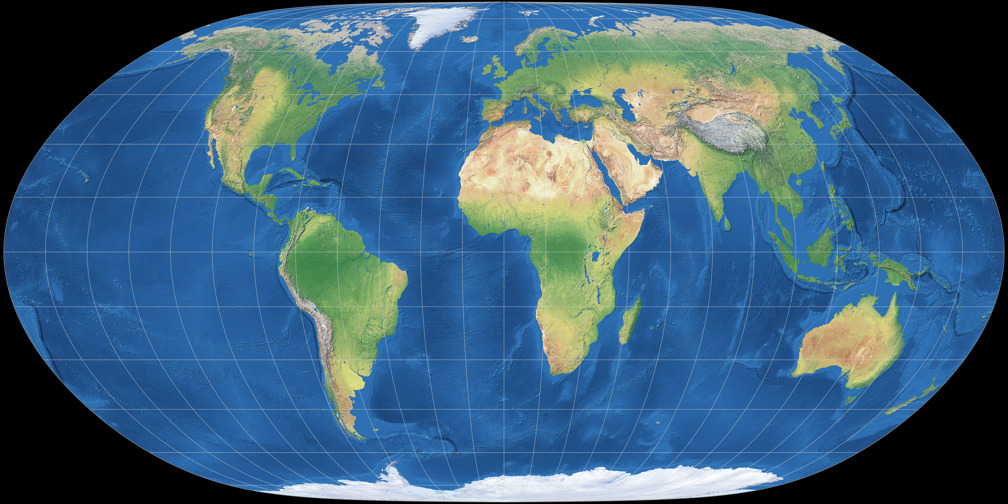
Kramer VII
The Kramer VII projection was developed by Leo Murphy in 2016 [3] using the software Flex Projector. Except for its brief mentioning in the Flex Projector gallery, there are (to my knowledge) no information at all about it. So this is kind of a premiere… :-)
The Kramer VII was optimized for low scale distortion, and indeed it has the lowest weighted mean error for overall scale distortion among all projections that are offered in Flex Projector.
 This image shows Flex Projector’s distortion tables.
The row called Scale lists the weighted mean error for overall scale distortion for the entire
globe, the row Scale Cont. for continental areas only. Kramer VII has the lowest value in
both categories.
This image shows Flex Projector’s distortion tables.
The row called Scale lists the weighted mean error for overall scale distortion for the entire
globe, the row Scale Cont. for continental areas only. Kramer VII has the lowest value in
both categories.
The image doesn’t show all projections that are listed by Flex Projector, but after the last entry shown
(the Hammer projection) there are only others which bear an even higher value.
Okay, now we know about an important property of the Kramer VII – can we now take a look already?
The first thing that leaps to my eye is the unusual outer shape – the only projection I know of which has a faint resemblance in this regard is the Canters W16. There’s a considerable areal inflation near the poles but on the other hand, it’s comparable to the amount of inflation in projections like Eckert III or Wagner IX and clearly below the inflation of such well-known projections like the Miller Cylindrical or Gall Stereographic so I guess it’s »with acceptable parameters«, as Data might say.
Speaking of distortions – here are the isolines of areal distortion and of maximum angular distortion as exported from Flex Projector and of course the Tissot indicatrix:


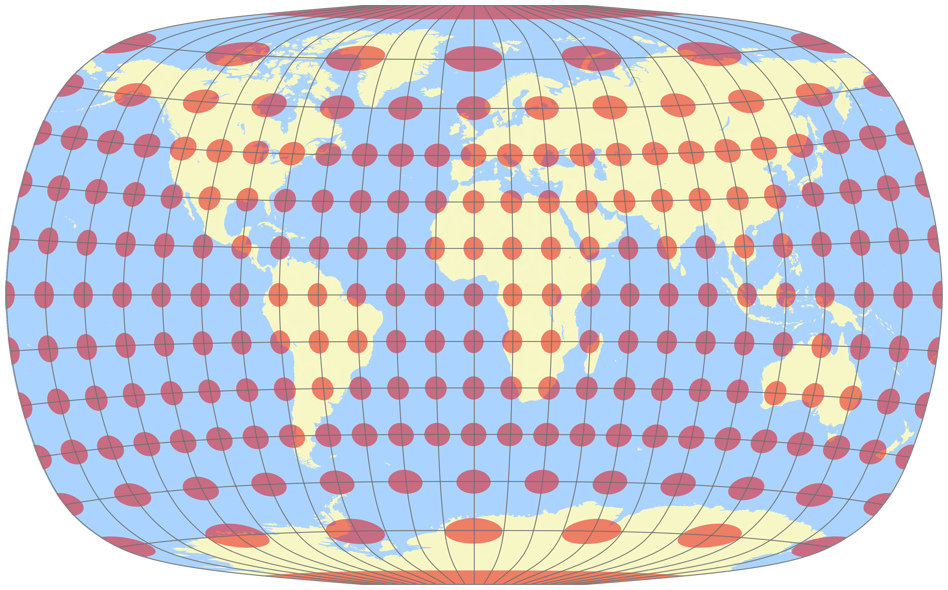
I think the only thing remarkable here is the peculiar path of the isoline marking the maximum angular distortion of 10°. Aside from that, everything’s very much what you’d expect from a projection like this. And coming again to the matter of rectangular maps: The outer shape is of course very close to a rectangular, so if you care about that, here you are.
To sum up, I can say that the Kramer VII is a nice unusual but not totally unfamiliar looking projection with very low scale distortions. In my opinion, it’s definitely usable, nothing bizarre.
So, there’s only one thing left that needs to be addressed – the name.
Why is it called Kramer VII when it was created by Mr. Murphy? Well, I asked him
about it and here’s his reply:
The name was my father’s idea (I let him choose it), and Kramer was the name of our family dog (…)
As for the VII, I’m not sure why my dad picked that. Perhaps because he just liked the number 7? Regardless, there aren’t any Kramers I - VI at the moment. Maybe I’ll have to make them all someday…
Then I wanted to know if he’d like to add any words of his own to my introduction of the Kramer VII, and he asked me to put down a single line:
„For my dad.“
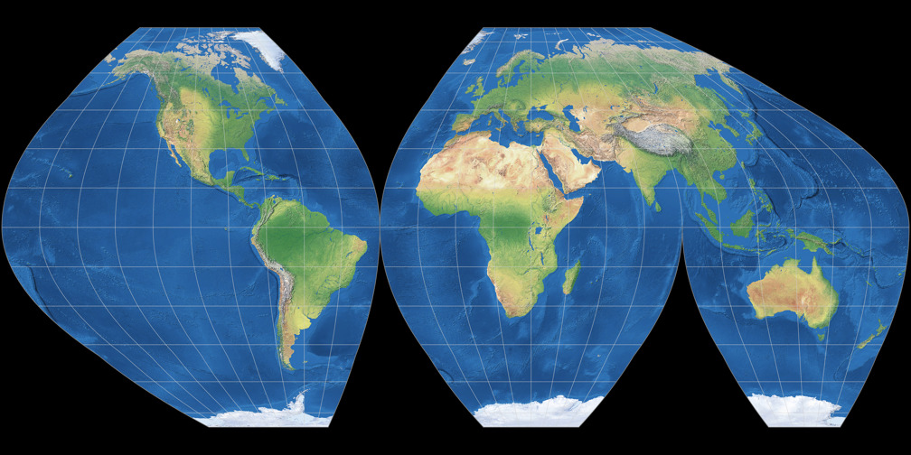
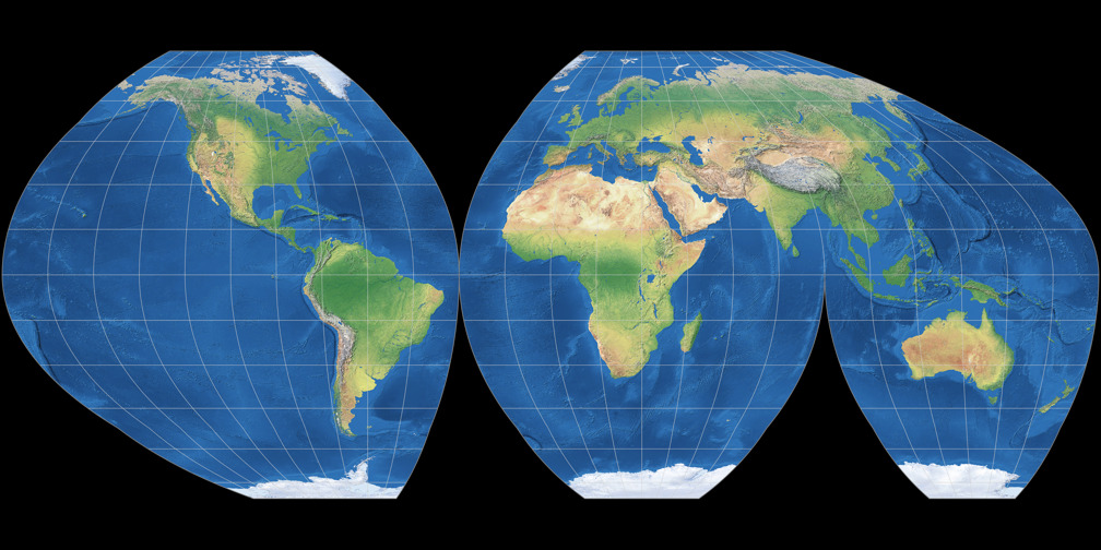
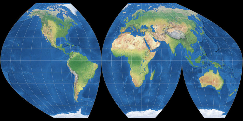
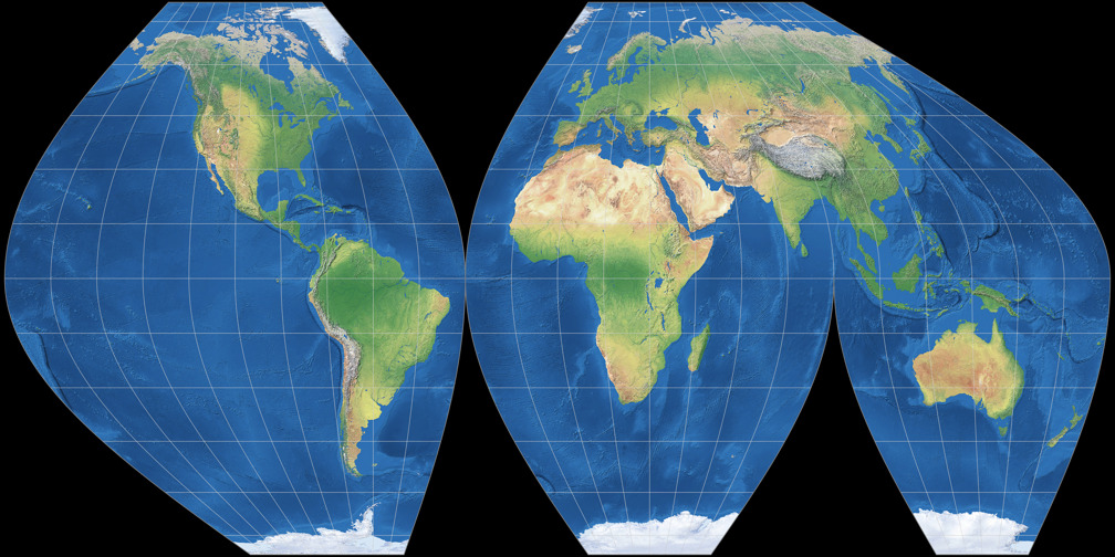
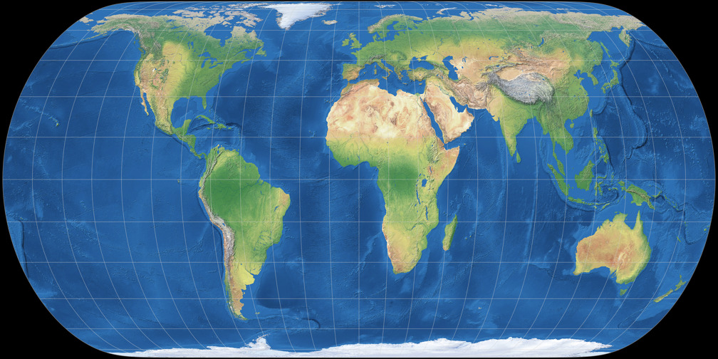
Equal Earth
And the last one for today is brand new:
It was introduced this very month, August 2018.
[4]
It does not look unusual. In fact, it was specifically designed to resemble the popular Robinson projection,
but unlike that, to retain the relative size of areas, i.e. it’s an equal-area projection, and it’s bearing the catchy name
Equal Earth.
Admittedly, my first thought was: »What? Why another pseudocylindric equal-area projection?
We’ve already got more of that kind than anyone can eat!«
– but after reading the paper of the creators Šavrič, Patterson & Jenny I felt that
the idea was not so bad after all.
I’m going to elaborate on that sometime soon.
For the moment, just enjoy this well-balanced projection (or better still, refer to the
paper of the creators if you can’t wait to learn more).

See you soon!
References
-
↑
Canters, Frank:
Small-scale Map Projection Design.
London & New York 2002. - ↑ A bit more of information about Gringorten’s projection can be obtained at progonos.com.
- ↑ All information about the Kramer VII projection was retrieved in personal communication with its creator Leo Murphy.
-
↑
Šavrič, Bojan & Patterson, Tom & Jenny, Bernhard. (2018):
The Equal Earth map projection. International Journal of Geographical Information Science. 1-12. 10.1080/13658816.2018.1504949. available at researchgate.net
Comments
Due to spam posts, comments are now subject to moderation, which means they remain hidden until they are approved by a moderator.
One comment
 Except where otherwise noted, images on this site are licensed under
Tobias Jung
Got to the Flex Projector Gallery:
https://flexprojector.com/gall…
There, download the Kramer VII zip file. It contains a .txt file that can be opened with any text editor, and holds the tables in the way that Flex Projector stores them.
To fully understand what the values in the text file mean, it might be helpful to download the Flex Projector software and inspect the values there.
Good luck!
Kind regards,
Tobias