
Tue Apr 26, 2022 Spilhaus Projections: A Quintet of World Ocean Maps
Today, I added five projections that are quite unique.
Most of the projections in
My Projection Collection explicitly or implicitly
aim at a favorable representation of earth’s land surface, i.e. to show it
with low distortions. In this regard, the projection presented by
Athelstan F. Spilhaus (1911-1998), a geophysicist and oceanographer,
fundamentally differ from all other projections I’ve shown so far,
because they focus on the representation of the oceans.
Yes, I
once mentioned in passing the
oceanic view of Goode’s Homolosine.
There, just like in Spilhaus’ projections, the land areas
suffer the fate that usually befalls the oceans: they are shoved towards the borders of the map,
extremely distorted and interrupted.
See how you like it, continents! 😉
The Spilhaus projections are unique nonetheless because they
present the seas and oceans as a unified, uninterrupted body of water.
To quote the author himself:[1]
That the world ocean is a continuous body of water with relatively free interchange between its parts is of fundamental importance to oceanography. On ordinary world maps the interruptions forming the edges of the map are often placed in the oceans to show the continents to best advantage. If, on the other hand, oceanographic conditions as a whole are to be shown, it is desirable to have the map interrupted within the land masses and the world ocean shown as a unit.
But before we look at the projections, four notes in advance:
-
Spilhaus didn’t develop any new projections. Instead, he
used existing projections and chose a
specific projection center that serves the purpose in question.
(Although he might not have been aware of that on the last-mentioned projection in this blogpost. I’ll elaborate on that later.) -
As far as I can tell, there are no established names for the first four projections,
and only a, well, “half-established” name for the last one. Therefore,
I picked names of my own choosing which are supposed to acknowledge the original authors.
But I’ll also allot
alternative denominations based on the half-established name.
(If I’ve made things too complicated now, just read on. It’ll become clear.) - The first two projections are meant to be shown in portrait format, just like I’m going to show them here. For technical reasons, they are rotated by 90° CCW over in my Projection Collection.
- Three maps are shown here with repetitions of certain parts of the world. In the Projection Collection, however, the base map as provided by the projection software is listed – i.e. without repetitions.
Hey Ho. Let’s go!
1942: Two projections in portrait format
In 1942, Spilhaus for the first time presented maps choosing a projection center which puts the world ocean into focus.
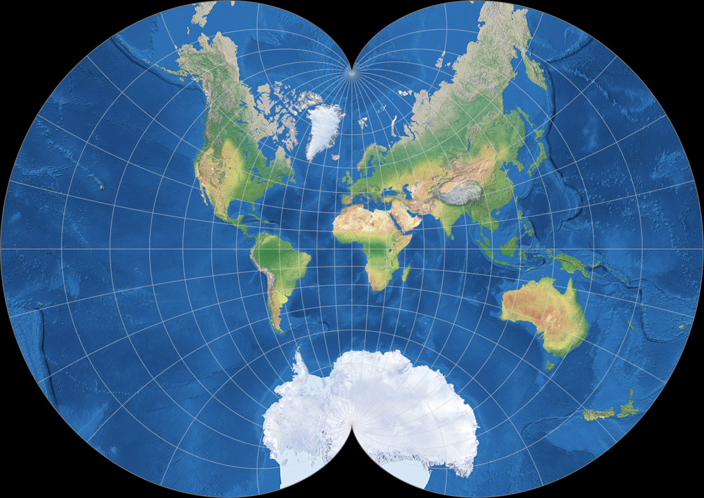
Spilhaus-Hammer I
or
Spilhaus World Ocean Map in an Ellipse
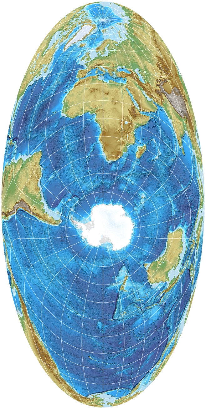
One of them is his version of the Hammer projection, shown above. The center is set to 70°South/15°East, with an axial tilt of 90° CCW (the transversal aspect).


While this map beautifully shows that the five (or three or seven, depending on how you count them) seas we usually refer to are actually one contiguous body of water, the world ocean is not totally uninterrupted. This can easily escape notice on the map above, but is clearer in Spilhaus’ second 1942 map, a variant of the conformal August Epicycloidal projection, using the same projection center:
Spilhaus-August
or
The Spilhaus World Ocean Map in an Epicycloid

Here, it is obvious that especially the Gulf of Mexiko, but also others peripheries are interrupted: This conformal projection magnifies the areas near the edges of the map substantially, while on the equivalent Spilhaus-Hammer I, they are severely compressed in East-West direction. Of course the areas in question do appear completely on the map, but they are cut off of the continuity of the world ocean. To compensate for that, Spilhaus added a few extensions to the maps, roughly like that:

On the Spilhaus-August, it’s obvious that the extensions were added deliberately. On the Spilhaus-Hammer I however, they are so small that they look like rendering glitches at first glance. Moreover, you need a bit of graphical skills to add them (that I haven’t which is why they look a bit clumsy) and a map projection software that is able to extend a projection beyond its boundaries.
As you can see, I could create them but the software I’m using for this renders the extensions in terrible quality. Fortunately, this is mostly concealed by scaling the images down to a size appropriate for web use but they are totally ineligible for a printed map.
So, in terms of being intended as “maps for the whole world ocean”, I feel there is still room for improvement. Maybe Spilhaus thought the same, because a lot of time later, he came back to the matter. Let’s jump ahead almost fourty years.
1983: Two circular projections
In 1983, Spilhaus presented five more world ocean maps;[2] we look at two of them. Again he drew on two existing projections, again one is equivalent and the other one is conformal, again he used the same projection center for both of them. This time it’s 45°South/95°West.
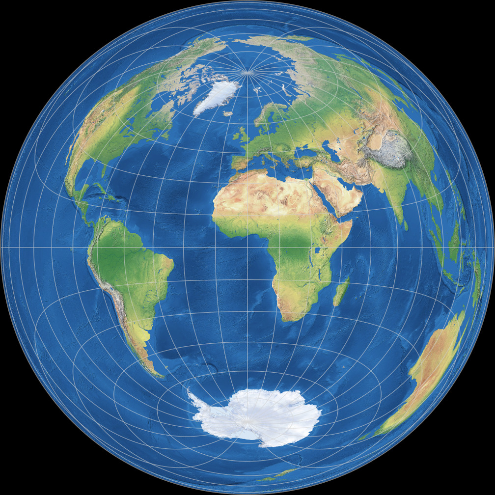
Spilhaus-Lambert Azimuthal
or
Spilhaus Equal-Area World Ocean Map in a Circle

The Azimuthal equal-area projection by Johann Lambert, centered to the coordinates mentioned above, shows the entire world ocean without any interruptions. It has a globe-like appearance, although the distortions actually do not correspond with the perspective ones of a real globe. Asia is sliced open and stretched out to surround the rest of the world. In order to retain the property of equivalence, the continent has to be reduced in width and appears in the result like a narrow, unobtrusive border around the map. Alas, the same happen to parts of the World Ocean, so that you can hardly recognize then – e.g. the Mediterranean or the Red Sea. And because of the distortions of the coastlines it gets hard to localize some areas of the Ocean, e.g. the Bay of Bengal and the Arabian Sea.
I emphasizing this because this is quite different in the conformal map:
Spilhaus Stereographic
or
Spilhaus Conformal World Ocean Map in a Circle
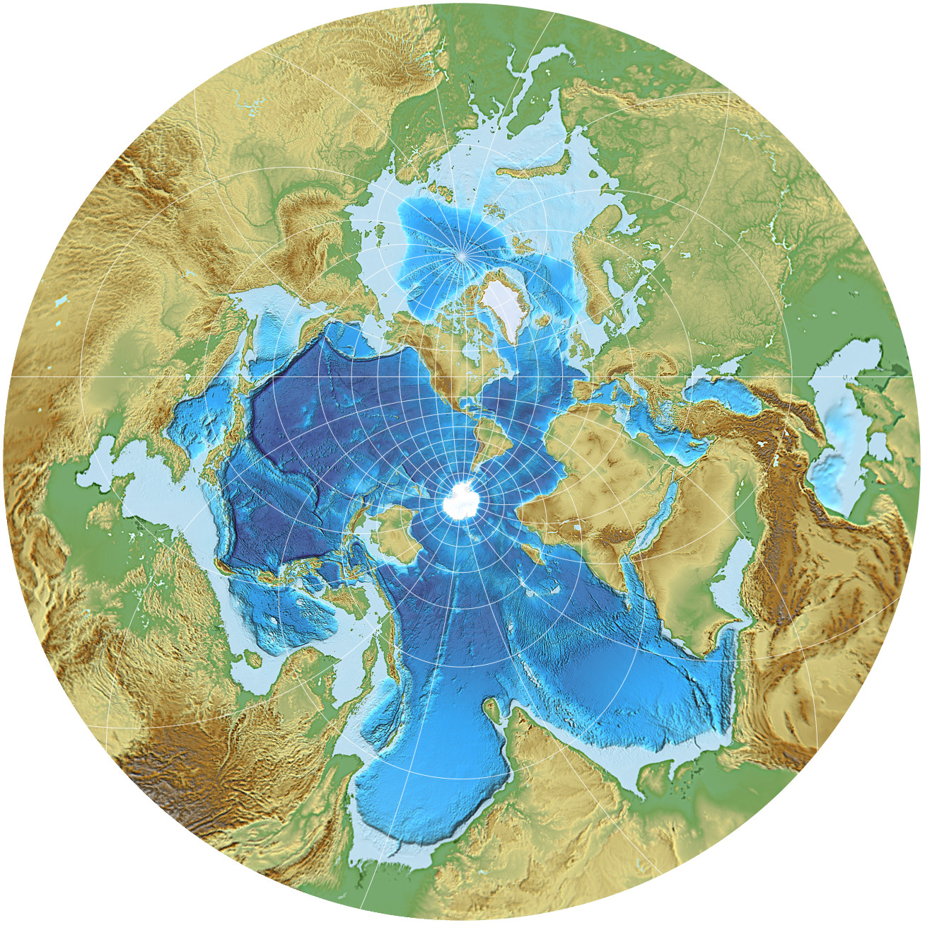
Here, Asia gets enlarged, and hugely so:
On the area of Sri Lanka, the 100-fold magnification is exceeded,
and at the outer rim of the circle, the amount of areal inflation reaches 900.
I’m quite certain that the casual map reader will have a hard time to
understand what is going on here and might assume that this is
an erroneous depiction of the earth.
On the other hand, this could raise awareness for the fact that every map projection is, to a certain degree,
arbitrary; and thus, clear up common misconceptions
(e.g. the notion that there could be something like the “most accurate” projection).
All right, perhaps this is a bold hope…
However, in terms of the projection’s stated goal – demonstrating
that the oceans actually are an unified body of water –, this
one might even be better than the previous examples.
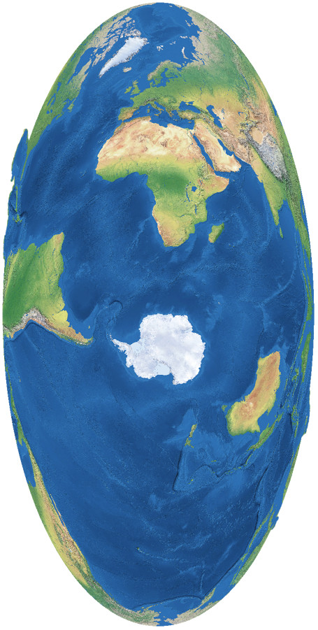
Years later, in his “Atlas of the World with Geophysical Boundaries”[3], Spilhaus presented a different version of this map, in which most of the land area of Eurasia was deleted. He decided to use a hard cut at the shorelines, but for the depiction here I used a soft transition instead:
For the sake of completeness I’d like to mention that Spilhaus’ circular variant
of the stereographic map also doesn’t show
the complete Earth: On the stereographic projection, the areal inflation rises into infinity
at the edges so it has to be limited. For the rendering shown here, I decided to limit it
by a small circle around the
map’s center, having a radius of 159°. With this value, only landmasses are
removed from the map, which is acceptable for a world ocean map.
In the following image, the black dot covers the area that is not displayed:

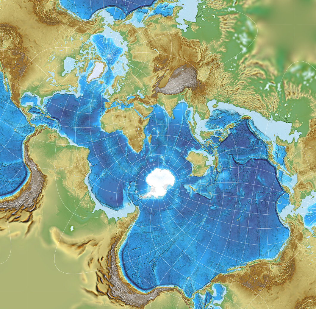
1979: A square-shaped projection
We go back again a few years to see the projection which is, in my opinion, the most fascinating one of the bunch. Actually, it’s also the one that got the ball rolling, because my attention was drawn to Spilhaus’ World Ocean Maps when I read the ArcGis story by Šavrič, Burrows & Kennedy[4] which features this wonderful map:
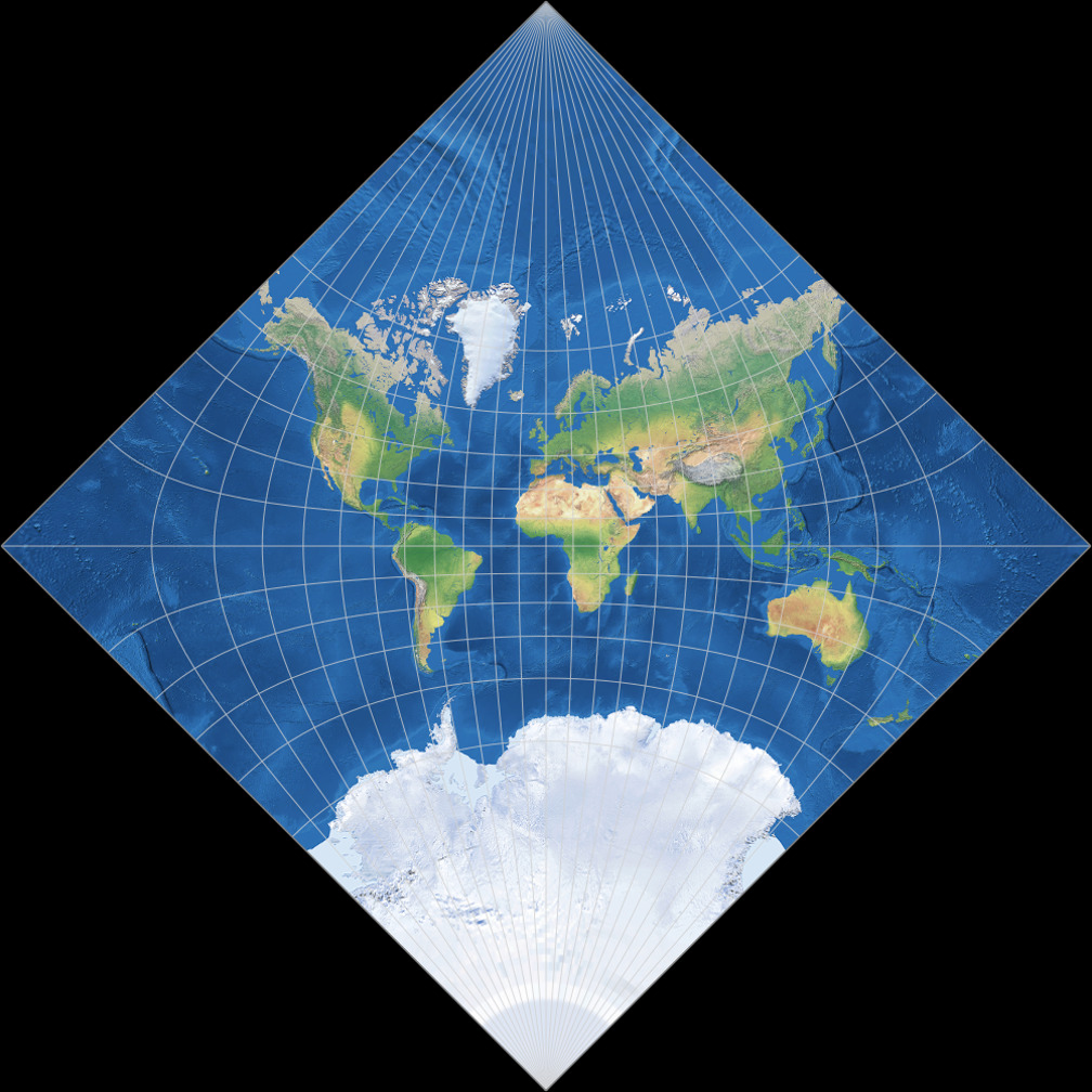
Spilhaus-Adams
or
Spilhaus World Ocean Map in a Square

The three authors point out that this projection was introduced in 1979[5] (not in 1942 as sometimes is claimed) and show that this is, in all probability, an instance of Adams World in a Square II with a map center at 49.56371678° South, 66.94970198° East and an axial tilt by 40.17823482° (or, if you prefer, 49°33′49.3804″S, 66°56′58.9271″E and 40°10′41.6454″), rotated by 45° CW after projection.[6]
Just like on the stereographic Spilhaus, we’ve got the problem – or the chance, depending on how you view it – that the map is quite confusing at first glance, and that the amount of areal inflation increases to many thousands of times. Furthermore, the annoyance familiar from Spilhaus-Hammer I and Spilhaus-August is repeated, namely that the world ocean is depicted with small interruptions (again, most obviously in the Gulf of Mexiko).
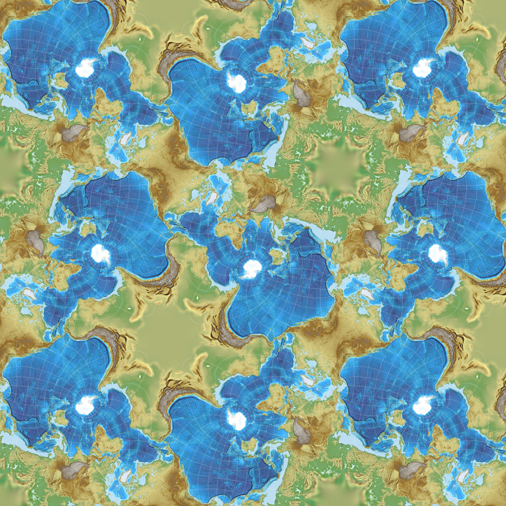
Now, there is a solution to both problems. Regarding the interruptions, we again make use of repetitions. But this time, there’s no need for a map projection software that can extend projections beyond their boundaries. The thing is, this projection can be tessellated, i.e. you can put multiple copies of the map (some of them rotated) next to each other, and they build an ongoing “mosaic”. Then, just cut out the part that you need: A rectangle that shows the World Ocean without interruptions, but with a few repeatings instead. Here are the results of these two steps:
You don’t have to copy the entire base map – of course it is sufficient to copy the required parts only from one edge of the map to paste them to another.
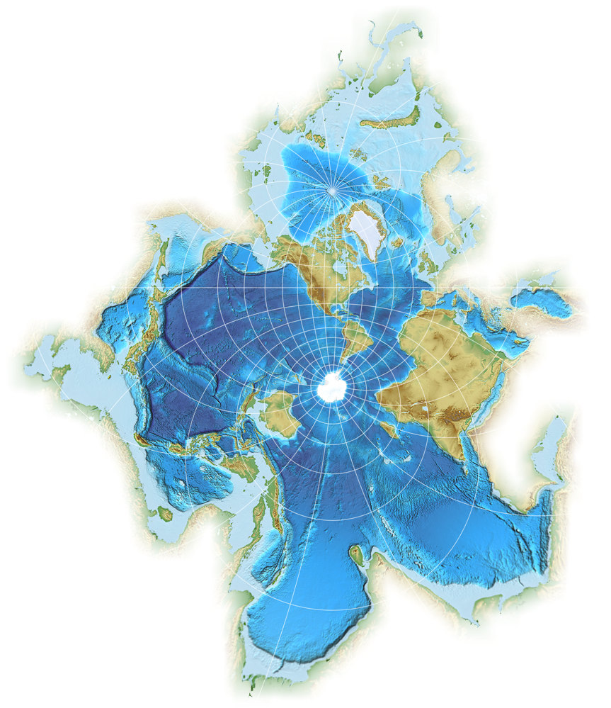
But what about those gargantuan inflations? Well, they all appear on land, and this is a Ocean Map. Again, just delete the most inflated parts of the land, we don’t need them. And then, you end up with a variant of Spilhaus-Adams that looks like this:
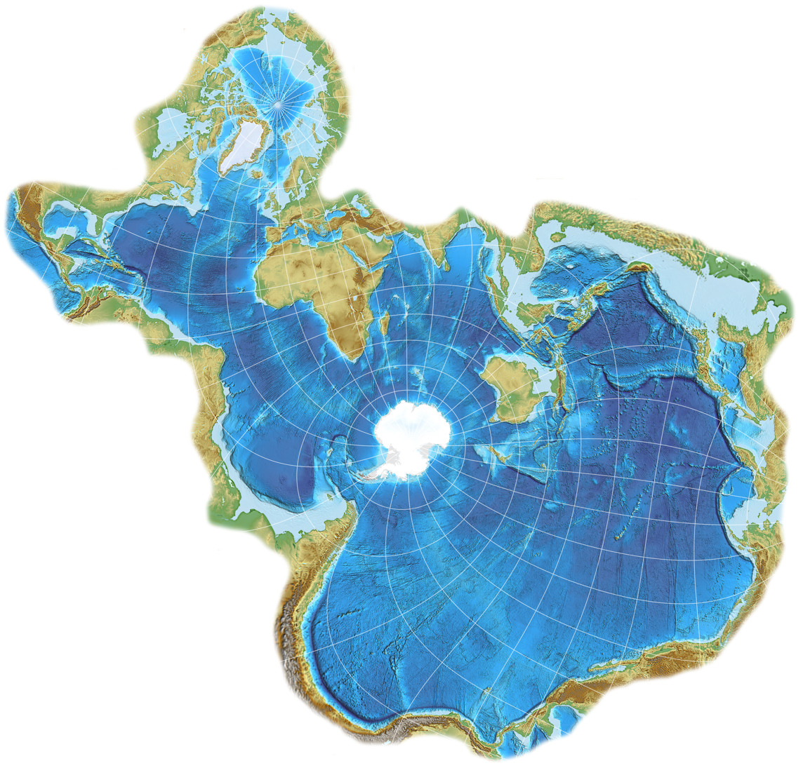
Spilhaus-Adams with repetitions and deleted land areas
In this configuration the projection appeared in the German magazine mare (see this photo on flickr, by Cédric Hüsler) and various other publications; John Nelson provided a few wonderful maps in this blogpost Spilhaus? More like Thrillhaus. The final map of course is not a square anymore – not even before you deleted the land areas. Nonetheless, since the projection it is based upon is square-shaped, it’s correct to have the “in a square” part in the name.
But I’d also like to talk about the denomination that I applied, Spilhaus-Adams. It is curious: In all the maps he introduced, Spilhaus noted the original author. But for this one, he claimed that it is “a new projection of the world in a square devised by geodesists Robert Hanson and Erwin Schmid, who helped me with the equations and programmed the computers which drew the maps” (cited from Šavrič, Burrows, Kennedy). Maybe they really re-invented the Adams World in a Square II, not knowing of Adams’s prior work? Such things have happened in the world of map projections. Maybe Hanson and Schmid missed to mention that the equations weren’t their own creation? I guess we’ll never know for sure, but now that we can assume that it is the Adams projection (and moreover, that my rendition above and the one form the ArcGis story definitely are oblique aspects of it), the name is appropriate.
Résumé
We’ve inspected five of the world ocean maps by Athelstan Spilhaus (in his aforementioned “Atlas of the World with Geophysical Boundaries”, he also showed several others). All of them are ideal for maps that are intended to bring the ocean into focus. Spilhaus-Hammer I and Spilhaus-August are probably the ones on which even inexperienced map users can orientate themselves most quickly, but the maps need some extensions to show the Ocean without any interruptions (which can pose a technical problem, depending on which map projection software you are using). The globe-like appearance of Spilhaus-Lambert Azimuthal might avoid confusion, but makes it difficult to locate certain areas of the World Ocean. This is distinctly easier on the Spilhaus Stereographic, which on the other hand can give you quite a turn with its overwhelming landmasses. You can, as shown above, delete them – but it also has enormous areal inflation on some parts of the sea (Arctic Ocean, Bay of Bengal).
You probably already can see what I am getting at:
Spilhaus-Adams is my favourite! 😁
I’m referring to the version with deleted land areas – which, by the way,
was never presented by Spilhaus himself.
Yes, it might be confusing at the first glance, too, but I think after a moment
it’s not too hard to identify all parts of the World Ocean, and it avoids
the most hideous inflations on the area of the ocean.
The repetitions needed to present an uninterrupted sea can easily be
added, you don’t need any special features of the projection software.
In my eyes, it best fulfils the goal of a world sea map.
Sometime (hopefully) soon, I’ll come back to the topic of special aspects of older projections and tessellation.
References / Footnotes
-
↑
Spilhaus, A. (1942): “Maps of the whole world ocean.” Geographical Review, 32 (3), p. 431-435.
doi: 10.2307/210385 (paid access) -
↑
Spilhaus, A. (1983): “World ocean maps: The proper places to interrupt.”
Proceedings of the American Philosophical Society, 127 (1), p. 50–60
jstor.org/stable/210385 (free access after registration) -
↑
Spilhaus, A. (1991). “Atlas of the World with Geophysical Boundaries:
Showing Oceans, Continents and Tectonic Plates in Their Entirety”.
Independence Square, Philadelphia: The American Philosophical Society.
Accessible at Google Books - ↑ Bojan Šavrič, David Burrows, Melita Kennedy (2020): The Spilhaus World Ocean Map in a Square
- ↑ Spilhaus, A. (November 1979). “To see the oceans, slice up the land.” Smithsonian, p. 54–63.
- ↑ Read the paper by Šavrič, Burrows & Kennedy to learn how they found that specific projections center. Also, be aware that Spilhaus himself most likely didn’t work with that high level of accuracy: Eight decimals in the coordinates translate to roughly 1 millimeter or 0.0393 inches of latitude.
Comments
Due to spam posts, comments are now subject to moderation, which means they remain hidden until they are approved by a moderator.
4 comments
Diana Contreras
Rhamph
André
Christian Hilton
Or more pertinently, should the map be interactive and allow the viewer to move the centre as required?
 Except where otherwise noted, images on this site are licensed under
Tobias Jung
See the Legal Disclosure https://map-projections.net/im… and my few words “about me” https://map-projections.net/ab…