
Mon Nov 26, 2018 The Equal Earth Projection
The Equal Earth projection was developed by Bojan Šavrič, Tom Patterson and Bernhard Jenny and introduced in August 2018 as follows: [1]
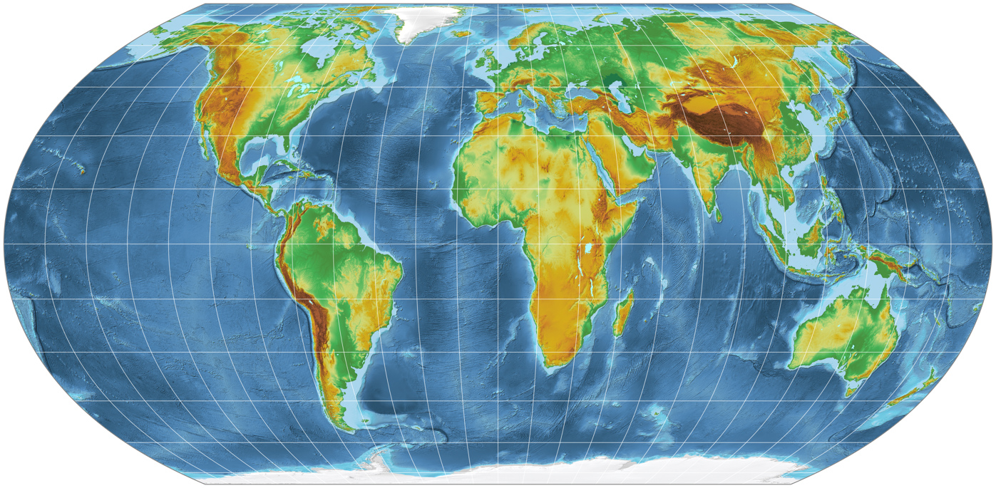
The Equal Earth map projection is a new equal-area pseudocylindrical projection for world maps. It is inspired by the widely used Robinson projection, but unlike the Robinson projection, retains the relative size of areas. The projection equations are simple to implement and fast to evaluate. Continental outlines are shown in a visually pleasing and balanced way.
Huh?
Yet another equal-area pseudocylindrical projection?
On my website I already list almost 50 projections of this type (and believe me, there are even more),
including customizable projections like Hufnagel and Sinucyli;
with the generalized Wagner VII/VIII you can at least create »pseudo-pseudocylindrical« maps,
and Wagner IV would be customizable, if only anyone would care to implement the
options provided by Wagner.
So, what's this about?
Why does someone sit down and even bother to launch another thing like that?
Actually, there are good reasons for that. Let’s take a look at this.
The Motivation for Creating a new Map Projection
In 2017, several news stories reported that in Boston Public Schools old world maps using the Mercator projection
were replaced by maps using the Gall-Peters projection (sometimes simply called Peters projection).
[2]
Most articles repeated the well-known but – mostly false – claims.
While it is true that the Mercator projection extremely distorts the relative size of areas, this had nothing
to do with colonialism but with navigation. Moreover, the Gall-Peters projection is not the only equal-area projection
available, and it is simply not true that all we always get to see is the Mercator projection.
(Go to your nearest book store and grab any atlas that is offered there!)
But while all these other equal-area projections mentioned above have been around since decades or even more than a century, while they are well-known to any decent cartographer and have been used in various atlases – they obviously remain unknown to the general public.
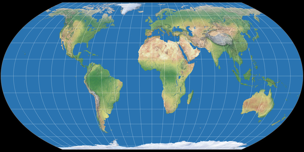
Yet there is another projection that gained some popularity and mostly likely, looks familiar to most people: The Robinson projection, created by by Arthur H. Robinson in 1963. It belongs to the compromise class of map projections, i.e. it preserves neither shapes nor relative size of areas but tries to balance out a compromise that simply »looks right«.


The Robinson projection is not only popular, it also has various properties that seem to be preferred by map readers, as shown by a survey a few years ago. [3] So Šavrič, Patterson & Jenny decided to adopt some Robinson properties for the new equivalent projection, namely to create »a pseudocylindrical projection with pole lines and meridians that do not excessively bulge outwards, has regularly spaced meridians, and a height-to-width ratio close to 1:2.«
The result is an intermediate form between the Eckert IV and Wagner IV projections: It has pointed corners like the Wagner IV but the curvature of the outer meridians is more similar to Eckert’s.
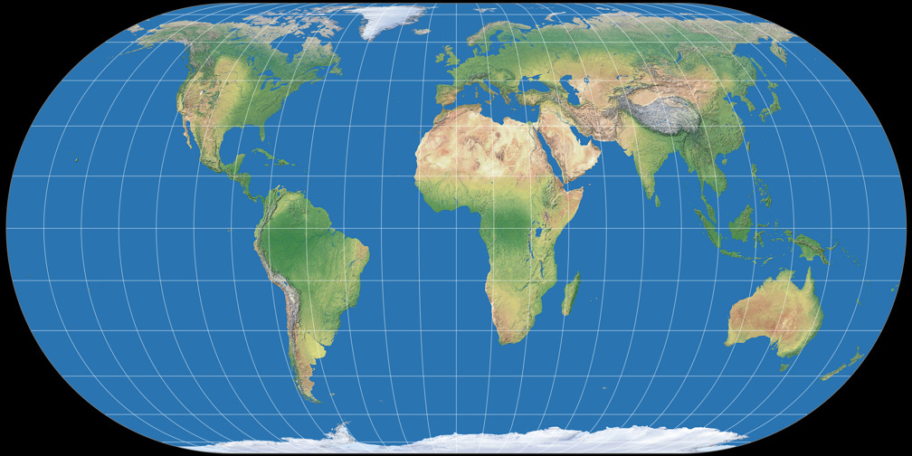
In order to avoid elongated continents in north-to-south direction, they added
a slight horizontal stretch (while maintaining equivalence), so the the Equal Earth projection is a bit wider than the Robinson projection.
Nonetheless, they achieved the goal to create an equal-area projection with a »look & feel«
similar to Robinson very well:
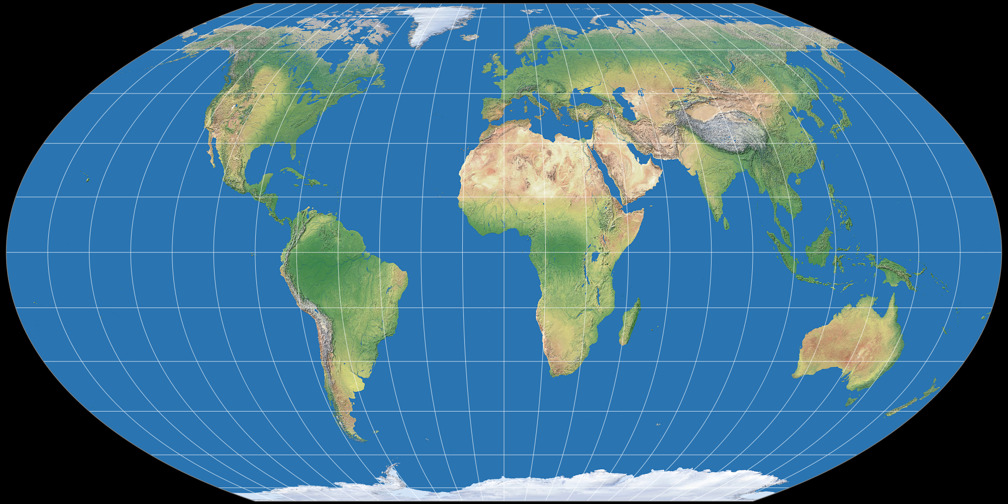
Equal Earth projection vs. Robinson projection
So, do we need this?
Let’s come back to the question I asked in the beginning:
Do we need another pseudocylindric equal-area projection?
Actually, no. But: The Equal Earth projection is a well-balanced projection, which might
»look right« to many people, because of its resemblance to the Robinson projection.
Moreover, it already has gained some attention
[4]
– and I think that’s exactly what it is about: Gaining attention.
Attention is the one thing that is badly needed.
As I’ve said above, there are dozens of great equal-area projections, but they have remained largely unknown to the general public.
Starting fresh by creating a new projection with a catchy name might be the right thing to do if you want to get people
to know that there are great, applicable equal-area map projections.
Currently, it’s not easy to find a wall map using an equal-area projection that is not Gall-Peters – there are a few but you have to enter very specific search terms to find them. The Equal Earth projection could change that – at any rate, I keep my fingers crossed that this will succeed.
P.S.: I can’t deny it – and most of all, I don't see any reason why I should:
Personally, I still prefer other equal-area projections like Wagner IV, and especially projections
of the lenticular class like
Wagner VII
or
Strebe 1995.
P.P.S.: It is a bit of a nuisance that some of these articles don’t quite get idea, and claim false things like
»An accurate world map is something that has evaded cartographers for centuries,
but this new design just might make distorted maps a thing of the past« or
»this new map may be the closest to what the world actually looks like yet«, or even
»they [Equal Earth’s creators] claim it is the most accurate [world map] yet«.
Especially
since Šavrič, Patterson & Jenny write nothing at all to encourage such
misunderstandings. In fact, they even add distortions tables which clearly show that while
the Equal Earth projection has favorable distortions patterns, some older projections have lower (= better) values
of scale distortion and angular deformation.
Furthermore, they clearly state that aesthetic considerations led to the final result.
References
-
↑
Šavrič, Bojan & Patterson, Tom & Jenny, Bernhard. (2018):
The Equal Earth map projection. International Journal of Geographical Information Science. 1-12. 10.1080/13658816.2018.1504949. available at researchgate.net -
↑
A brief, randomly selected list of articles covering the maps at Boston Public Schools:
– at wbur.org
– at theguardian.com
– at newsweek.com
– at globalcitizen.org (this one’s full of terrible misunderstandings) -
↑
Šavrič, Bojan & Jenny, Bernhard & White, Denis & Strebe, Daniel. (2015):
User preferences for world map projections. Cartography and Geographic Information Science. 42. 398–409. 10.1080/15230406.2015.1014425. available at researchgate.net -
↑
A list of articles regarding the Equal Earth projection:
– at www.popularmechanics.com
– at www.johndcook.com
– at www.maproomblog.com
– at phys.org
– at allthatsinteresting.com
– at www.iflscience.com
Comments
Due to spam posts, comments are now subject to moderation, which means they remain hidden until they are approved by a moderator.
One comment
 Except where otherwise noted, images on this site are licensed under
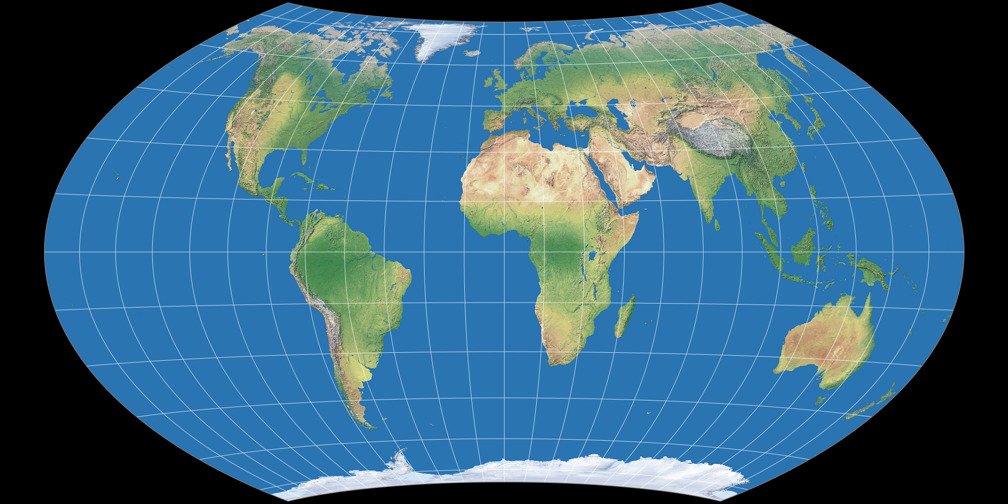
Tobias Jung
Indeed! It didn’t occur to me before, but you’re right!