
Fri July 29, 2022 Lee, Markley, CALM & Grieger
Updated on Wed June 04, 2025
Today, I added four projections to my Projection Collection.
All of them are conformal with comparatively low areal inflations on the continents,
and three of them show the Earth in a rectangular map.
This is going to be a longer blogpost, so here’s a sneak peek before we go into detail:

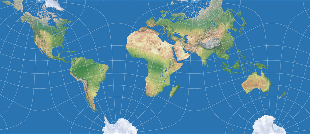

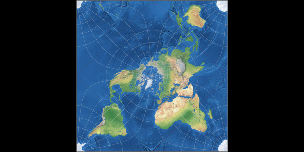
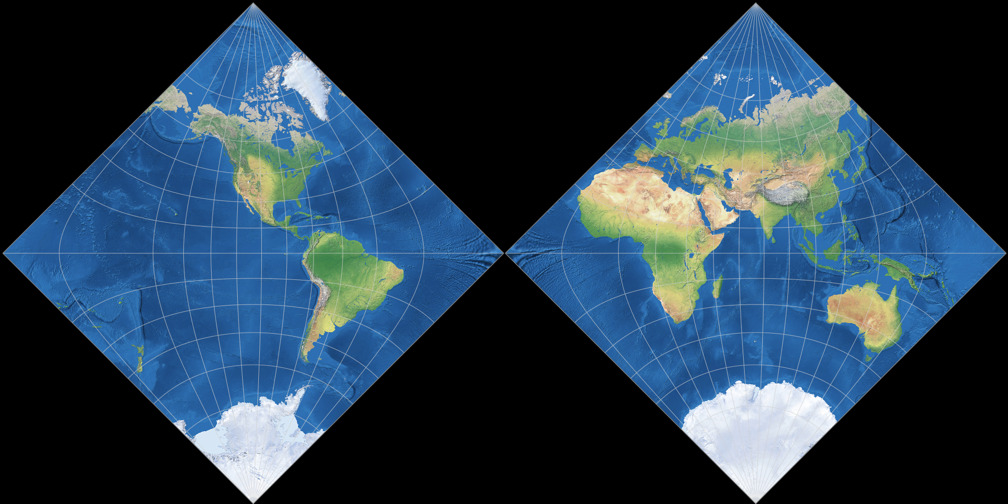
Lee’s Conformal Tetrahedric Projection

Let me start by (again) quoting John P. Snyder from Flattening the Earth, page 266:
The most extensive treatment of the subject of map projections as a mathematical challenge without necessarily a practical outcome was to devise conformal projections for hemispheres or world maps bounded by simple geometric figures (…)
Lee [showed] the world conformally on the faces of all five of the regular Platonic polyhedra (tetrahedron, cube, etc.).
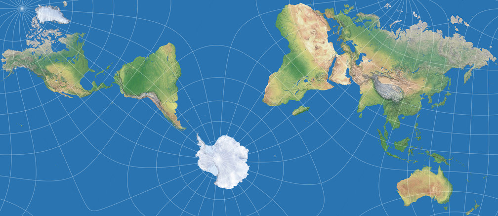
And here is one of them, the tetrahedral version, presented in 1965.[1] For the image listed in my Projection Collection, I chose two show two aspects, a north and a south polar one (as I did with other tetrahedral projections before, namely the Snyder tetrahedron and the van Leeuwen great circle and small circle variants). According to Carlos Furuti’s excellent map projection website Lee’s original map was centered to the south pole, but he didn’t mention the longitudinal center. He presented an image that equals to a center at 15°W, while Paul B. Anderson preferred 20°W and Justin Kunimune put a version with 22.5°W to the Wikimedia Commons.
Which is the original one, which one is the best? – I don’t know. For the image in my Projection Collection, I decided
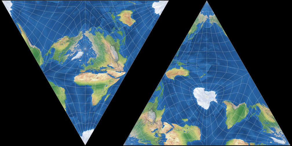
to use the center Kunimune used. Here, you can compare the distribution of areal inflations of the three variants;
the lines represent values of
1.2; 1.5; 2.0; 2.5; 3.0; 3.5; 4.0; 4.5; and 5.0:


Sidenote: The “central” meridian is, to some extent, a point of view. For example, on the north polar aspect shown above, it’s set to 150°E (that’s the straight line running form the north pole to the upper vertex of the triangle) in the map projection software I used, but it also could be the antipodal meridian 30°W, running to the center of the base. Also, some other meridians depending on the orientation of the triangle.
So, with the right projection center, Lee’s conformal tetrahedric projection does
a great job at keeping the worst areal inflations away from the continents,
but what about the “practical outcome” Snyder was talking about?
I doubt anyone would want to use a world map like this in an atlas
or a report. Yes, it can be tessellated – see the Furuti link given above or
Kunimune’s depiction –,
and you can print it on paper in order to fold a tetrahedral pseudo globe
(Furuti
offered some beautiful examples).
But both applications are more in the field of decorative work.
Well, I guess Lee’s world in a triangle really is not a projection with a practical outcome.
Or is it?
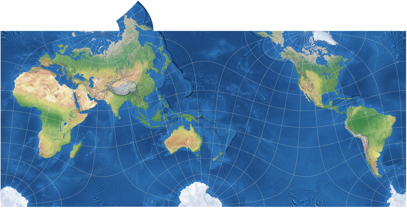
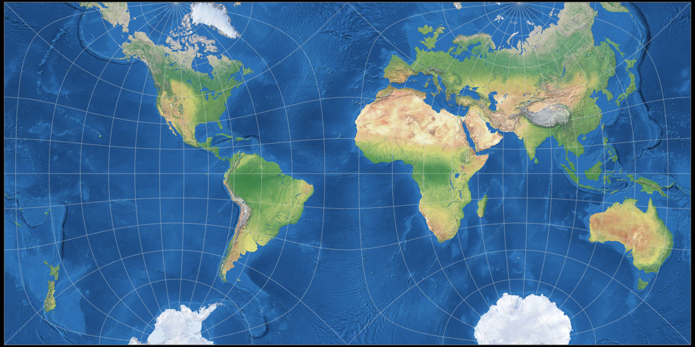
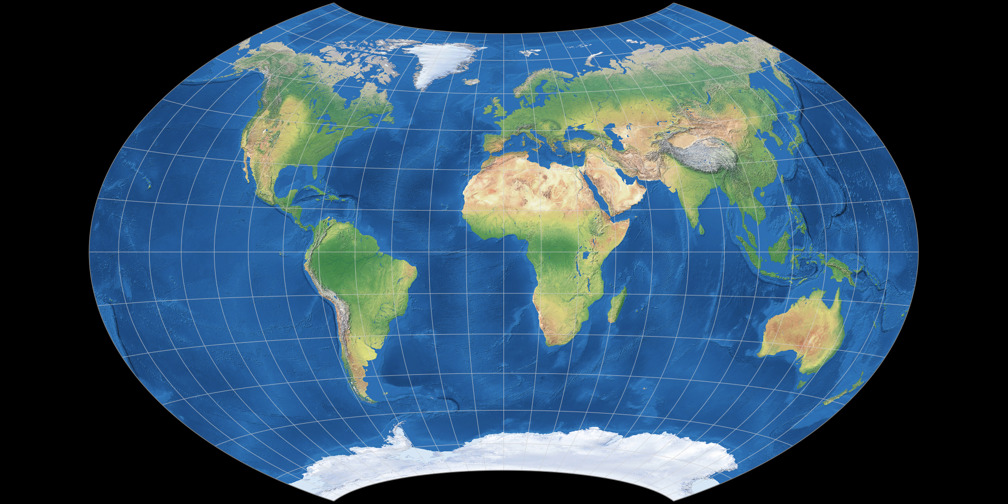
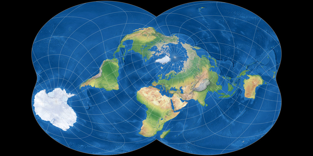
Markley’s Conformal Tetrahedral Projection
Now, this is a projection that can be used for practical purposes!
And in case you disagree, I’m going to briefly discuss the “practical purposes” matter at
the end of this blogpost.
It’s conformal, it has comparatively low areal inflation on the landmasses,
the arrangement of the continents is not too confusing, and hey, it’s rectangular! People just love
rectangular world maps!
Yes, but the thing is: This is Lee’s conformal tetrahedric projection!
As F. Landis Markley reported in his 2020 paper[2],
he re-invented the conformal projection onto a tetrahedron in 1982 (at that time, unaware of Lee’s prior work),
set a specific map center (see below)
and arranged the four faces of the tetrahedron (two of them appearing twice) like this:

Then, you just have to cut away the unneeded parts at the left and right edges of the image to end
up with the rectangular map.
Markley developed this configuration as an improvement on the
Guyou projection,
so it makes sense to compare the distribution of areal inflations of that two:


Both of them are not too confusing, i.e. the layout of the landmasses still looks
familiar if you’re used to world maps in equatorial aspect, centered at or near the
Greenwich meridian; although the continents seem to “bob and weave” a bit.
Moreover, both projections show the poles twice.
Therefore, my personal recommendation would be to use them only for maps where the graticule is displayed.
I still like the Guyou projection a lot, but regarding the distribution of
inflations on continental areas, I agree that Markley’s arrangement is an improvement.
Both projections can be tessellated, so you can
easily come up with own variants: For example, if you don’t like the
interrupted Antarctica, add an extension to show it completely (in my rendition,
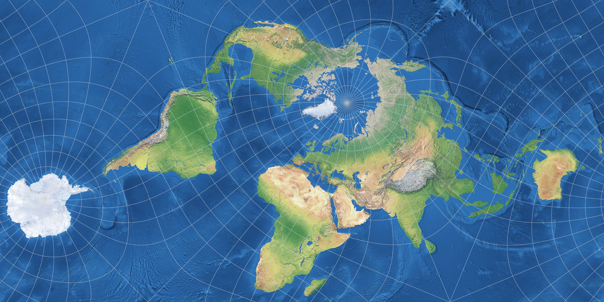
using the example of Markley’s map, without repetitions); or you can create a pacific-centered version – here,
also with an extension, this time to show Siberia uninterrupted, using repetitions:

To come back to the projection center: As mentioned above, it depends on how the software
handles Lee’s projection. In Geocart the projection
center has to be set to
Latitidinal: 35°15′51.8029′N
Longitudinal: 115°W
Transversal: 180°
In Justin Kunimune’s Map Projection Suite,
the configuration is:
Latitude: -35.26
Longitude: 65
Ctr. Meridian: 0
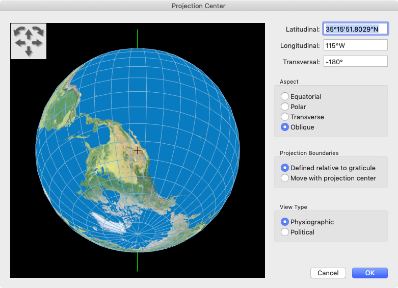
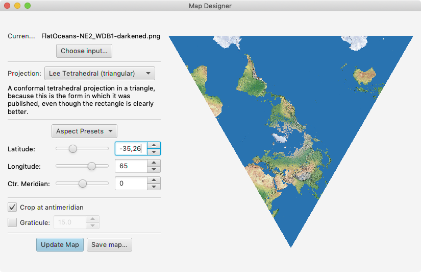
The exact coordinates in Geocart were derived from the d3 implementation mentioned below. Note that Kunimune’s software takes the antipodal values, except for the fact that only two decimals are allowed. However the difference to the latitudinal value of Geocart is only 488 meters on the sphere which of course is neglectable in a world map.
Since Kunimune’s application doesn’t create single faces of the tetrahedron but a full-world representation instead, arranging and cutting the intermediate results is different:

And last but not least, there’s also an implementation of Markley’s tetrahedral map for d3-geo-projection. Without this presentation, I wouldn’t even know about Markley’s map, so thanks a lot!
In my opinion, Markley’s arrangement makes a wonderful conformal world map. And it proves that Lee’s Tetrahedric Projection can be put to a practical use.
Did I just use the singular?CALM – Conformal Authagraph-Like Map
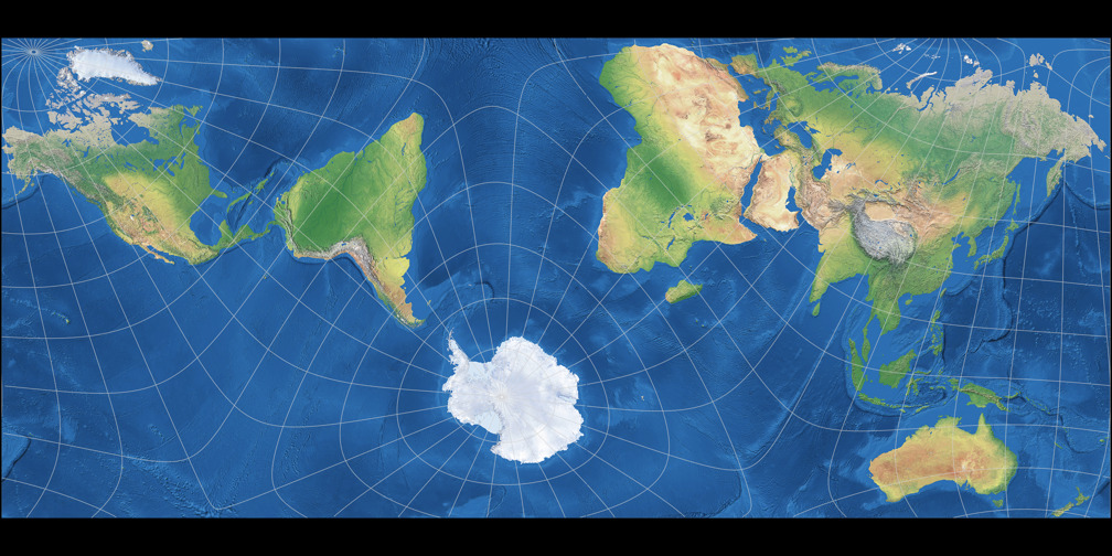
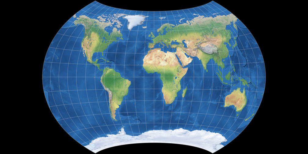
In his blogpost “Tetrahedral projections” of 2019, Farhan Adrian presented another configuration of Lee’s projection that shows an arrangement like the Authagraph map. The Authagraph got hyped a few years back, although that may have partially been due were some misunderstandings and false claims about it (as I once pointed out briefly). However, the layout of the continents is interesting, so I think it’s nice to see a conformal variant.
In personal communication, Mr Adrian told me the projection center he used – Thanks a lot, Farhan! 🙏 –
and also proposed its name: CALM for Conformal Authagraph-Like Map projection.
So, the CALM projection was created in Kunimune’s software with the configuration:
Latitude: 77
Longitude: 143
Ctr. Meridian: -163
… which translates to the Geocart setting of
Latitidinal: 77°S
Longitudinal: 37°W
Transversal: 17°
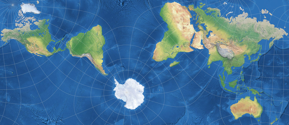
The construction of the CALM projection is identical to the process shown above, no need to go through this again. But let’s inspect the areal inflations, in comparison to Markley’s projection:

As usual when you change the projection center (or perform a coordinate system rotation, as you can also say) there are certain regions that benefit from it while others are at disadvantage. Overall, I again prefer Markley’s arrangement. But the CALM is not too bad either, although it disturbingly inflates Brazil’s easternmost tip and Australia’s west coast, and painfully blows up the New Siberian Islands[3]. Moreover, the “dance of the continents” gets a bit too wild for my taste. On the up side, it manages to show all major landmasses incl. Antarctica without interruptions.
But what I like best in the CALM projection: I prefer it to both the original Authagraph map and its “mutated offspring”, Kunimune’s IMAGO. And this is coming from me, who usually thinks; “Oh, I like this projection, but it also would be nice with a bit less areal inflation” – which was, more or less, my motivation for creating projections like Wagner BCW-A I, F13 Copycat, and Guyou-Wagner. But in this case, the drawbacks of the “almost but not quite equivalent” property of the Authagraph and its offspring, which show up as visibly deformed shapes, are too prominent.
Well, don’t take my word for it – see for yourself and decide:
Compare the CALM and IMAGO projections!
Note: For the sake of better comparability I’ve added a Atlantic-centered version to my Projection Collection, but of course you can also create it Pacific-centered (as the Authagraph usually is presented):

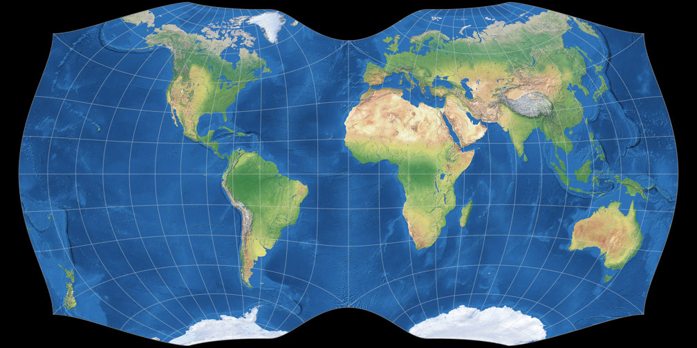
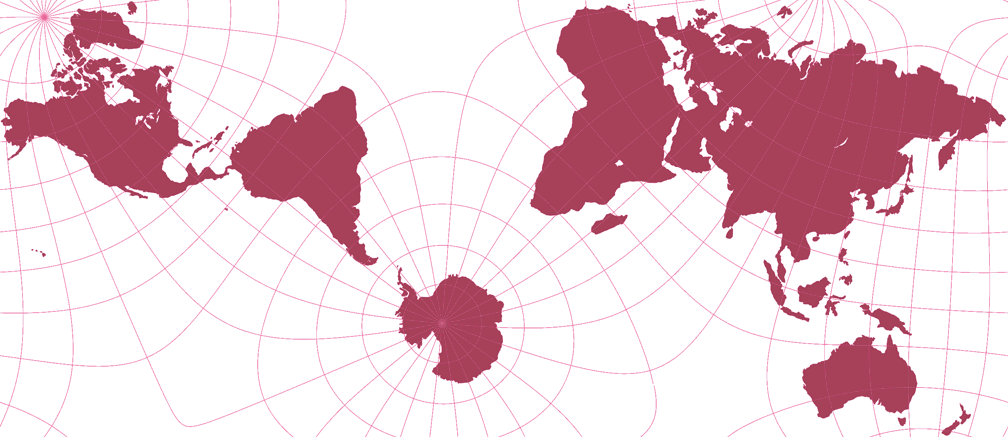
Grieger’s Triptychial Map

And here’s another rearrangement of a classical conformal projection: In 2019, Björn Grieger presented[4] an interesting oblique version of the Peirce Quincuncial Projection of 1879. The transverse aspect of Peirce’s projection is known as Adams Hemispheres in a Square, and since the latter renders the world as I needed it (namely in two separate hemispheres), I chose this one to create the triptychial map. Using Geocart, the construction of the projection is as follows:
- Create two instances of Adams’ hemispheric projection. Set the projection center of one instance to 45°N, 0°E and the other to 45°S, 180°E.
- Rotate the finished map of the “northern” hemisphere (i.e. the one containing the north pole) by 45° clockwise, and the “southern” hemisphere by 45° counterclockwise.
- Export the two maps e.g. as TIFF file, and open them in a graphics editor.
- Cut the “southern” hemisphere vertically in halves. Put the half containing the south pole to the left of the “northern” hemisphere, the other one to the right. Put the three partial maps together seamlessly.


The arrangement of the three map parts corresponds to the one of a triptych, hence the name Triptychial Map. (Honestly, I’m nor sure if the adjective “triptychial” even exists, but – who cares? It exists now!)
The layout of the continents is a lot like the one of the Canters W23 – hardly surprising, because both projections want to show all major landmasses without interruptions, and there are not many projection centers which will allow to do that. For laypersons, this manner of representation might be a bit confusing. That is not a bad thing per se, it never hurts to get people thinking. But one should carefully consider for what kind of maps such a projection is appropriate.
On to the distortions! Again, there are visible inflations – the corresponding diagram is shown below – on Africa (as in Markley’s projections) and South America (as in the CALM), but this time, other parts are affected: Southern Africa and South America’s west coast. The Malay Peninsula and Sumatra are affected even more – but the Galápagos Islands take the cake! They are magnified about fortyfold, roughly as much as the New Siberian Islands on the CALM projection.
I wanted to see if you could come up with a better distribution of the distortions on the continents,
so I moved the longitudinal center from 0° to 10°W for the northern and 170°E for the southern hemisphere.
And indeed, Africa got a little better, South America got visibly better,
the Malay Peninsula & Sumatra got really better, and the Galápagos Island got
a hell of a lot better.
Meaning that they got shrunk down nearer to their actual size. If that is
really “better” might be a matter of opinion…
Of course, as I’ve said above, someone has to bear the brunt, and here it’s East Siberia, Japan and (probably most strikingly) the Indian subcontinent. Nonetheless, I preferred my configuration, so I contacted Björn Grieger to ask him why he decided on the configuration he presented. Here is his reply, quoted with kind permission (and translated to English by me):
I had also experimented with variations in the projection parameters to avoid the exorbitant magnification of the Galapagos. After all, there is a continuous range in parameter space that leads to acceptable projections, each with advantages in some areas and disadvantages in others. In the end, I simply opted for the completely “smooth” numbers, both rotations of exactly 45°. The enlargement of the Galapos Islands draws attention to them, and I simply conceded that to them, you might say, because of their importance for the development of evolutionary theory. The “smooth” angles also lead to the nodes of a 15° graticule being exactly at the critical points, which helps to understand what is happening there.
As I noticed later, there’s another argument against my projection center. You will probably see it, when we now look at the visualization of distortions using Grieger’s original center and my attempt:


My projection centre cuts through New Zealand. Ouch!
You could now move the centre slightly again to avoid this, but that would of course move
areas that I wanted to improve back into the slightly less favourable areas.
You could also use an extension like I showed above on Markley’s conformal tetrahedral projection,
but that would be a rather small extension and I do think that those tend to look a bit awkward.
Another possibility is not to cut the southern hemisphere into two equal halves
but to make one part a little bigger, so that New Zealand can be divided
divides without interruptions. Here is an example, this time using a 10° degree grid:

This of course screws up Grieger’s fine symmetrical triptych. Granted, the asymmetry
is hardly visible, but to me, it’s a bit of a nuisance nonetheless.
So in my version, certain regions are reduced in size (moving closer to their real size),
which naturally leads to others being enlarged – and the symmetry of the composition
is abandoned.
The bottom line is: I don’t think my variant is actually an improvement but merely an alternative
you can pick if it matches your preferences better. Which is basically the case whenever you perform
a coordinate system rotation, so I don’t know why I even care to mention it (again).
😉
Update June 4th, 2025: A larger version (1988 × 994 pixels) of this variant
can now be viewed and downloaded.
So much for the new projections. As promised above, I would now like to come back to a specific question…
“Practical Outcome”?
Are these maps a “practical outcome” or not? The Geocart Projection List cites the Guyou projection as suitable for “novelty maps”, thus implying that a somewhat similar map like Markley’s falls more into the realm of decorative applications. And yes, I also probably wouldn’t recommend it for the use in an atlas or a report (unless the content of the report calls for a conformal map but I have no idea what kind of report does). On the other hand, imagine a general reference map that you want to hang up on your wall, with lots of labels for countries, cities, and physical features. So its main purpose is to convey information, but it surely doesn’t hurt if it also looks attractive, does it?
To give myself an impression of it, I reprojected a world map I built a few years ago (which was using the equirectangular projection with standard parallels at 35° N/S) to Markley’s conformal tetrahedral map. The labels were included in the projection process, that’s why they are bowed and bent and broken and compressed and expanded:
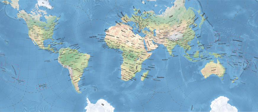
Reprojected world map using Markley’s tetrahedral projection.
Open a very large version
(2765 × 1200) in a new browser tab/window.
Well, it works for me! That is, it would work if it was properly done. I actually like that the label’s base lines run along the parallels but I dislike the way the labels get inflated and deflated. However, I do think that a map like that can be called a “practical outcome”.
This may apply to a lesser extent to CALM and especially Grieger's projection. I can well imagine the latter for such thematic maps, for which the Dymaxion map is currently often used, e.g. showing the early human migrations. The property of conformality is certainly not necessary for such maps, but it also does not pose a problem because of the small areal inflations. And Lee’s original configuration – well, I created a climate map as a test. And somehow I like the distribution of the climate zones, how it gets warmer from the center to the equator and then colder again towards the corners of the triangle. Admittedly, I find this more confusing than the usual (mostly cylindrical or pseudocylindrical) climate maps, so the main use of Lee’s variant might indeed remain in the decorative field.


Again I reprojected the labels.
On a real-life map, of course, they should not be upside down…
But regardless of whether the works presented here are practical or not: All of them are fine conformal world maps which keep the inflations on the continents low. And thus, a welcome addition!
References / Footnotes
-
↑
L.P. Lee, 1965:
Some Conformal Projections Based on Elliptic Functions
doi.org/10.2307/212415 (paid access) -
↑
F. Landis Markley, 2020:
Tetrahedral Map Projection - ↑ But there was also something good about the giant New Siberian Islands: I noticed that (not only) they are missing on the world map image I’ve been using since 2015 to generate the green and red silhouette maps! Ooops. Apparently, I overdid the generalization back then…
-
↑
The projection was developed in 2010. Presented to the public in
B. Grieger, 2020: Optimized global map projections for specific applications: the triptychial projection and the Spilhaus projection, EGU General Assembly 2020, Online, 4–8 May 2020, EGU2020-9885, doi.org/10.5194/egusphere-egu2020-9885.
Be sure to hit the “Display file” button at the bottom of the page!
Comments
Due to spam posts, comments are now subject to moderation, which means they remain hidden until they are approved by a moderator.
2 comments
Mauricio
I have been looking for an adequate projection for a project. Was leaning towards Autagraph, Peirce Quincuncial and Dymaxion. But Grieger’s Triptychial Map ticks all marks that I need despite the distortions.
Do you happen to know of any Gieger's Triptycial Political Map with country names on it ?
Thanks.
Nick
Tobias Jung
What size exactly do you have in mind?
Nick
Something close to 1920x1080 (keeping the original aspect ratio of course) would be great.
Tobias Jung
Thank you! Yes, it was great! :-)
> Something close to 1920x1080 (keeping the original aspect ratio of course) would be great.
Oh, that is not a problem … or, to quote the Producer Guy: Actually, it’s super easy – barely an inconvenience!
I always create the images somewhat larger than needed to scale them down before putting them online, and the original image is 1988 × 994. You (and everybod else) can download it here:
https://map-projections.net/im…
Enjoy!
 Except where otherwise noted, images on this site are licensed under
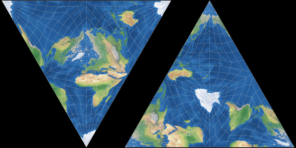
Tobias Jung
Regrettably, I’ve never seen a map of that kind. :-(