
Mon Jan 15, 2018 An Equal-area Projection in the Fashion of the AuthaGraph Map
Updated on Wed June 27, 2018
Since the AuthaGraph world map by Hajime Narukawa won the Japanese Good Design Grand Award in October 2016, it has received a lot of attention – a list of some articles can be found below.[1] Unfortunately, most of these articles are full of misunderstandings, inaccuracies and simply false claims. But that is not the issue today. I will discuss this at some point in the (hopefully) not too distant future. At the moment, I just want to make a few short statements:
– No, the AuthaGraph map is not the »most accurate world map that exists«. There is no most accurate map of the world, and there will never be one.
– No, the AuthaGraph map is not even more accurate than the Mercator projection. It avoids extreme distortion of the proportions, that’s right. But that alone does not make a map »more accurate« in a general sense than any other map. It’s more accurate than Mercator when it comes to preserving areas, yes.
– No, the Mercator projection doesn’t lie and it’s not faulty. It was created for
a special purpose, namely to show all rhumb lines as a straight lines.
It fulfils
the task exactly (and even is the only projection that is able to do this). A
lie is at most the assertion that all we ever get to see when we look at a world map, is the Mercator projection.
Don’t just believe me … go to the nearest bookstore and study the world maps of the
atlases that are offered there. I’d be surprised if you could find even a single atlas that uses
Mercator for the main world maps.
– No, the AuthaGraph map is not equal-area, i. e. it does not show the proportions of size
correctly. The authors of the map don’t even claim otherwise, but various
articles do. And to be honest – the name AuthaGraph does not exactly help
to clarify this misunderstanding, since the name is explained to be derived from authalic (= equal-area).
Is it at least close to equivalence (the property of being equal-area), as the rest of the articles
say? Well, »being close« is of course a very vague term. Among the compromise map projections
it is certainly one of those that are closer to being equal-area than to being conformal.
But in my opinion, the deviations from true
equivalence are too striking to speak of real proximity.
– No, the map cannot be folded back into a three-dimensional globe. The variant with which this is possible (and which is offered as a paper model) is an intermediate step in the construction of the map but isn’t identical to the finished world map. (And by the way: Even if this were possible, you’d only end up with quite a bad globe, because folding paper doesn't remove any distortions.)
– No, the map is not suitable for determining flight routes.
And no, no, no, the map certainly doesn’t solve a »457-year-old problem«. It doesn’t solve a problem which »has plagued every map we have ever seen«. It doesn’t solve any problems at all. (Well, maybe the authors’ income problems, but certainly not a cartographic problem.)
Having said that, I’d like to stress: I have nothing against the AuthaGraph
map! Just something against false assertions. In fact, I even like the map itself!
I like all unusual map projections. In any case, they remind us
that every projection, no matter how normal and ordinary it may seem to us,
is nothing more than a certain interpretation – one attempt among the
theoretically infinite number of ways to deal with the fact that it’s
simply impossible depict the (approximately) spherical earth exactly on a flat map.
From a purely aesthetic point of view I find the AuthaGraph map quite
appealing. Their practical value may not be the greatest of all – at any rate,
I can’t think of too many purposes in which it’d be better or more suitable than other
projections, except maybe a single, very specific case that I’ll mention in
the above-mentioned future article. But who says that a map of the world can’t
just be beautiful and appealing? I sure as hell don’t!
But there’s another problem with the AuthaGraph world map: Even if you want to use it for a certain purpose – you can’t. You can buy a finished poster, but you can’t create your own world map using this projection. The formulae used to create the map have not been published and therefore can’t be used in any map projection software.
For this reason, Marcin Ciura has already picked up the slack and came up with a reproduction of the AuthaGraph, including the corresponding formulae.[2] I didn’t know that when I started my own experiments. And since developing projection formulae far exceeds my own mathematical abilities, I chose a completely different approach: I decided to use an existing projection to obtain results that are not completely dissimilar to the AuthaGraph map.
Update June 27, 2018: I didn’t know this before, but there is another attempt at approximating the AuthaGraph map, created by Justin Kunimune, which gets closer to the original. See update note below.
Procedure
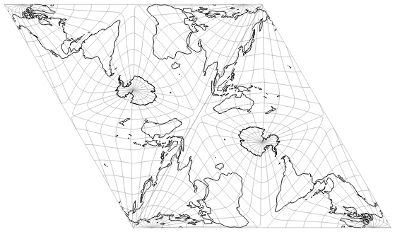
I decided to use the van Leeuwen projection (or Vertex-oriented Great Circle Projection, as the authors called it when they introduced it[3]) which, as I have already mentioned, is suitable for constructing pseudo-globes in the form of a regular tetrahedron. After all, the AuthaGraph map is also based on this geometric form. In addition, the van Leeuwen is equal-area – it was my declared goal to come up with a map that actually (and demonstrably) retains equivalence. I used Geocart which to my knowledge is the only map projection software that offers van Leeuwen.
The working steps themselves are quite simple.
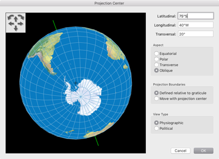
1. Create a new map using the van Leeuwen projection.
2. Select a suitable center of the projection, if necessary with a certain tilt of the axis (that’s the Transversal input value in the screenshot). (I will come back to the selection of a suitable center.)
3. Duplicate the result, rotate the duplicate by 180 degrees.
4. Put the two maps together seamlessly.
Joining seamlessly is a bit of a problem: For reasons that I will not go into more detail now, you’ll always see the seam. I can only recommend to do it the same as I do: Just claim that it’s intended to see the transition, so that the viewer can still understand how the finished map was put together. ;-)
5. Repeat duplicating & joining as often as you want or need.
6. You now have a tiled map with repetitions. If you want to have a rectangular map showing all parts of the earth only once, cut out the desired rectangle.
7. Curse and scold, because the rectangle either cuts landmasses that you didn’t want to cut or because it contains certain areas twice. ;-)
8. Go back to step 2 and select a new center.
Depending on whether you prefer to work in Geocart or in a graphics editor, you can export the current state from Geocart after steps 2, 3, 4 or 5; for step 6 you’ll definitely need a graphics editor.
There’s an alternative approach, which consists of exporting the triangular projection after step 2 and cutting it up and putting it together again in the graphics editor according to the following scheme:

For a single map, this is probably the better approach. But since I have tried several projection centers, it was better to put the triangles together in Geocart and then let them be rendered anew for the projection center I chose.
So, how do you find a suitable projection center?
I guess you don’t want to spend the rest of your life
trying all possible combinations of longitudinal, latitudinal and rotational values…
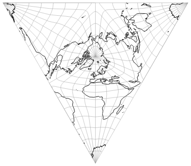
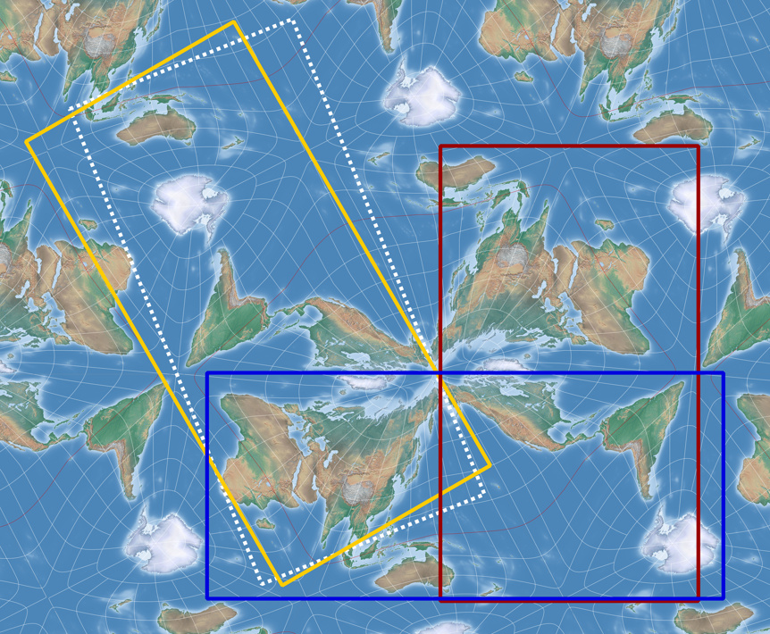
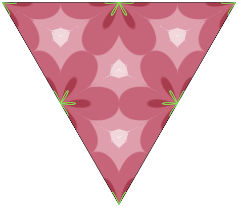
The best thing of course is to proceed with a bit a planning, as Marcin Ciura wonderfully demonstrates in his blog post mentioned above. I skipped that task and just tried to figure out which projection center is (approximately) set in the triangular map that is highlighted in image #2 on this page [direct link to the image] and then ran a lot of try and err passes.
Despite this rather unscientific approach, I have come to some satisfactory results. Before I finally start to present these results to you, I’d like to say a few things in advance:
- My results consistently show higher angular distortions (= distortion of the shapes) than the AuthaGraph original or Ciura’s and Kunimune’s variant. This is probably at least partly due to the fact that my experiments are equal-area (not just »close to equivalence«). However, if you already dislike the shape distortions of the original AuthaGraph map, it’s better not to read on – Marcin Ciura’s and Justin Kunimune’s reproductions will be better for you.
- The possible ways to cut out a rectangular map without interrupting landmasses are rather limited in my results. On the other hand, the original AuthaGraph map is not as good in this regard as is sometimes claimed. Have a look at the image I linked to above: Only the green and white rectangles meet this requirement. The red, orange and dashed rectangles cut through landmasses, as do my results.
- I don’t claim to have found the best projection center! You are welcome to experiment with the van-Leeuwen projection yourself – it is absolutely possible that you will find a better configuration.
-
I don’t want to propose an improved AuthaGraph map.
I don’t want to replace the AuthaGraph map.
My initial motivation was simply to have fun in experimenting, to see whether or not I can end up with an equivalent map with a certain similarity.
That’s all.
The fact that these experiments enable other people to create their own AuthaGraph-like map is a positive side effect, but it was not my main goal.
Enough talk!
Do we finally get to see some maps now?!?
Results
I have come to various results, all of which have their own advantages and disadvantages. For demonstration purpose, the first example is reviewed in detail, the other ones will handled more briefly.
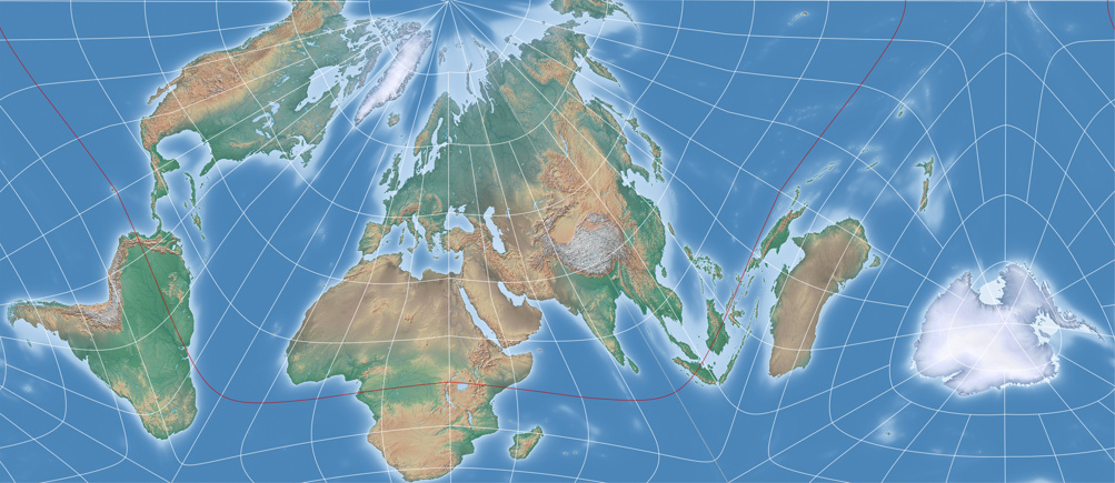
Example No. 1
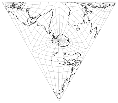
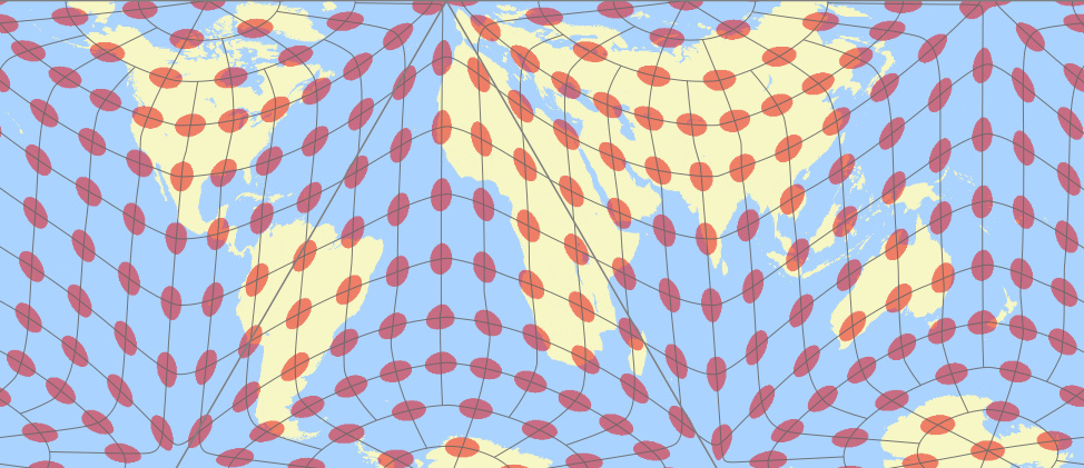
My personal favourite among the experiments is achieved by placing the
projection center at 75° South/40° West with an axial tilt of 20°.
The result rendered by Geocart looks like this:

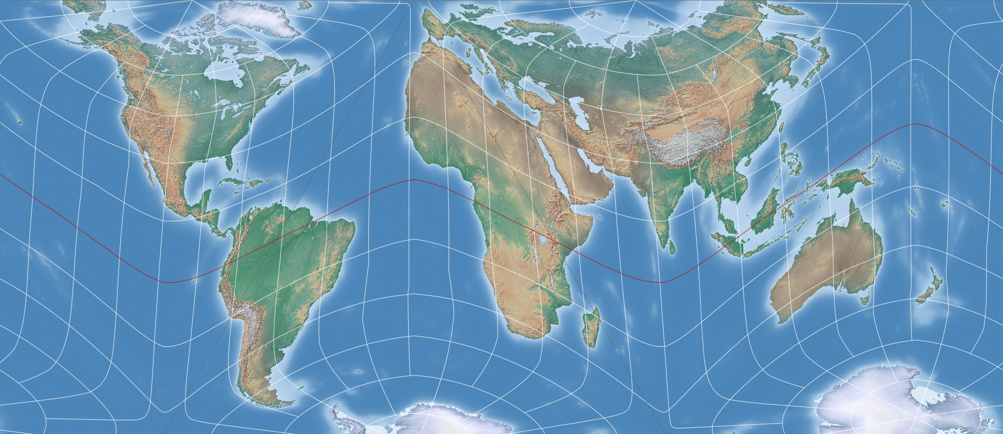
In the horizontal direction, this configuration unfortunately allows only one variant which does not cut through landmasses (in contrast to the original, which allows three variants). The vertical and tilted cuts pass through landmasses – but in a similar way to the original:
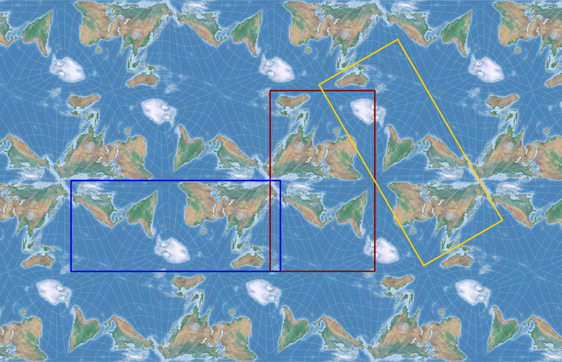
Let’s take a closer look at these rectangular maps:
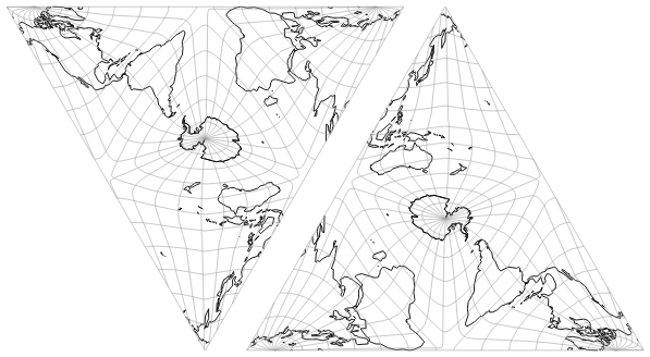
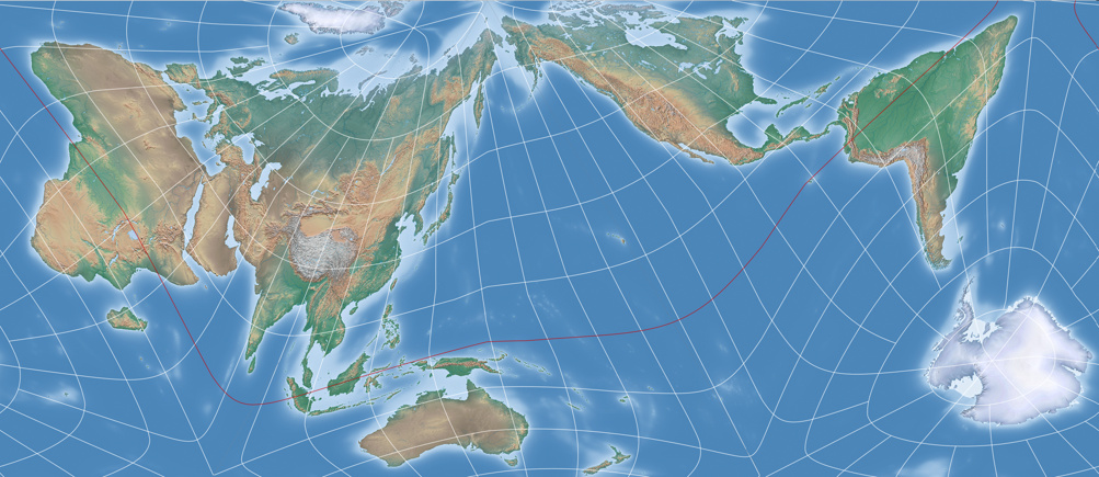
The map in landscape format, cutting through the Bering Strait, avoids passing through any major landmasses…
wellll, there are a few pixels of Alaska and
New Zealand that end up on the far side of the map. But if you change the
cutting line in order of not passing through Alaska, you worsen the segmentation of New Zealand and vice versa.
So I take the liberty of ignoring the few pixels and call this
one my first result:

We also take a look at the vertical and tilted snippets (the latter was rotated again to be straightened up). As mentioned above, these variants correspond pretty much to the original examples of the AuthaGraph map.


For the sake of completeness, we will also have a quick look at the other two horizontal cutting options. If you set Africa to the far left (as is the case with the AuthaGraph variant shown most often), Antarctica is broken up. If you move South America to the far right, Antarctica is also broken up, but only a very small bit remains on the right side of the map. I find this small relic even more annoying than the clear separation in the »Africa-left« variant. But maybe you feel different.


Seeing the tiny part of Antarctica that gets separated from the rest of the continent, it became clear to me that there has to be a variant that leaves Antarctica intact but separated from South America…
Example No. 2
As promised, there’ll be less talk now on the following examples.
In #2, the projection center was set to 76° South, 51°20´ West with an axial tilt of 32°
which as desired allows you to put South America to the right edge of the map without cutting through Antarctica:

Cutting through the Bering Strait even works better than in #1:

So why isn’t this one my favorite, but example 1?
The disadvantage of this configuration, in my opinion, is that Africa and
Ireland are squeezed very close to the edge – and New Zealand is, barely
noticeable, even severed: Stewart Island appears, separated from the main
islands of New Zealand, at the edge of the map below Antarctica.
These are of course minimal disadvantages. But
still, I like the No. 1 a bit better.
A little bit.
The vertical and the tilted cuts don’t bring any special changes compared to the first example, so we skip them and move on to the third example.
Example No. 3
As mentioned above, the AuthaGraph map is usually shown in the variant that places Africa on the left side of the image. I also found a variant for this: Projection center 74° South, 10° East, tilt -42°.
Unfortunately, this configuration doesn’t allow any other decent cuts: The vertical and the tilted rectangle have to cope with unfavourable separations of land masses or repetitions.
The dashed rectangle seems to produce a fairly decent section – but some
areas of the Pacific Ocean are shown twice, as you can see if you look at the
graticule lines carefully. This may not even be noticeable on maps without a graticule and/or
flat representation of the oceans… but still is a bit of a cheat. ;-)
Therefore, I’d recommend that variant only if you absolutely want to have
Africa on the far left without any parts of Antarctica.
Abandoning the Imitation
In case you’re interested in results similar to the AuthaGraph map only, you can skip the following section and move on to the distortion patterns right away.
At some point I discarded the idea of getting as close as possible to the AuthaGraph map – both in terms of appearance and the possibility of (almost) arbitrary cuts. But I think that this way, you can also create some appealing maps.
Examples No. 4 and No. 5
The first map is the configuration 73°25´ South, 116° West, tilt -34°. I like it – it’s a bit closer to the world maps we are used to; and at least it’s possible to move Antarctica to the far left or far right without cutting other continents.


I find this variant quite suitable if you want to have a rectangular, equal-area world map without interruptions of the continents – but it is also quite good for purely decorative purposes. I particularly like the arrangement in a hexagon:

Only after I had created this variant I noticed that the creators presented a similar example when introducing the projection. I didn’t notice that before because their arrangement in the paper looked something like this:
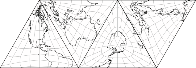
Reconstruction of the figure given in the Strebe/van Leeuwen paper
If you tile this configuration (according to my experiments it seems to be centered 20°N/90°W, no tilt) and then rotate it, you can cut out the following rectangle:
So indeed, this is not unlike my previous example, although if Alaska gets cut here. The decorative representation in the hexagon on the other hand has the advantage that the two South Americas move a little further apart from each other:

Example No. 6a and 6b (work in progress)
I’d like to label the last two examples as work in progress at this stage.
They’re even closer to the arrangement as we know it from common world maps –
decide for yourself if that’s an advantage or a disadvantage.
The graticule still twists and bends, but in my
opinion in a – hmm, how do I put it? – in a more comprehensible way than the
examples given above. Regrettably, Antarctica has to be divided into two parts.
I’ll dismiss the examples of the vertical and tilted cut here, because they doesn't lead to any
useful results.
Probably I’ll experiment a bit on the results in the near future to see if I will be able to
get a world map from a configuration like this which I like better.
So here are the two results with the projection centres 42° South/167° East (no tilt) and 50°S/29°W/7,5°.

I think we’ve got enough examples, don’t we?
Let’s take a look a the distortion patterns!
Distortions
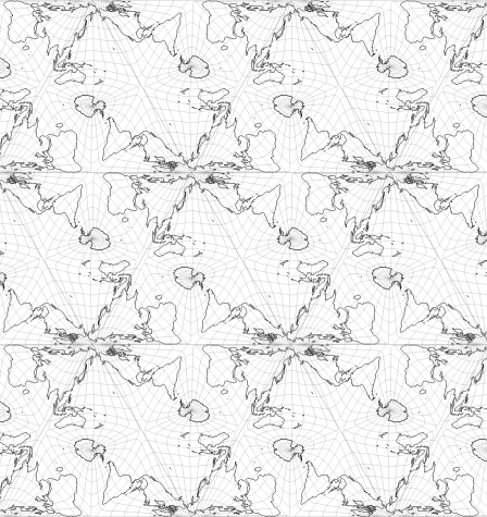
 This is not a 1970s wallpaper pattern. This is a visualization of the
distortion (or a univariate color representation of the map’s distortion characteristics,
as it is called in the Geocart manual) in the van Leeuwen
projection – we are talking here of course about angular distortion (=
distortion of the shapes), because with a true equal-area projection
(did I mention that the AuthaGraph map isn’t?)
there are no areal distortions. It doesn’t matter which projection center is
selected – within the original triangle, the distortion distribution is always
the same. Only the position of the continents within the triangle changes, and
thus they move into differently distorted areas.
This is not a 1970s wallpaper pattern. This is a visualization of the
distortion (or a univariate color representation of the map’s distortion characteristics,
as it is called in the Geocart manual) in the van Leeuwen
projection – we are talking here of course about angular distortion (=
distortion of the shapes), because with a true equal-area projection
(did I mention that the AuthaGraph map isn’t?)
there are no areal distortions. It doesn’t matter which projection center is
selected – within the original triangle, the distortion distribution is always
the same. Only the position of the continents within the triangle changes, and
thus they move into differently distorted areas.
How do your read this diagram? The following legend will help:
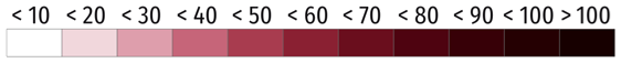
So, these are patterns of maximum angular deformation, 10° increments, deeper color signifying greater distortion.
White marks the range of 0 to 10 degree, the brightest shade of red marks 10 to 20 degree etc.
The green lines will be explained in a moment.
As you can see, there are no white areas in the diagram of the van Leeuwen projection: There is no point on the map that is free of distortion. You probably thought so when you looked at the maps. But there is one thing that I find very interesting. To illustrate this, I’ll show the distortion patterns of three equal-area projections, which are known to have a low mean value of angular distortion (Eckert IV, Wagner VII and Behrmann’s cylindrical equal-area projection), as well as a version of the sinucyli projection, in order to have a pointed-pole projection in the mix:


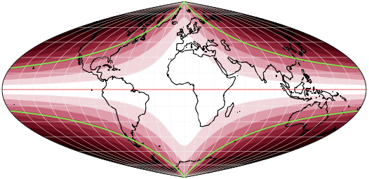
All of them have large areas with an angular distortion of less than 20° – these areas are rather small in the van Leeuwen. But the four also have areas that exceed the value of 100°! Now for the green lines: They mark the max. angular distortion of exactly 42°, which is the highest integer value within the van Leeuwen projection (the absolute maximum is about 42.7°). In the other four projections, there are considerably large areas beyond this value.
Here is once again the legend I have shown above – but in this case, I have marked (very roughly) the range of distortion values that occurs within the van Leeuwen. The other projections, however, use the entire spectrum from 0 to > 100.

In the van Leeuwen projection, the distortions are distributed more evenly.
Now, here’s a thought:
Sometimes, equal-area projections are recommended
because they allow a »fair« representation of the earth. No country is
preferred, no country is disadvantaged – all of them are shown in the correct
proportions. But if it makes sense to you, shouldn’t this kind of justice also be applied
to the extent of the angular distortions?
In the van Leeuwen projection, all countries and continents are distorted; some
more, some less. But with much less variance than with usual maps. It
doesn’t seem to be a bad idea when it comes to fairness of representation.
For clarification: I am not saying that this kind of justice is called for. I leave this consideration to each one who wants to create a world map. I’m just saying: In case you want a »fair« representation of the earth, it seems a bit… inconsistent to me to confine this fairness to areal distortions but to ignore distortions of the shapes.
Well!
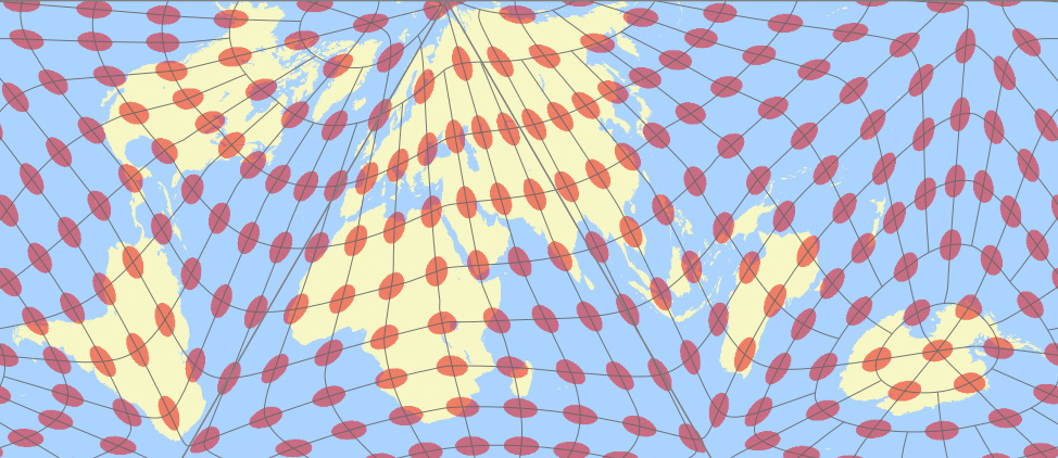
After this little philosophical excursion, I’d like to present the
representation of the Tissot indicatrix and the univariate color
representation of the distortion pattern, for all of the variants shown
above.


… so, how can I use it?
It’s time for some bad news:
To my knowledge, Geocart is the only map projection software
that can render the van
Leeuwen projection – and Geocart is not exactly cheap. (I think it’s worth its
price, otherwise I wouldn’t have purchased it; but I can understand if it seems
too expensive to you.)
The formulae have already been published in 2006, but are only accessible if a)
you happen to own the issue in question of the journal Cartography and Geographic Information Science,
or b) you want to use the paid access at
tandfonline.com.
However, the formulae have been published and they aren’t copyrighted themselves – so someone would only have to take the trouble to copy them out and they can be published everywhere (and then, be used by all appropriate applications).
Conclusion
My goal was to create an equal-area map that is close to the appearance of
the AuthaGraph map. Did I succeed?
Well, at first glance, there are similarities regarding the position of the
continents and the distribution of the angular distortion. However, a closer
look reveals significant differences. Especially the more pronounced distortion of the
shapes may be unpleasantly perceptible in the examples I’ve shown. This can be
explained, at least in part, by the property of being truly equal-area.
If you are looking for an AuthaGraph alternative, but place more emphasis on
the best possible fidelity if shapes, I’d like to point to Marcin Ciura’s and Justin Kunimune’s
results again.
In terms of areal relationships, however, the van Leeuwen maps are more accurate than the
AuthaGraph. Hey, maybe I should advertise one of them as »the very most accurate map in the
world«? ;-)
No, because the improvement of areal distortions comes at a price,
namely the
increased angular distortion. Moreover, even regarding the areal distortions,
my maps are »only« as accurate as any other equal-area projection: They preserve all areal relationships.
Above all, however, the van Leeuwen projection has the advantage that at least one map projection application supports it and the corresponding formulae have been published (although they are currently quite difficult to access – see above – but this can change). And that enables you to create your own maps using this projection, and study the distortions yourself instead of relying on inaccurate information such as »approximately equal-area«.
Revolutionary, groundbreaking or in any way »better« or »more accurate« (in a general sense) than other projections, are neither the original, nor Ciura’s or Kunimune’s replications, nor my own experiments.
Update June 27 2018: Justin Kunimune’s AuthaGraph Variant
I wasn’t aware if it in January, when I wrote the blogpost above, but at that time, there already was another
(non-equal-area) approximation of the AuthaGraph map available that even gets closer to the original than Marcin Ciura’s variant:
Justin Kunimune presented his article Reverse Engineering the AuthaGraph
in November 2017. The formulae for his approximation are included in the open sourced code of Kunimune’s own
map projection software, which is also offered
as Windows application and executable Java files for macOS and Linux (needing a Java runtime environment).
I’m going to write more about this approximation in the (hopefully) not-too-distant future.
For the moment, I just have to say that according to my preliminary analysis, it’s at least
partially closer to real equivalence than the original – which of course means that there are still
some deviations.
However I’ll have to investigate furtherly.
But not to keep you in suspense, here are two images of Kunimune’s AuthaGraph variant:


Footnotes/References
-
↑
A more or less randomly selected list of articles about the AuthaGraph map:
http://geoawesomeness.com/best…
https://www.quora.com/Why-dont…
https://www.thesun.co.uk/news/…
https://www.stuff.co.nz/world/…
http://www.popularmechanics.co…
https://gizmodo.com/this-wacky…
http://blogs.discovermagazine.…
https://www.wired.com/2016/11/…
https://www.japantimes.co.jp/l…
… plus, a more balanced approach:
https://dmswart.com/2016/11/10…
… two german articles:
https://www.wired.de/collectio…
https://www.berliner-zeitung.d…
… and another german article (incl. video) which wonderfully demonstrates that the AuthaGraph map might just replace old misconceptions with new misconceptions instead of explaining the earth’s surface better. If you don’t speak German, you should really try some translation software on this – it’s amazing how much nonsense has been stuffed into this short article:
https://www.welt.de/wissenscha…
-
↑
Marcin Ciura:
Reproducing the AuthaGraph World Map -
↑
van Leeuwen, Diederik / Strebe, Daniel:
A “Slice-and-Dice” Approach to Area Equivalence in Polyhedral Map Projections
in: Cartography and Geographic Information Science, Vol. 33, No. 4, 2006, pp. 269-286
available at a fee: doi.org/10.1559/152304006779500687
Comments
Due to spam posts, comments are now subject to moderation, which means they remain hidden until they are approved by a moderator.
2 comments
daan
Nice work on the aspect experiments!
Cesar
Cesar
Tobias Jung
I’m sorry but I do not understand what you are asking here. Could you please clarity?
 Except where otherwise noted, images on this site are licensed under
Tobias Jung