
Mon Sep 18, 2017 News on map-projections.net
A comparatively large update with several changes that are partly related to each other (at least »behind the scenes«).
My Blog gets launched
… well, that’s obvious.
After all, you’re reading it right now. ;-)
If you are interested in the motives for adding the blog: Read
the very first blog post.
New Versions of the Projection images
The physical maps with relief ocean floor have been
replaced by a new version for (almost) all projections. The difference is admittedly rather small,
but it was important to me nonetheless. The images showing the ocean with a flat blue tint will soon be replaced.
That topic is covered in detail in in an own blogpost.
New Projections
A handful of new projections have been added:
Bottomley (in two configurations), Breusing Geometric, Cabot (in two configurations).
In addition, there are also additional configurations of projections that were already available in the comparison:
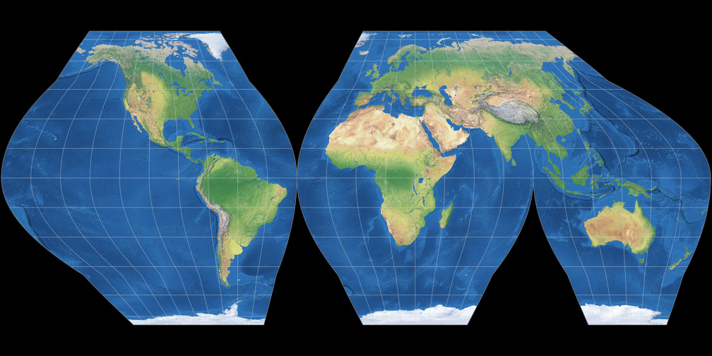
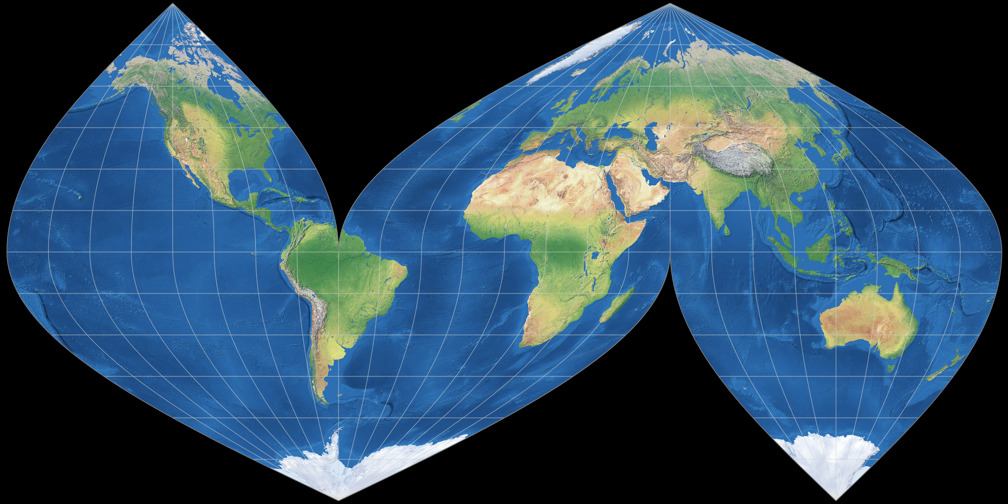
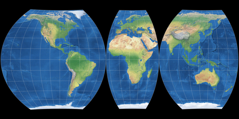
The interrupted McBryde S2, the equidistant conic projection, the sinusoidal projection using the sinoidal
interruption scheme, as well as an unusual interrupted variant of the Wagner VII, which to my knowledge
has never before been presented in this way.
Read more about the Cabot projection in its own blogpost. About the new conic projections, see below.

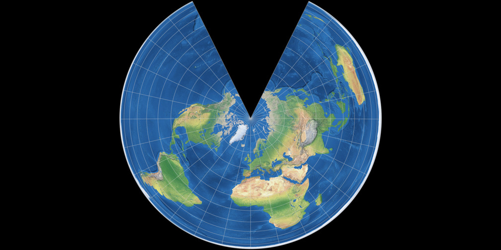
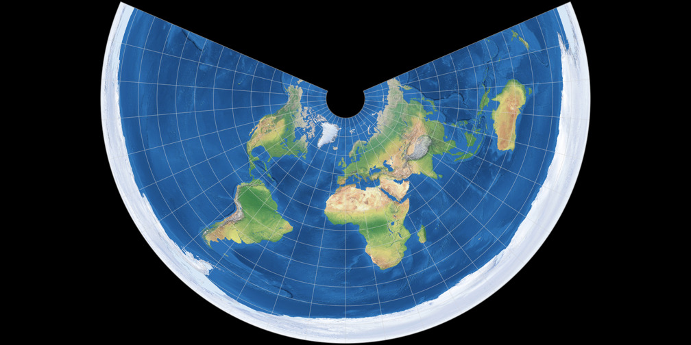
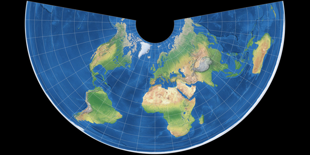
Changes on interrupted projections
Before, all interrupted projections have been shown in the Goode interrupt scheme. The idea behind it was to achieve a better comparability this way. In retrospect, I have to say that this idea was a bit misguided in the first place: If a cartographer proposed an own interrupt scheme, I should use this scheme for his projections! Therefore, the projections of Boggs and McBryde are now shown in the interruption scheme designed by their authors.
Small changes on the projection images
The images of two projections were reworked a bit.
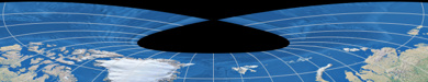
The Albers projection, which was truncated at the top and the bottom, is now show completely.

Laskowski’s tri-optimal projection has a special peculiarity: The pole line loops and intersects itself. I think this is obvious in the image below – and it actually is a loop, not two »horns« whose tips touch each other.
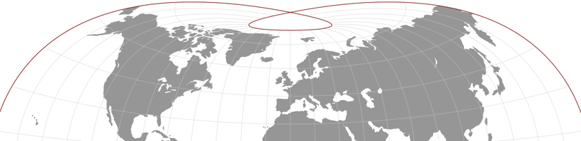
However the previous image kind of suggested »horns« – I hope the new image will bring home the message less ambiguous

Changes on the Conic Projections
Now, this might be a bit confusing. I’m trying to sort it out comprehensibly…
 The projection formerly labeled Lambert Equal-Area Conic Projection
is now called CM Lambert Equal-Area Conic Projection.
The projection formerly labeled Lambert Equal-Area Conic Projection
is now called CM Lambert Equal-Area Conic Projection.
CM is for »compare maps«, indicating that it’s an unusual configuration that
is only used for matters of comparison.
The freed-up name Lambert Equal-Area Conic Projection was given to a different configuration,
which is probably more common – and in my opinion, also more suitable for a full world map.
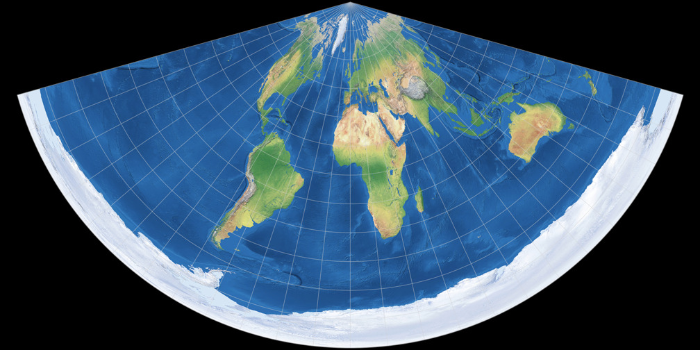 The projection formerly labeled CM Equidistant Conic Projection –
hey, it’s still bearing the same name and hasn’t changed at all!
;-)
The projection formerly labeled CM Equidistant Conic Projection –
hey, it’s still bearing the same name and hasn’t changed at all!
;-)
For the latter projection, a new configuration (again, one which is more commonly used) has been added;
it’s called 20/60N Equidistant Conic Projection because it has been rendered with standard parallels
at 20 and 60° North.
So much for the news.
What’s the next step? At the top of my to-do list are of course the new images for the flat ocean maps.
I’ve already started with it, but that takes time…
Moreover, I already have a few articles in mind which I’m going to publish in the blog.
Stay tuned!
Comments
Due to spam posts, comments are now subject to moderation, which means they remain hidden until they are approved by a moderator.
2 comments
cousteau
Re: comparing interrupted projections, I think it makes more sense to compare the uninterrupted versions anyway. Also, different projections have different interruption requirements, so even when comparing interrupted projections one may want to compare how the interruption schemes affect them too.
Also, kudos for your site! I really like it a lot.
Constant Xarax
Just a note.
"World maps", maps of the whole planet Earth, where, 1., most of the surface is covered by large areas of water, AND, 2., most of the human population lives on large areas of land, is easy ! :) I mean, it is much easier than the general case, of trying to map, on a "flat" plane, what happens on the "curved" surface of a sphere. In the case of Earth, one can "distort" the large water areas, the oceans, much more than the large land areas, the continents - simply because most human activities ( apart from trans-oceanic travel, transportation and sports by boats and airplanes, fishing, offshore drilling, and a few, only, others ), happen on land, so, for most people, what happens on land is what matters most.
That is a feature some "World Maps" take advantage of much more than others. In particular, in those "World Maps" where the Southern hemisphere is divided / "interrupted" in three parts / "lobes" , most of the large land areas can be represented in more "familiar" forms, and not be distorted very much, in the expense of extensive but more "acceptable" distortions of the large water areas.
( However, I am not aware of "World Maps" where one takes advantage of yet another characteristic of Earth : the familial "Water Planet" aspect. Not only most of Earth is covered by water, but most of this water is concentrated on one side. So, why most two-hemispheres "World Maps" have their center on the equator, and not on Ireland and New Zealand ? :) )
 Except where otherwise noted, images on this site are licensed under
Tobias Jung
I (now) completely agree with you that even in the comparison, it’s better to use the original interruption scheme. Should’ve changed this long ago!
And it’s good that you remind me of John Savard’s site – it’s great but somehow, I never added it to the links section. I’m going to do that soon!