
Thu Apr 15, 2021 The Canters Projections (Part 2)
Here’s the second part of my quick run-through of the Canters projections introduced in 2002.[1] General informations were given in the first part so we can dive into the projections without further ado.
Just a reminder:
– All Canters projections were optimized for favourable representation of
the continental areas, disregarding the oceans – and unless otherwise noted, Antarctica
was excluded from the optimization as well.
– I’m not using Canters’ original projection names but the designations
suggested by Dr. Böhm.
Pseudocylindrical Projections with Pole Line

What can I say about them? They are, ummm…
They are pseudocylindricals. 😉
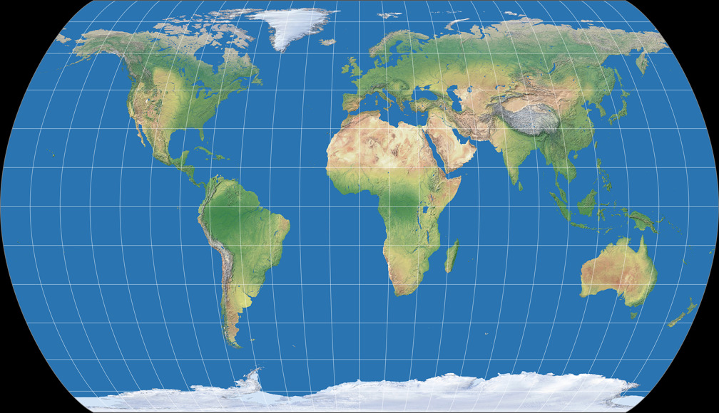
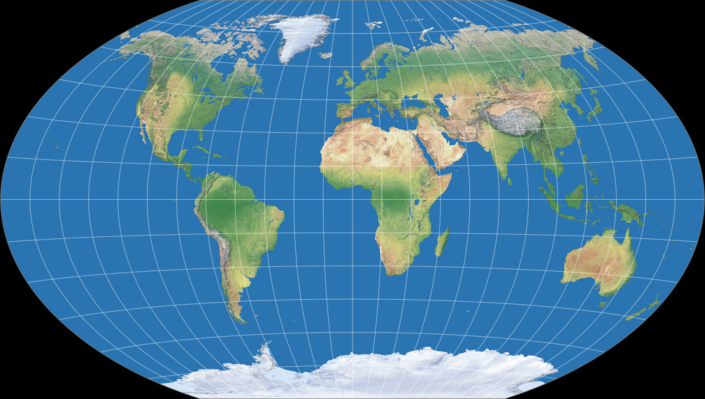
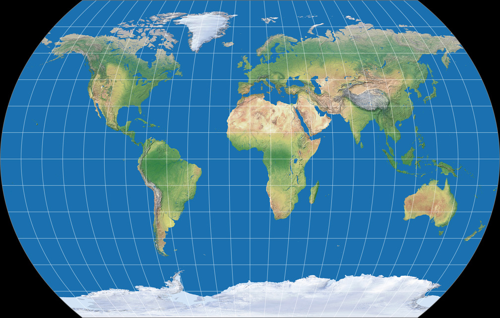
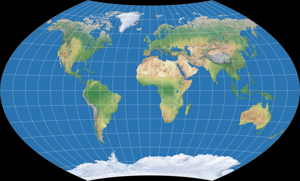
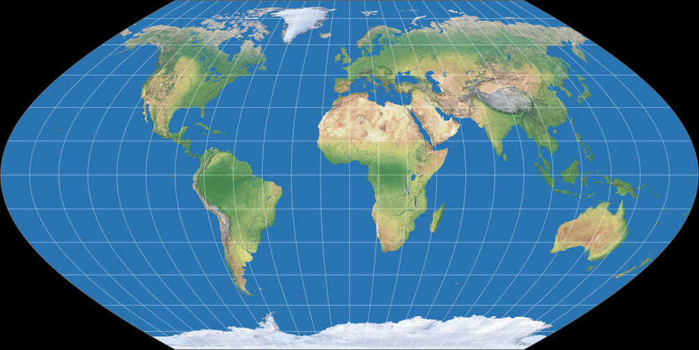
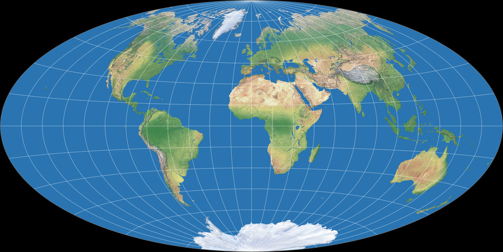
The first one, Canters W15, is obtained by optimization with only one constraint, namely
twofold symmetry.
(That is, of course, apart from the constraint that the result should be pseudocylindric.)
Like the polyconic W12, the North-South-Stretching of the equatorial areas and the East-West-Streching
of the higher latitudes is clearly visible.
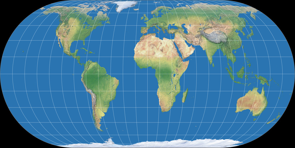
The latter is, as Canters says, “somewhat improved” on the W16 which has a shorter pole line
(half as long as the equator), while the N-S-stretching remains. The most striking feature of
this one is that the meridians are almost straight between 40° North and South, resulting
in a distinctive outline.
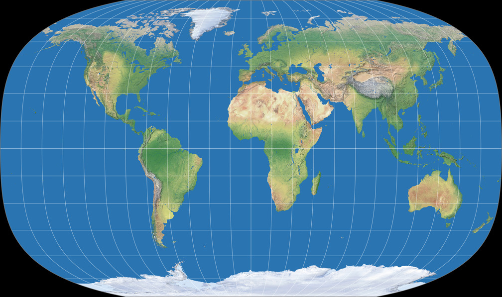
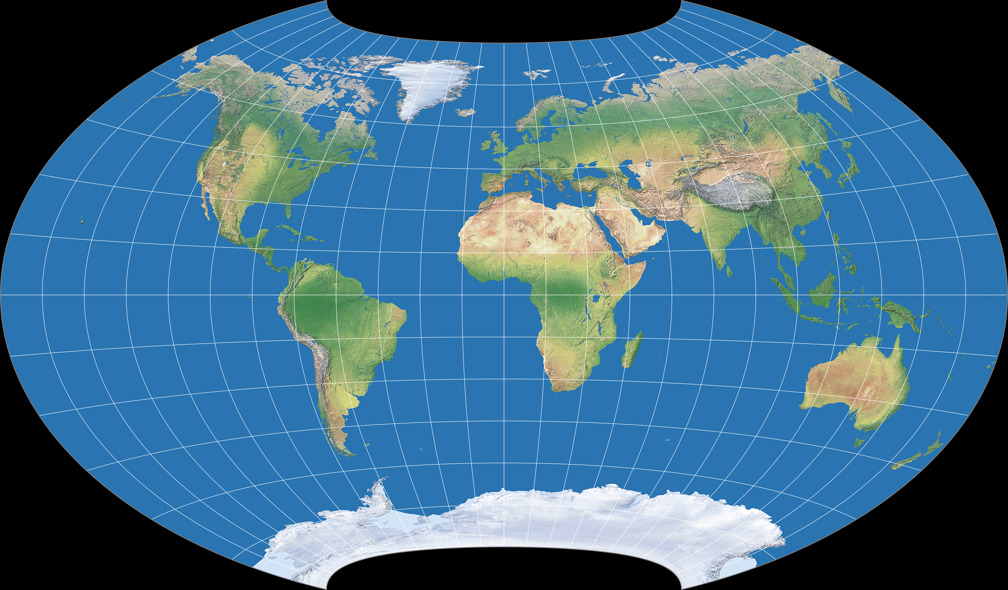
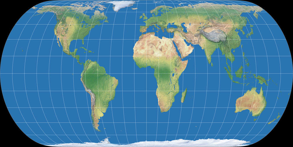
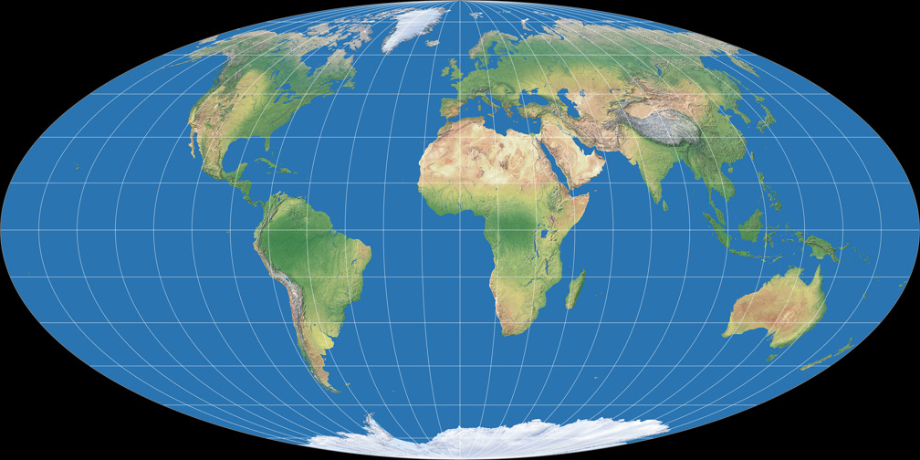
Conversely, the W17 (which has a correct ratio of the axes) improves the equatorial areas and increases the stretching of the polar regions. It also has a considerably lower values of areal inflation throughout the map.
Just like we did in part 1, we’ll look at the Tissot indicatrices and the K1 values at the end of each section:


| Projection | K1 |
|---|---|
| Canters W15 | 1.1430 |
| Canters W16 | 1.1453 |
| Canters W17 | 1.1458 |
Projections with Ponted Poles

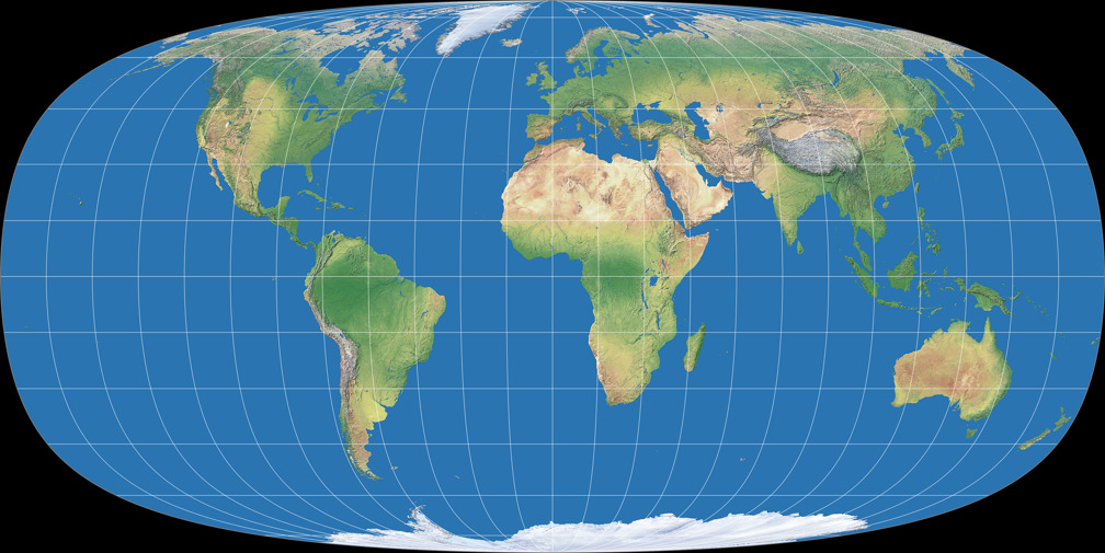
“… world map projections with a pole line of finite length have more balanced distortion patterns than
pointed-polar projections”.[2]
It is known. 😉
Yet sometimes a pointed-polar projection is needed or desired – e.g. to add a bit of fidelity;
after all, the poles are points on the globe –, but most projections of that kind
like
Aitoff
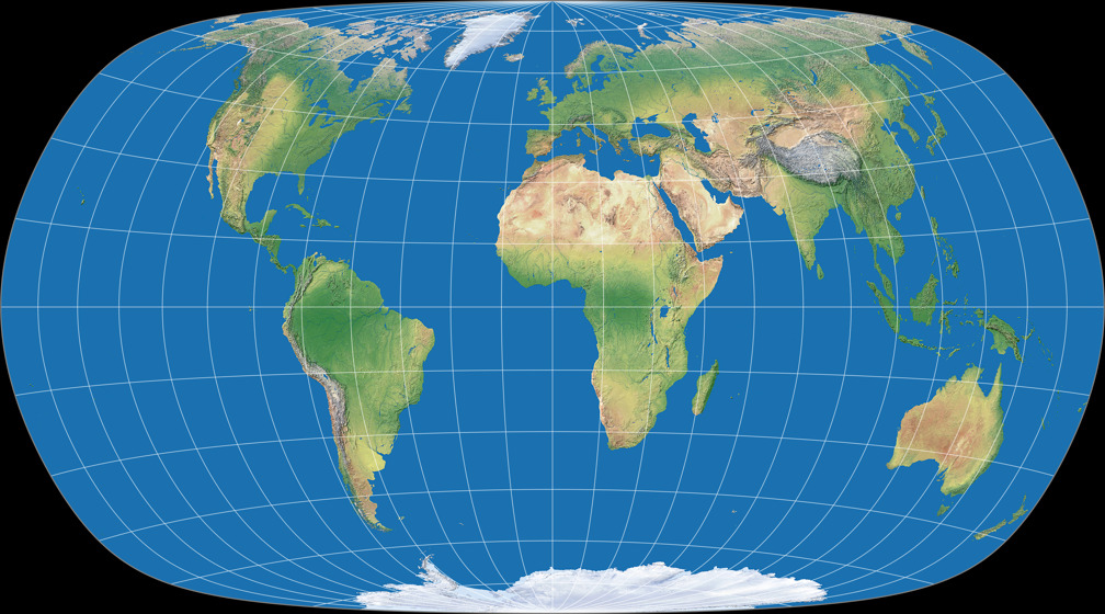
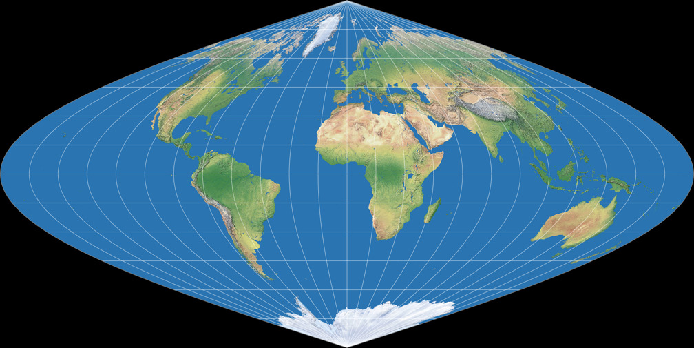
suffer from the compression of the polar regions. This is avoided on the Canters W18
by creating an “apple-shaped” or “telophasic” (as I have started to call them) projection in the manner of the
van der Grinten IV
but with a considerably lower amount of areal inflation. I have to say that I’m still quite uncomfortable with
the representation of both shapes and areas in the North-West and North-East parts of the map…
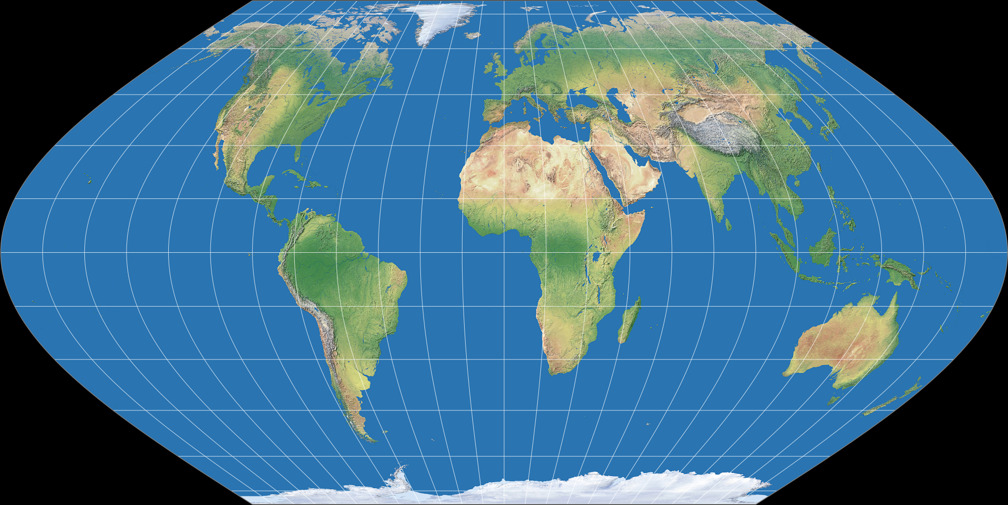
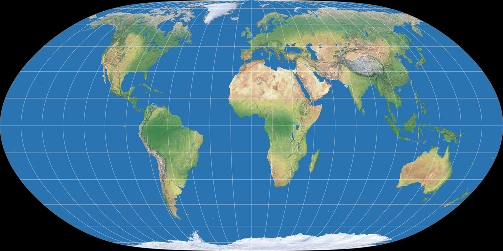
Therefore, Canters W19 is more to my liking – although, you may have noticed that, I am generally rather reluctant to praise pseudocylindricals. The polar compression mentioned above is more obvious again, yet still within acceptable limits. It has lower areal inflation values than any other non-equivalent Canters projection: Normalized to the value at the center, no point on the map reaches a value of 1.5.
| Projection | K1 |
|---|---|
| Canters W18 | 1.1861 |
| Canters W19 | 1.2151 |
Oblique Projections


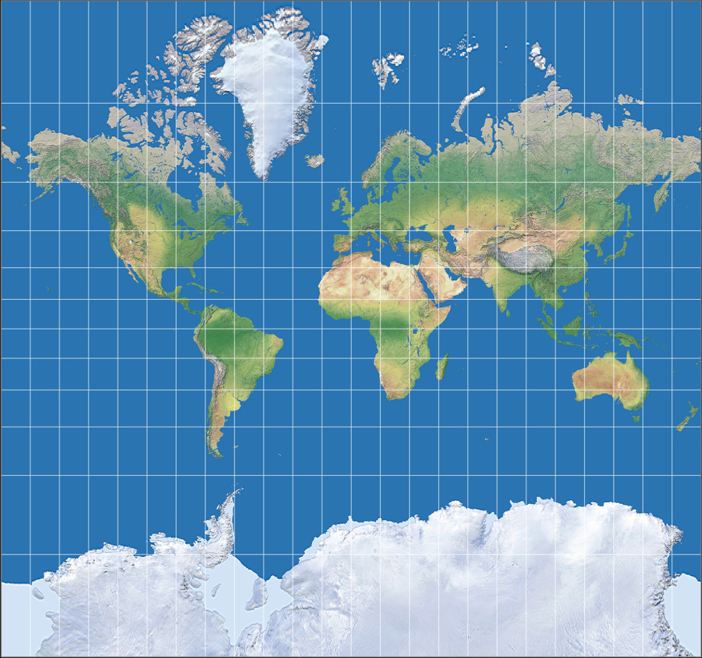
To lower the distortions on the landmasses, choosing a different projection center is a very easy and well-known method. Projections like Briesemeister, Philbrick Sinu-Mollweide and Bertin-Rivière take advantage of the option to just move the continents into an area of the map which shows favourable distortions characteristics. And here are Canters’ variations of that theme.
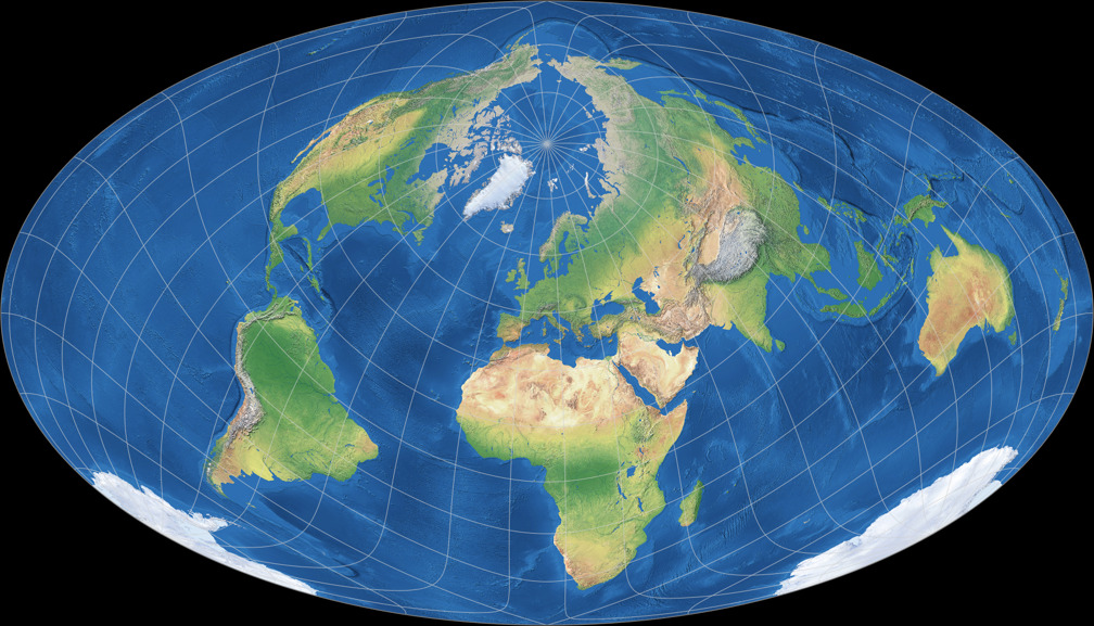
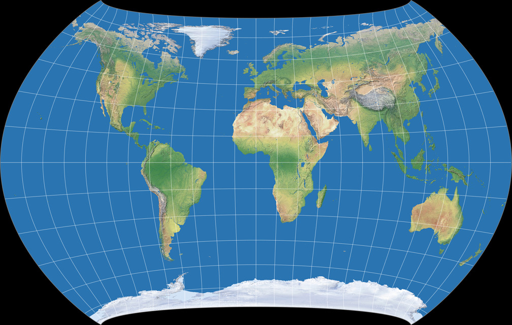
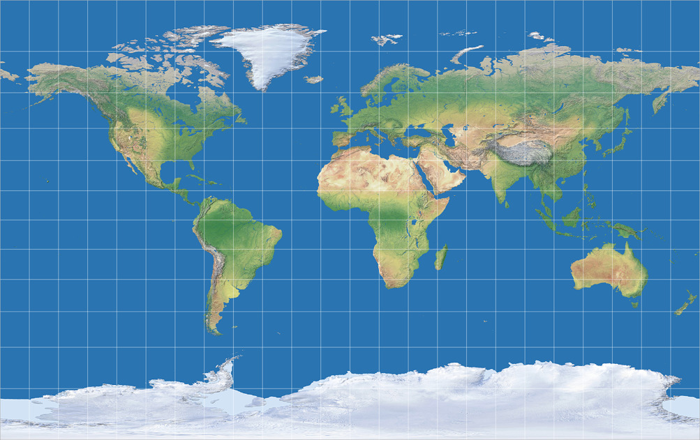
With the Canters W20, centered at 61°N, 24°E, we get another projection of more “academic” value:[3]
Although the re-orientation of the graticule leads to an overall distortion that is much lower than for normal aspect optimisations, the southern part of Africa is split up. The split is caused by the high concentration of land in the Northern Hemisphere, which has more weight in the calculation of the overall distortion value, and therefore strongly influences the position of the centre of the projection.
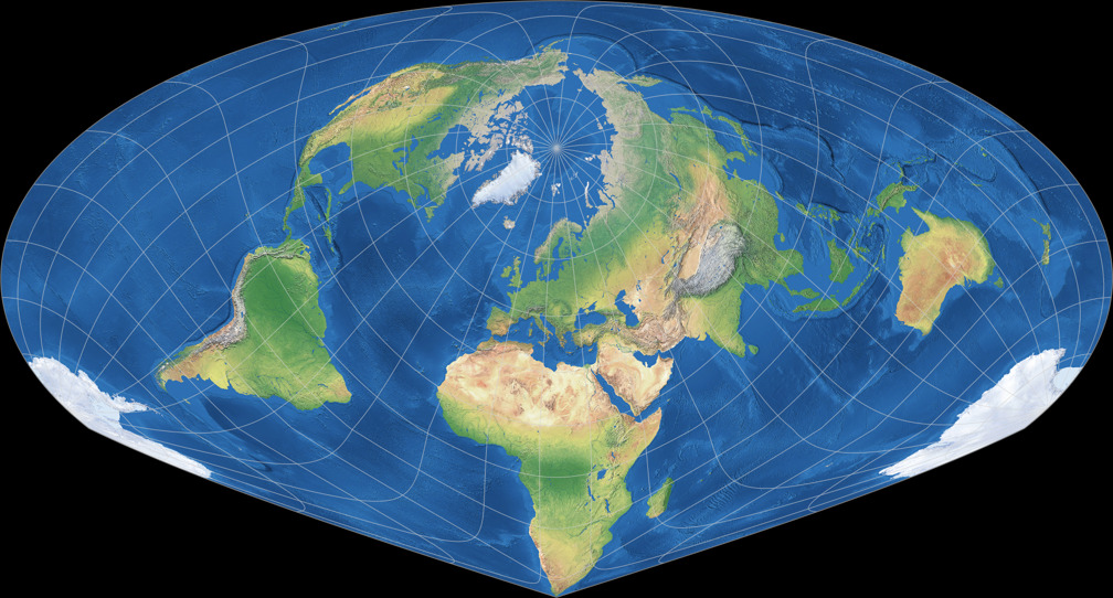
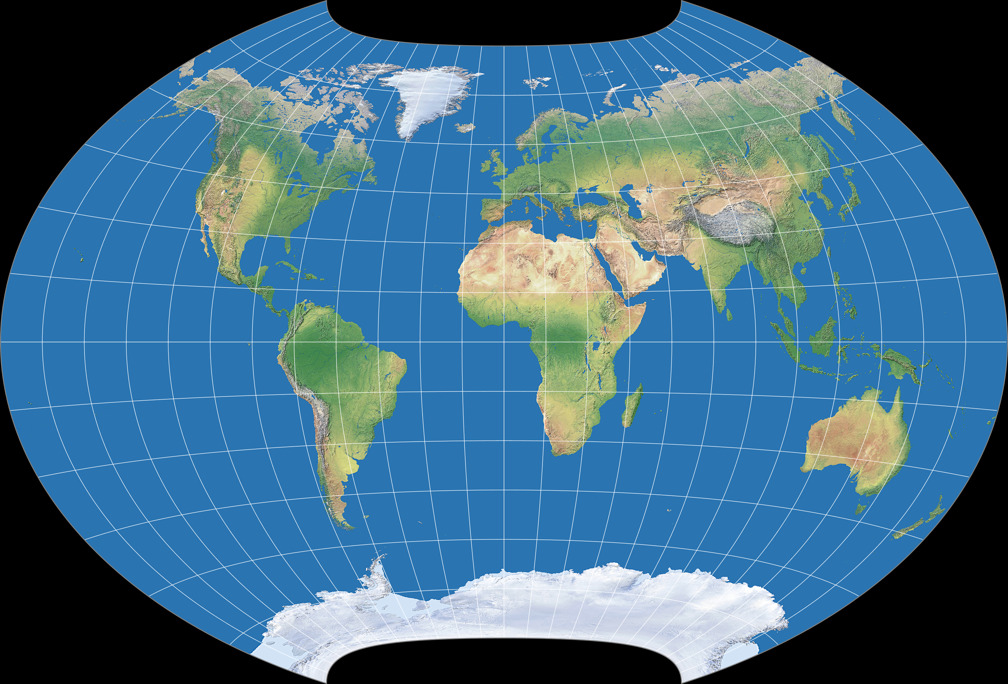
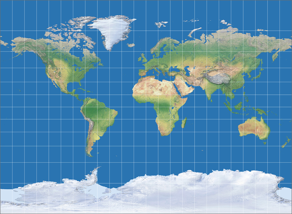
He concludes that sometimes, the optimisation process needs further adjustments to produce useful solutions, sets the projection center to 45°N, 20°E and optimises again, which results in Canters W21. Compared to the W20, it has a slightly increased distortion value but it remains much lower than for all of his projections in normal aspect (save the “academic” W10).
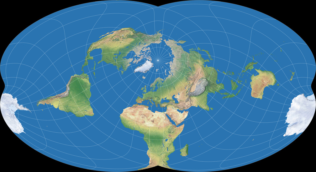
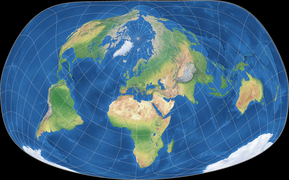
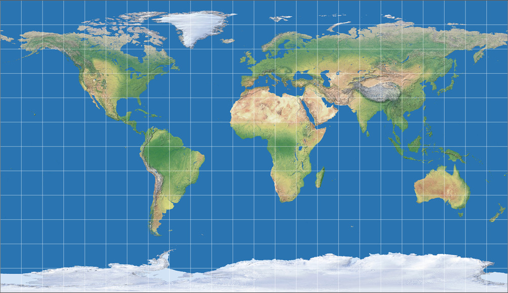
In order to show all continents including Antarctica without interruptions, it’s not enough to change the center of the projection, you have to add another rotation of the globe before projecting as well. The Canters W23 is defined with a meta-pole at 30°N, 140°W and the geographical North Pole at a meta-longitude of 30°E. Unfortunately, the map projection software I’m using to create the images of Canters’ projections doesn’t allow a specification like that. Instead, I used a projection center at 48°35′24″ North and 9°6′36″ West, with a projection spin of 40°53′24″ clockwise. These values – provided by Peter Denner, so once more, thanks a lot! – almost get to those meta pole etc. values given by Canters. As far as I can tell, they’re off by far less than one minute of arc.
To visualize the process, here’s a series of screenshots from Geocart (although this is not the software I used for the Canters projection images):

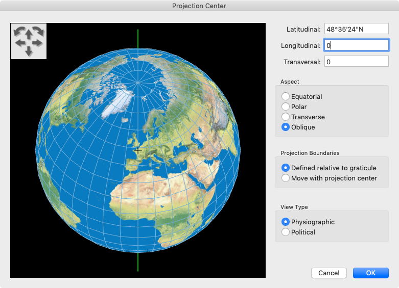

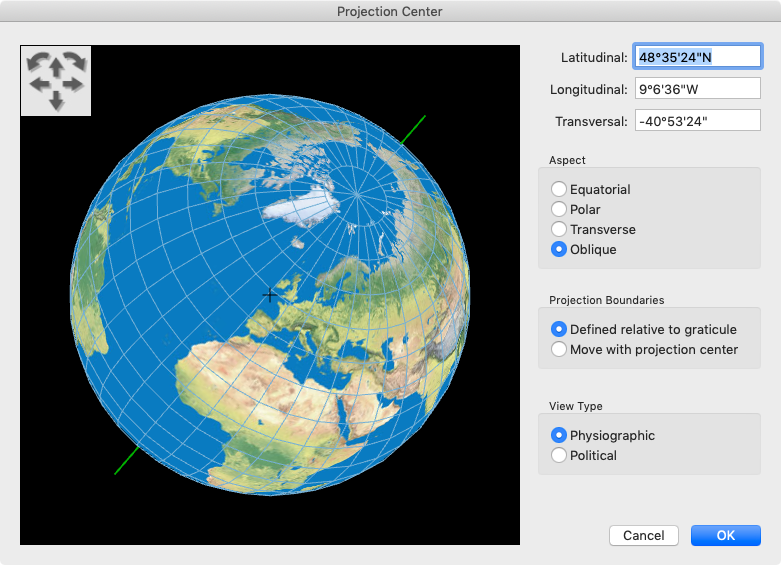
While I guess this is precise enough for all intents and purposes (and definitely precise enough for the images on my website), I still marked my rendition of the Canters W23 as “approximation” to be on the safe side.
Please note that while Antarctica is shown without interruptions, it is not included in the optimisation! The other continents are indeed represented with exceptionally low distortions: The maximum angular deformation stays below 40° and the area scale factor for almost the entire continental area below 2.0 – only the southern Africa exceeds this value. However, in my opinion there’s a slight downer: As you probably know, land areas only take up just under 30% of the earth’s surface. On the W23, which pushes the worst areal inflations into the oceans, that values drops to about 20%. This is, of course, a direct consequence of moving the unavoidable distortions as much as possible into the oceans – this is the only way to ensure the advantageous representation of the land areas. Nevertheless, it is somewhat problematic in my eyes when a projection aimed at this goal drastically pumps up the oceans.


| Projection | K1 |
|---|---|
| Canters W20 | 1.0583 |
| Canters W21 | 1.0737 |
| Canters W23 | 1.0506 |
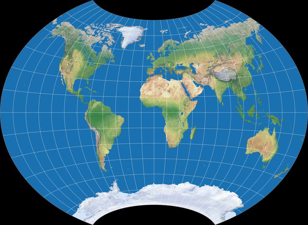
Hey, wait a sec – what about the W22?
Canters presents neither an illustration nor the coefficients that are needed to render
it, but it is mentioned in the text: It is a projection that is very similar to W23
and even beats the distortion values of W10. Regrettably there was a slight interruption
of Antarctica – the goal was missed and Canters discarded it in favour of W23.
We’ve still got five projection to go – nonetheless, we’ve reached an endpoint here. Canters started his own projections with a somewhat “wacky” projection obtained by unconstricted optimisation. He then added various constraints to achieve more usable maps and to fulfill certain requirements, at the cost of increasing the distortions, and stops at a very specific projection with almost as favourable distortions characteristics as the first one.
Equal-area Transformation
For the remaining five, Canters returned to the optimisation of existing projections, using a different approach and a slightly different goal. Probably in order to reflect this situation, Dr. Böhm skipped the designations W24 to W29 and called them W30 to W34.
If you go for minimum overall distortion, you will never end up with an equal-area projection: Equivalence will always come at the cost of comparatively large deformation of shapes. Yet equivalence is a useful property for many kinds of thematic maps, for political maps if you support the theory that political correctness is a matter of size – and yes, maybe even for general reference maps (at some point in the future, I will elaborate on that idea, but probably not anytime soon).
But of course you can go for minimum angular deformation within the class of equal-area projections. That’s what Canters is doing here. In my opinion, this is the most interesting series of all projections discussed in this blogpost which is why I’m devoting a bit more space to them.
From part 1 you might remember the
list of K1 values where the equal-area
Canters W07 ranked better than various compromise projections such as
the Canters W13 and W14 or the Winkel Tripel Bartholomew.
How does this fit with my assertion that equivalent projection will never
have low overall distortions?
Basically, not at all.
😳
For the moment, I’ll just regards the W07 as a very special exception which
maybe can be explained by the combination of Canters’ metric and
the peculiar shape of the projection…
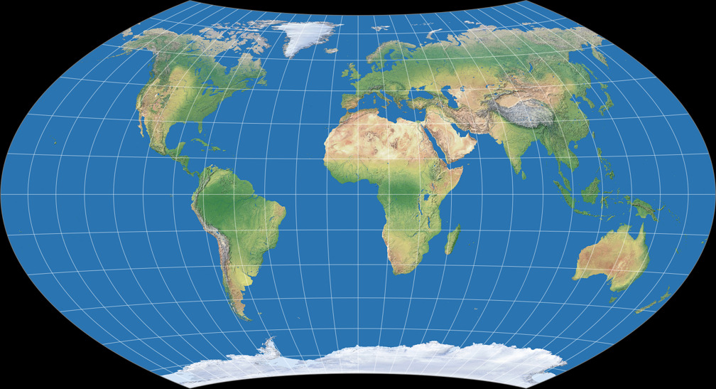
Canters approach on the W30 to W34 is different from the projections we’ve discussed so far: On the others, the map is projected directly from the sphere. This time, the sphere is projected to the map using a parent projection, which is then transformed to another map. The disadvantage is, as Dr Böhm points out[4], a slight numerical instability. The advantage is a higher degree of freedom: Using Umbeziffern (like on Canters’ Wagner optimizations Canters W01 to W09) you can’t escape the basic characteristics of the parent projections’ graticule. This restriction is removed on the “post-transformations”. The property of being equal-area, however, is maintained in Canters’ examples.

Canters W30 is a transformation of Wagner VII – and a very good example to show the differences of the approaches: By applying Umbeziffern on the Wagner VII, you can’t even get close to a graticule like this.
It has a distinctive, unusual outline
– the only projection I know with a similar outline
and a comparable distribution of distortions is the
Strebe-Snyder Pointed Pole, Bonne φ1 = 35°S,
an experiment of my own I introduced a few years back[5] – yet I feel that it is, contrary to the
W07, actually usable in atlas cartography or as general reference map.
Maybe that’s because its shape approaches a rectangle: People seem to
like rectangular world maps, and since maps almost always are printed
(or displayed) in a rectangular area, you don’t waste a lot of space.
While I think that there are more important features than “not wasting space”,
it surely doesn’t hurt if a projection possesses this feature as long
as it also has other advantageous properties on top of it.
Being an equivalent projection with low angular deformations, that’s the case
on the Canters W30 –
with a K1 value of 1.1510 it comes in second among all equivalent Canters projections, behind the somewhat
“delicate” W07.
There are considerable distortions near the poles and especially at the outer meridians, but most of them are kept away from the continental areas. The North-South stretching, a typical problem if equal-area projections with a pole line, is strikingly decreased. On the downside, Canters notes a strong variation of scale along the equator. Let’s what he does about that…
🌐

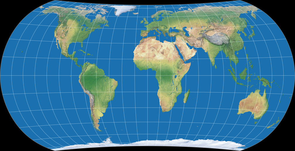
Canters W31 (another Wagner VII transformation)
reduces the scale variation along the equator – and returns to the
typical North-South stretching. Contrary to the W30, it does not look unusual at all.
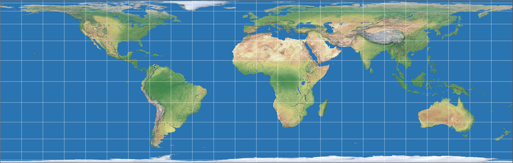
In fact, the mild curvature of the parallels makes it look very similar to a pseudocylindric
projection, e.g. the well-known Eckert IV:
Canters W31 vs. Eckert IV
It has a higher (= worse) K1 value than the W30, but barely so (1.1588). So which one of these two is the better choice is basically down to the question whether you want an unusual or an ordinary-looking projection.
🌐

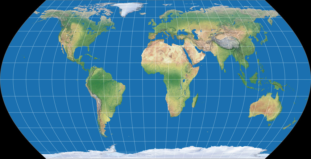
The Canters W32 is a transformation of the Hammer projection, and thus, has a pointed pole although its appearance approaches the look of pole line projections. Areas that are far awaa from the central meridians are visibly less sheared than in well-known pointed pole projections. It’s one of the few Canters projections which include Antarctica in the optimization process.
With a K1 value of 1.1510 it’s already well within the range of “traditional” equal-area projections, yet it’s
not too bad for a pointed-pole graticule. If you prefer pointed poles for
whatever reason, it’s a good choice. And on a side note – again, we have
some similarity to the 1992 Strebe equal area projections; it looks very
much like a horizontally compressed Strebe-Mollweide without the kinks at the equator:
Canters W31 vs. Strebe-Mollweide
🌐
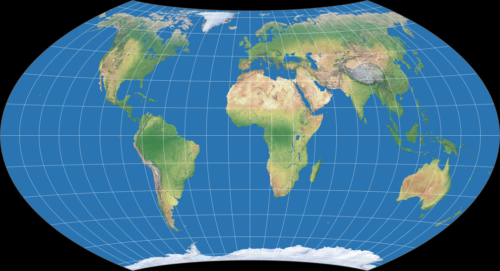
Finally, Canters present two transformations of the sinusoidal projection.
The first one, Canters W33 (K1 = 1.1676)
– again not including Antarctica in the optimization –, looks a lot
like the well-known Eckert IV and is even more similar (especially regarding the
distribution of distortions) to the lesser known Hufnagel 10.
But interestingly, the W33 does not have a pole line although it seems very much so.
Canters notes:[6]
Indeed, since the optimisation process start with the sinusoidal projection all meridians in the optimised graticule do meet in one point, only the shape of the meridians has been modified in such a way that it seems as if the graticule really has a pole line. This can be interpreted as the ultimate justification for the introduction of a pole line, as was done by many developers of pseudocylindrical map projections in the last century.
Of course, it does not escape Canters that, because of this similarity, the W33 also shows the typical disadvantages of the equivalent pseudocylindrical projections with a pole line, namely the North-South stretching of equatorial and East-West stretching of polar regions. And so …
🌐
… Canters concludes his series with a graticule in which Antarctica is once again included in the process of optimisation: Canters W34. As a consequence, it looks more like the known pointed-polar projections than the W33, but still seems to have a short pole line at first glance. Hardly surprising, the North-South stretching of the equatorial regions is less obtrusive and polar regions are less distorted, while the four “corners” are put at a disadvantage.
W34 has the worst overall distortion value of all Canters projections, but this can easily be explained by a hell of a lot of constraints: It’s pseudocylindrical equal-area projection with a pointed pole in equatorial aspect that includes Antarctica in the optimisation. Taking this into account, the K1 value isn’t even that bad.
This time, the table will not be sorted by the projection names but by the K1 values, from best to worst. It also includes the parent projection and, for comparison, Eckert IV.
| Projection | K1 |
|---|---|
| Canters W30 ∗ | 1.1510 |
| Canters W31 ∗ | 1.1588 |
| Wagner VII ∗ | 1.1640 |
| Eckert IV ∗ | 1.1670 |
| Canters W33 ∗ | 1.1676 |
| Canters W32 ∗ | 1.2071 |
| Hammer ∗ | 1.2140 |
| Canters W34 ∗ | 1.2250 |
| Sinusoidal ∗ | 1.2630 |
|
∗ equal-area |
|
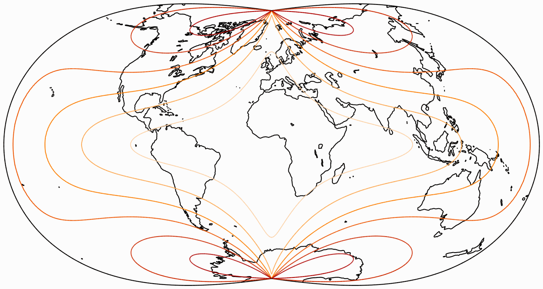
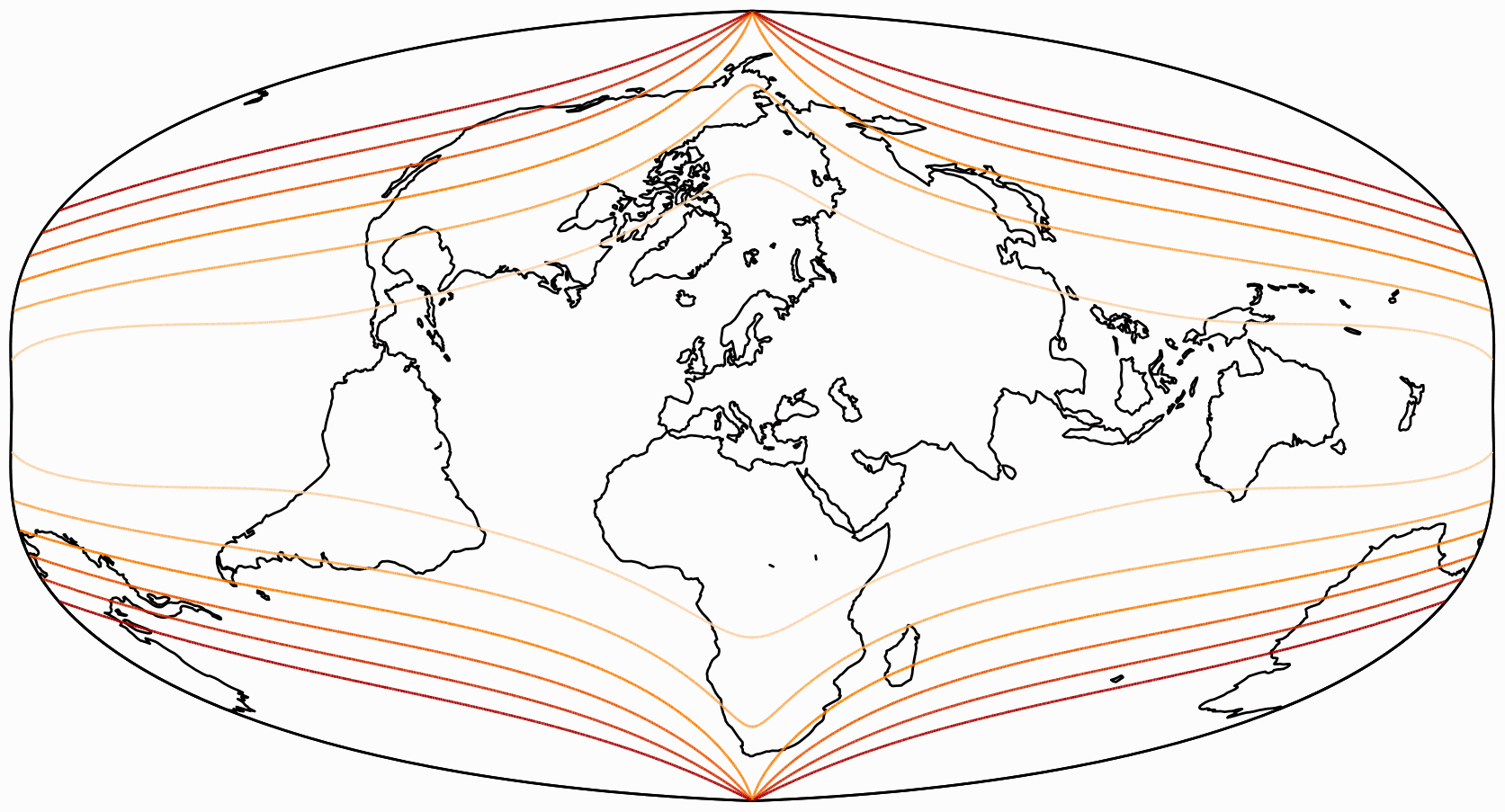
More Visualizations of Distortions
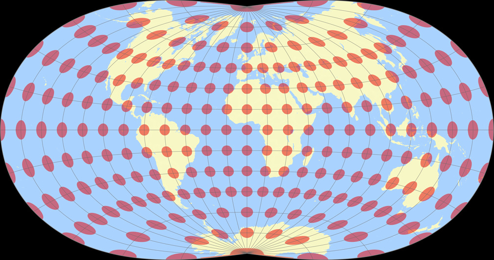
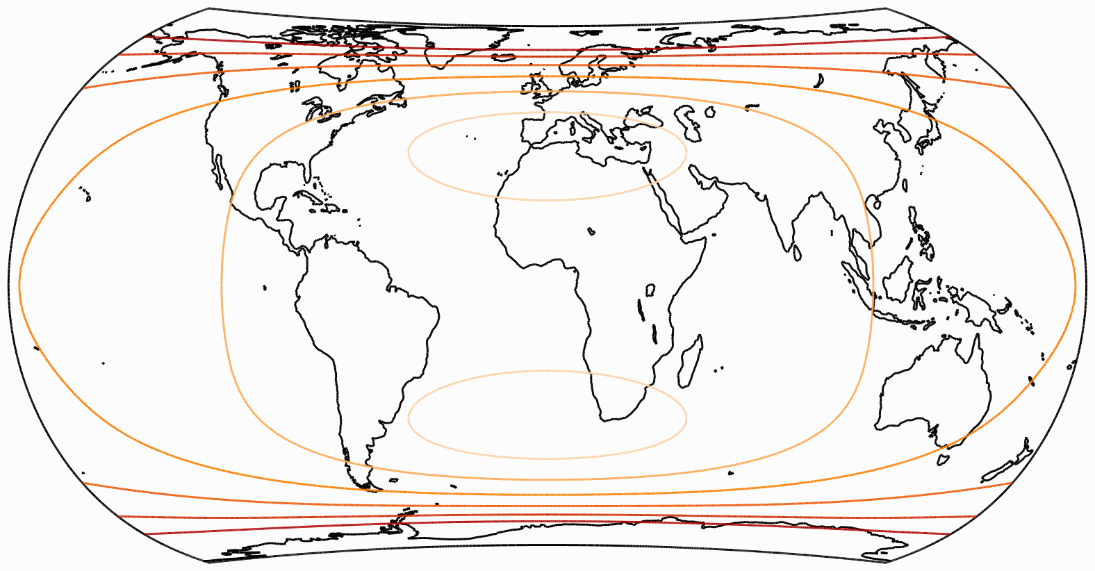
Isolines of Angular Distortions
Again, here are distortion visualizations provided by Peter Denner.
The isolines are given for max. angular deformation of:
10°,
20°,
30°,
40°,
50°,
and 60°.


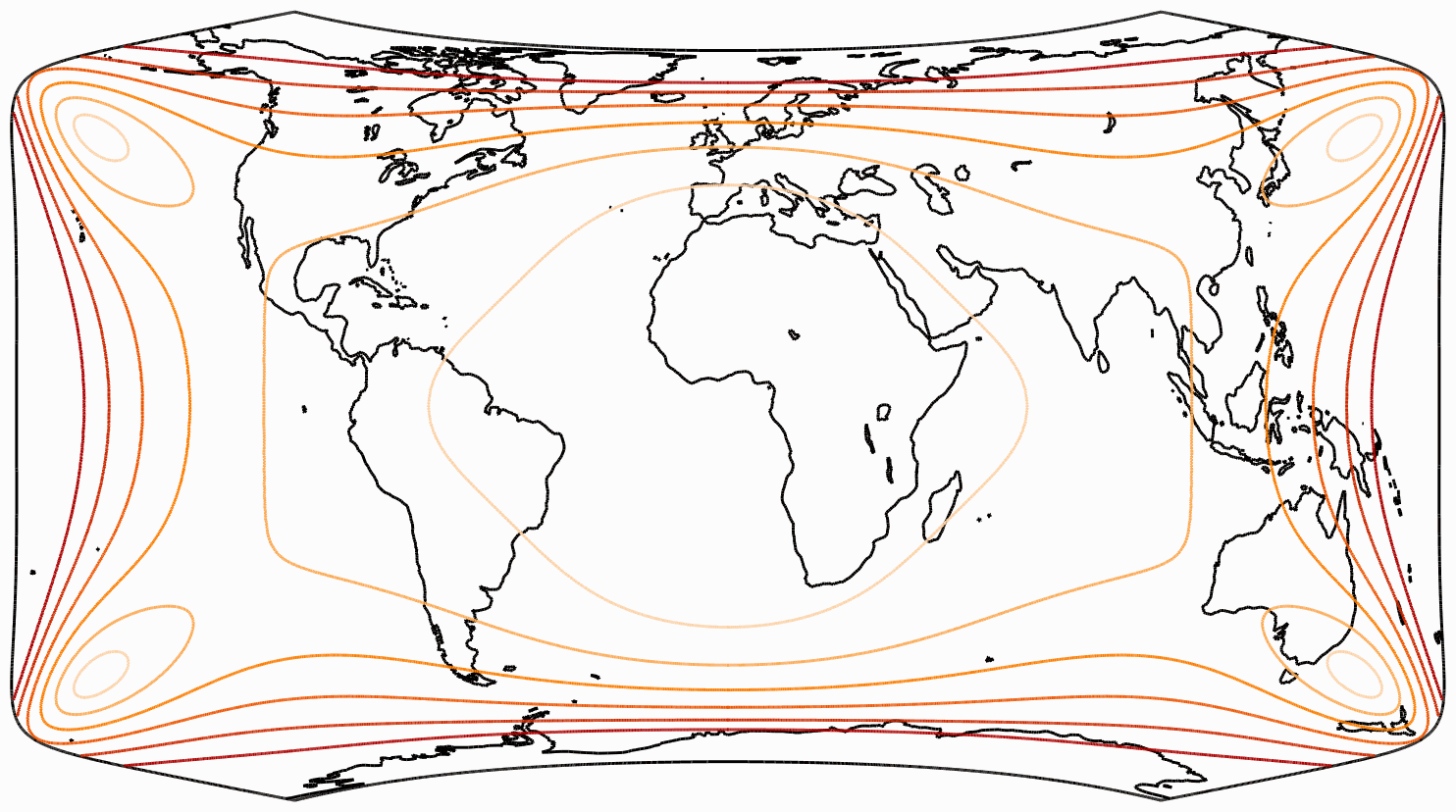

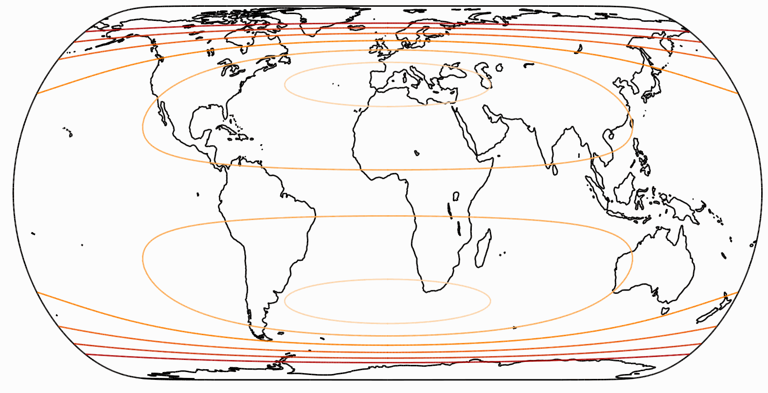

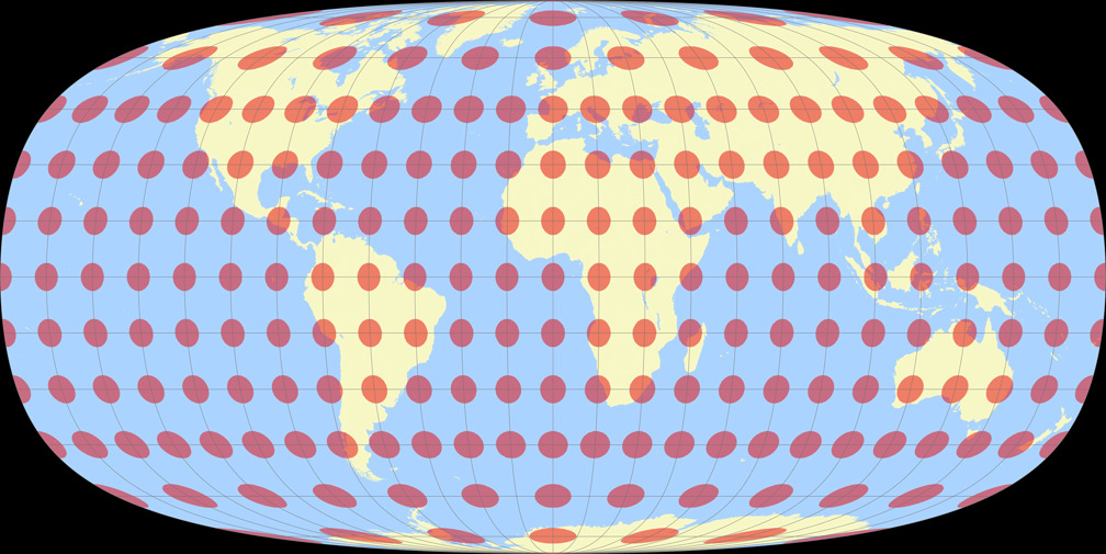
Isolines of Areal Inflation
Of course we skip the equivalent projections W30 to W34.
W19 is missing, too, because its areal inflations are so low that,
in the chosen configuration, there would be no isolines at all
(i.e. all points on the map are below an area scale factor of 1.5).
The lines are shown at areal inflation values of:
1.5;
2.0;
2.5;
3.0;
and 3.5.
Please note that they are normalized to the value at the central point of the map!
Mostly, these lines are given relative to the nominal scale of the map.


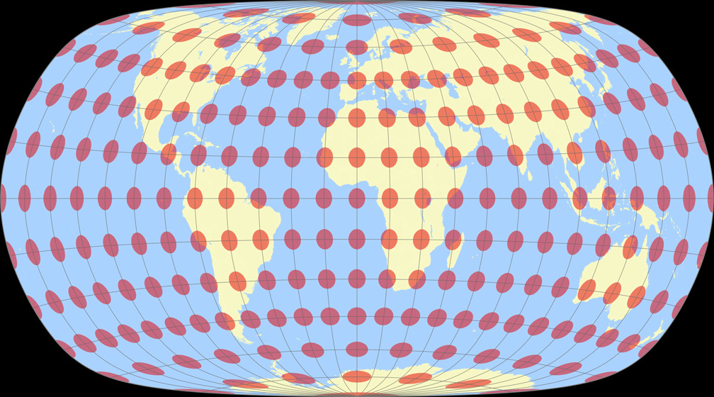
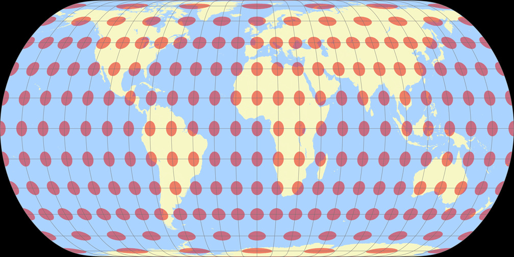
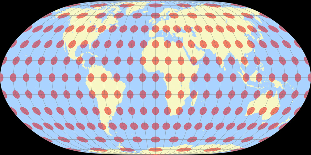
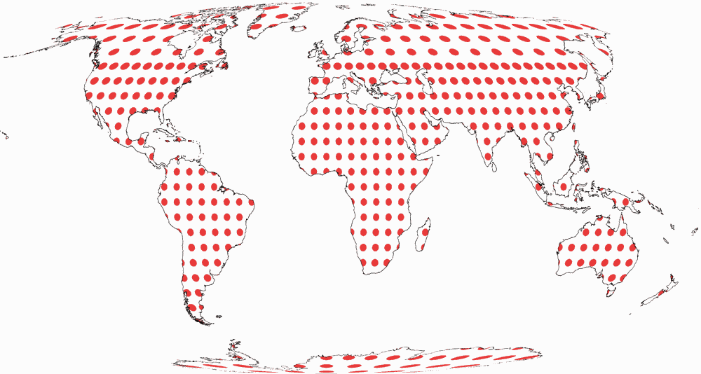
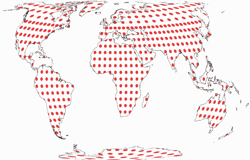
Tissot Indicatrix on Land only
And the Tissot indicatrices, limited to the continental area. Antarctica is only shown if it is included in the optimisation and on the W23 because it was the idea of the projection to show Antarctica uninterrupted.


Résumé
So, we’ve worked out way through 24 world map projections.
Some of them were academic projections with little practical use;
some look a bit unusual but not too terribly unfamiliar;
some of them improved on existing projections in terms of distortions,
while visually they don’t differ too much from well-known graticules;
and some are distinctive projections that lend themselves to practical use.
My personal favourites are W09, W13 and W14 – well, probably I’d prefer a W09
with a bit less pronounced horizontal compression or a projection that’s in between
W13 and W14, even if they end up with less favourable distortion characteristics.
I’m also very fond of W30 and W31 because they are interesting variations on
the equal-area theme.
But all “non-acamedic” Canters projection are reasonable alternatives with low distortion values.
I cannot and do not want to judge to what extent Canter’s evaluation scheme is practical. I find the resulting ranking largely comprehensible, but some rankings surprise me. I consider his decision to include only the continental areas (mostly excluding Antarctica) in the evaluation to be correct for many purposes, but not for all. In any case, one must bear in mind that the values only apply to the aspect that was examined, and in almost all cases that is the equatorial aspect, centred on the Greenwich meridian. Even a centring on 10° East, to avoid the interruption of Eastern Siberia, would probably change the ranking slightly – a representation centered to the Pacific, which is not uncommon in many countries of the world, would probably totally jumble the roster.
As far as I know, no one other than Canters himself has ever used the mean finite scale factor K1 to evaluate map projections. Of course, it is possible that I just missed it; nevertheless, the list of results should be taken with a grain of salt and best compared with results from other evaluation schemes.
List of K1 values
Again, a list of K1 values, this time for all Canters projection, plus the 23 well-known projections examined by Canters; sorted from best to worst value. Clicking the name shows an image of the projection in question.
References
-
↑
Frank Canters:
Small-scale Map Projection Design.
London & New York 2002. - ↑ Canters 2002, page 203.
- ↑ Canters 2002, page 209.
- ↑ Dr. Rolf Böhm: Canters Low-error Projections I (mostly German)
- ↑ See blogpost Strebe’s 1992 Equal-area Projections
- ↑ Canters 2002, page 218.
 Except where otherwise noted, images on this site are licensed under
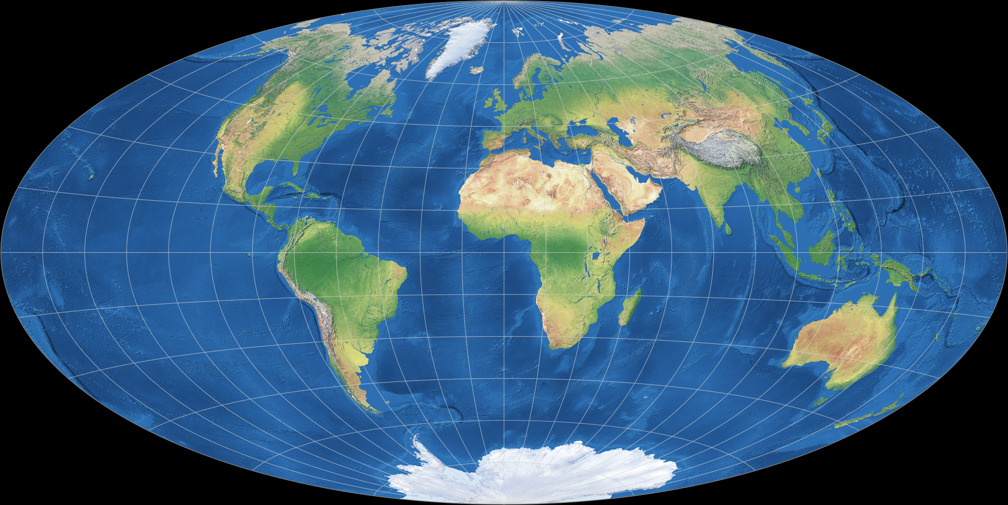
Comments
Due to spam posts, comments are now subject to moderation, which means they remain hidden until they are approved by a moderator.
More info
Be the first one to write a comment!