
Mon June 14, 2021 The Danseiji Projections
The Danseiji projections – /dɑnˈseɪdʒi/; from the Japanese words 弾性 (dansei, “elasticity”) and
地 (chi, “earth”) – were introduced in November 2019 by Justin Kunimune.[1]
They are unique: While three of them look quite conventional (and four do not), they are constructed in
a totally different way than any other projection I know of. I think I can’t explain this better
than @Fil did, so I’ll just
quote him here:
Instead of the traditional approach, where an elegant mathematical formula describes the mapping between spherical and planar coordinates, the idea with these projections is to create a mesh on the sphere, and map the mesh to the plane by assigning a position to each of the vertices. The mapping could be prepared manually, or through some kind of finite elements algorithm, designed to optimize for arbitrary constraints. For example, one might want to favor land continuity, or to lower the distortion of areas, or angles – or any other rule such as giving a larger amount of space to land vs ocean, or a larger amount of space to more populated areas…
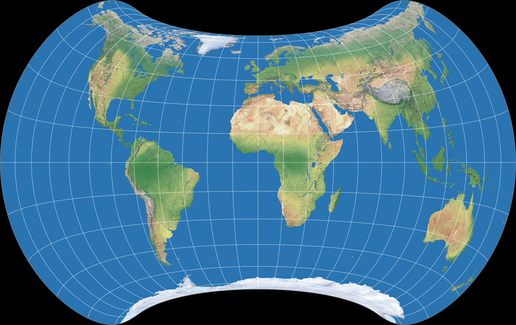
Note: Ich I get Kunimune’s paper right, the original mesh is not created on the sphere, but rather on an existing projection, namely – in the examples that Kunimune presented, which are shown below – on the Hammer projection and the equidistant azimuthal projection. Not that it matters a lot, but I wanted to mention it anyway.
With this approach, you achieve a freedom in design that cannot be reached by formula-based projections
(or only with very high effort),
but you can also restrict yourself to projections that look fairly traditional.
So let’s have a look at Kunimune’s examples – since the first three show some similarities,
we’ll inspect them en bloc, the remaining four will be treated separately.
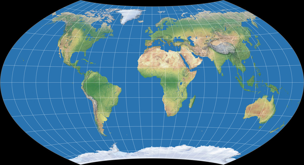
Danseiji N, Danseiji I, Danseiji II

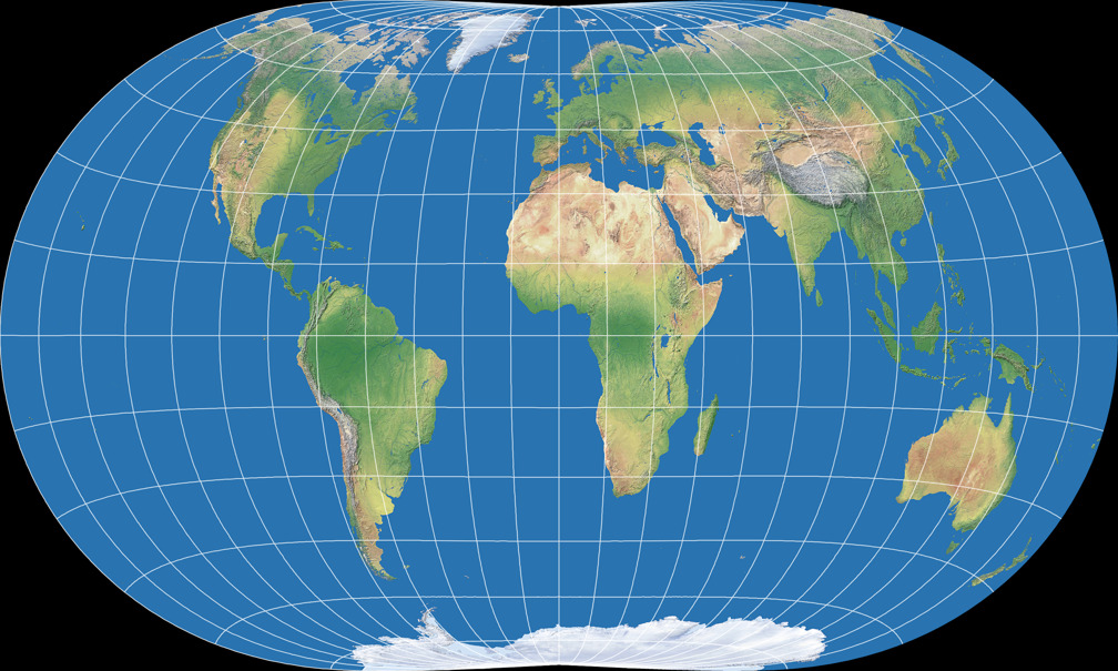

The Danseiji N is a fairly “normal” world map projection, nothing that would make the casual map frown. It’s an aphylactic or compromise projection with a rather mild amount of areal inflations. In terms of the distortions, Kunimune compares it to Winkel Tripel, Robinson and Wagner VIII, and yes, you can say they’re all in the same ballpark. Just like those three, Danseiji N is in my opinion a good choice for general-use world maps – and contrary to them, it has pointed poles, which is more realistic and e.g. leads to a better shape of Greenland. If you’re looking for an aphylactic pointed-polar map, here’s a good candidate.
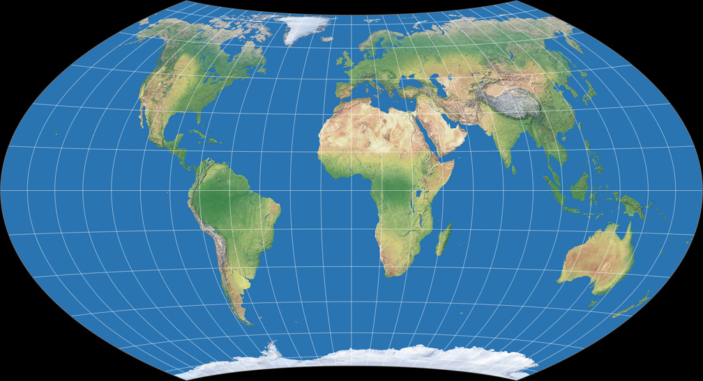
Danseiji I is an equal-area projection … well, almost.
Mathematically, it shows some deviations from true equivalence, but to the human eye they
aren’t visible, so might call it “equal-area for all intents and purposes”.
Apart from that, it’s very similar to Danseiji N.
A thought a lot how I should treat it in the
list on my website:
As a compromise projection, including a note that it’s almost equal-area –
or the other way round, as an equal-area projection with a note saying that
it’s actually not? I decided on the latter: While this is less accurate,
I felt that in terms of comparing projections it makes more sense this way.
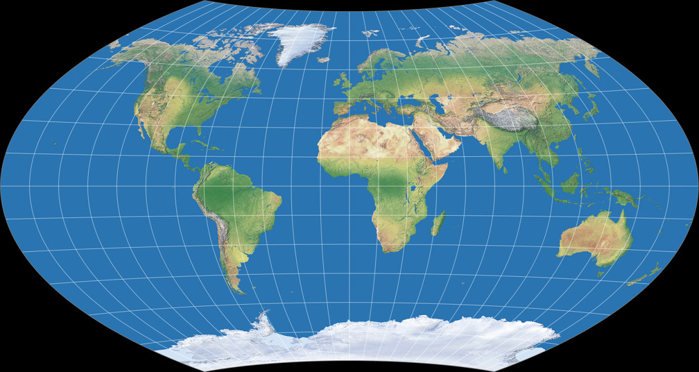
Danseiji II is also very similar to Danseiji N, but moving into the other direction, with an increased amount of areal inflation, thereby improving on the shapes – and it does quite a good job in keeping angular deformations low. However the areal distortion gets a bit too high for my taste. On the other hand, Kunimune says: “It would be a good projection for large posters”, and regarding that many wall maps use the Mercator projection or van der Grinten I I have to say that Danseiji II would indeed be an improvement here. Regrettably, I doubt that the map makers will consider it as appropriate alternative, because I believe that they prefer rectangular projections. Mercator is rectangular anyway and – as I have pointed out a while ago – van der Grinten I can easily be made into a rectangular map; a process that basically also works for the Danseiji II, but with less convincing results.
So far we have had three projections. I like their subtle variant of the shape that
I’ve come to call “telophasic”.
I like the idea of a family of similar projections, with one being (almost) equal-area
and the other two with an increasing amount of areal inflations – very much like e.g.
Wagner VII,
VIII and
IX.
What I don’t like is the extreme North-South-stretching of the lower latitudes. This is a typical problem
of equal-area poleline projections but here we have an equal-area pointed-pole projection and
two compromise projections. Thus, it would be much easier to avoid that problem.
Kunimune criticizes the
Hammer and
Strebe 1995
projections because they “both stretch out the extreme longitudes too much”. I guess that was what he was trying to avoid
(and successfully did!) – but in my personal opinion, the price paid is too high.
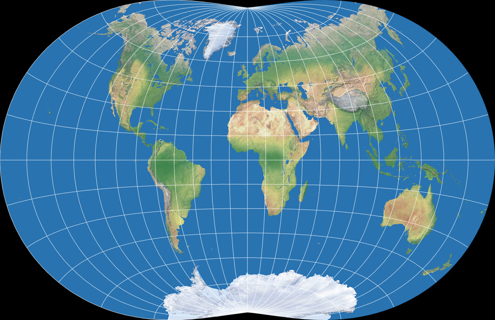
Here’s an experiment – Danseiji I, horizontally by a factor of 1.06 and (in order to maintain the property of being almost equal-area at the same time, vertically compressed by ≈0.943 (the reciprocal of 1.06):


Yes, it re-introduces the stretching of the extreme longitudes; and mostly likely also screws up the advantageous angular distortion values of Kunimune’s original. But visually, I find that this version is more balanced.
But before I get to deep into personal preferences, let’s move on to the remain four projections, which all are quite unusual and therefore, more interesting.
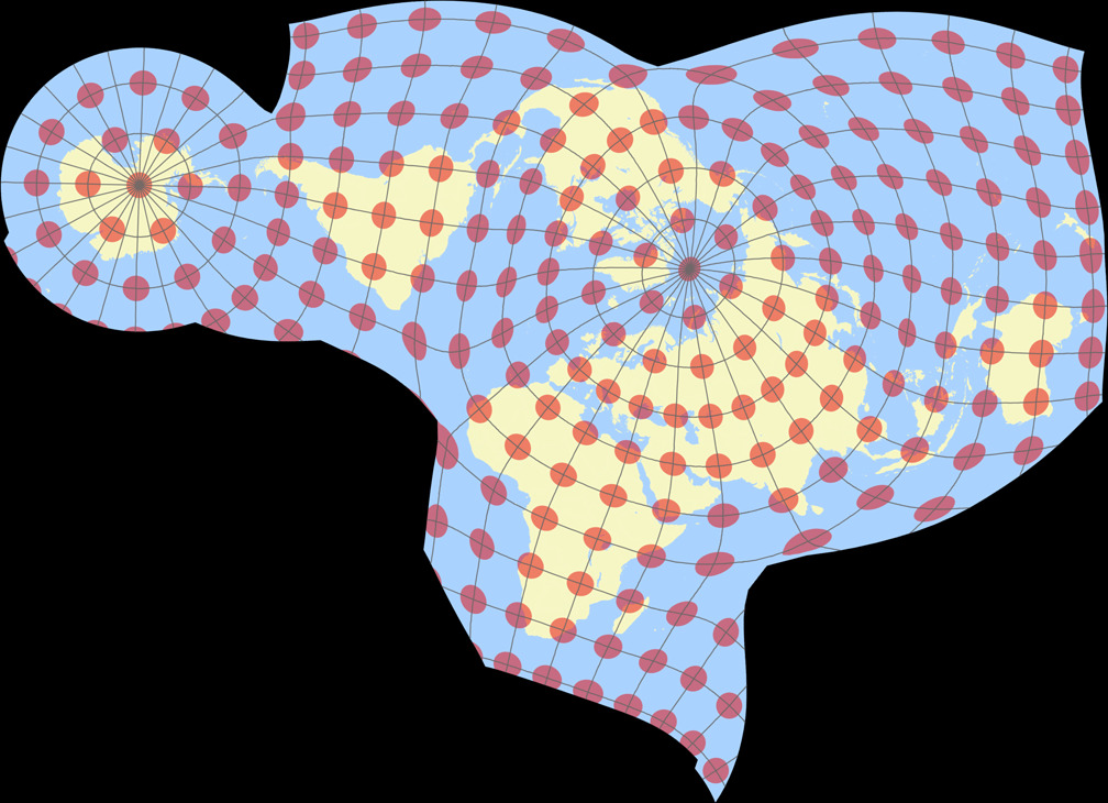
Danseiji III – Danseiji VI


Unlike the first three projections, which try to reduce distortions across the entire map, the Danseiji III concentrates on the land areas only, dumping the distortions as much as possible in the ocean – the only kind of Ocean dumping that I acclaim! As you can see, it also discards all ideas of symmetry and “orderliness”. And it really reaches very low distortions on land. To avoid distractions by the distortions in the ocean or the shape of the map, here’s an image of the Tissot indicatrix only displayed on land:

Although the projection is not equal-area (and also, not almost equal-area like Danseiji I),
you really have to take a close look at the Tissot ellipses to spot the deviations form
equivalence. The angular deformations are easier to detect but still, they
remain very moderate. (Talking about the distortions on land only here!)
Antarctica gets interrupted, but both parts are significantly less distorted
than in most other projections. And the “layout” of the continents is
close to the representation we are used to.
Kunimune says “I think this is the most widely applicable Danseiji projection”,
and I fully agree. This is a fine map projection for a lot of use cases.
The only trouble is that, as far as I can tell, asymmetric maps are generally not well-received, which is regrettable.
By the way – there is one prior projection which bears a certain
degree of similarity to Danseiji III. I’m talking about
Halstead’s Composite World interrupted projection. I’ve only seen
this once, namely at Carlos Furuti’s wonderful map projection site,
which has most regrettably been removed from the web, but at least
you can still read in
The Wayback Machine
(scroll down to the bottom of the page). Unfortunately, only the small preview image is preserved.
Like the Danseiji, it keeps most distortions away from the land to let them run wild
in the ocean, and it has a comparable arrangement of the continents. Personally, I
prefer the “cleaner” graticule lines and Africa’s shape in the Composite World.
On the downside, it has a few interruptions, creates a huge gap in the Norwegian Sea
and North Atlantic,
and its Greenland doesn’t look as nice as in the Danseiji III.
All in all, I prefer Kunimune’s projection, but Halstead’s work is worth mentioning, too.
It’s a real pity that, apart from the little bit I linked to, there seems to bei no
information at all about this projection.
🌐

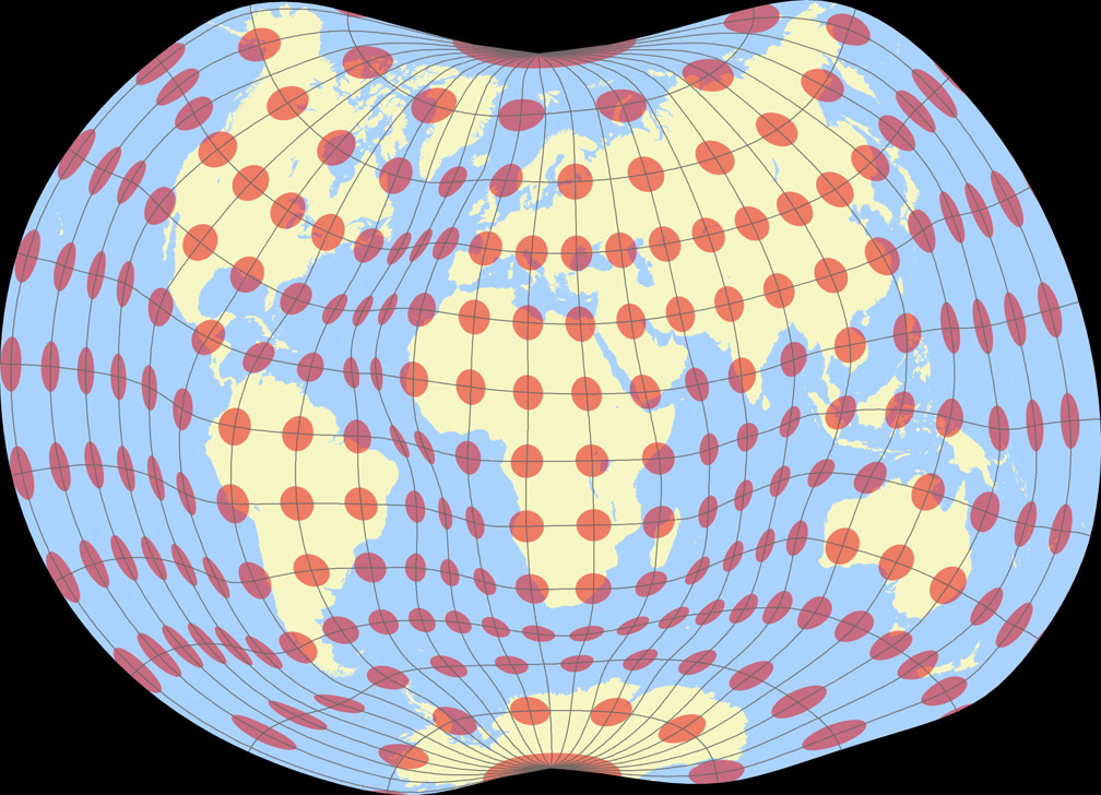
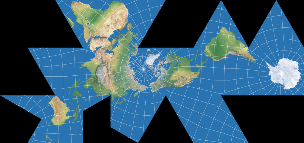
Like No. III, Danseiji IV concentrates on landmasses, but it moves away from conventional maps even more: It switches from equatorial to a polar aspect and allows more interruptions, reducing the distortions again. There is a certain amount of “flation” (= deflation and inflation), yet… well, maybe your eye measurement is better than mine, but for me, it’s almost impossible to say where it is – again, the angular deformations are easier to find albeit very low:

Although the boundary cuts and thereby the outer shapes differ, it is somewhat comparable to the
Dymaxion map,
but personally, I find the Danseiji’s organic shape more appealing.
And one more thing: As you probably have noted that the first two images above
have a different orientation that the “Tissot on land” graphic (which is using the orientation chosen by Justin Kunimune
in his documents). I’ve rotated it a bit in order to make it fit better into the frame of 2:1 aspect ratio
I’m always using on the website. And this reveals another strength of the projection:
You can basically rotate it any way you like,
you’ll end up with a decent map. Of course, you can rotate any map, but on
most projections, only specific angles will work well – a limitation that, in my opinion,
is not given with the Danseiji IV.
So, if want or need an unusual map with very low distortions on land – this is a real great choice!
One little remark, though, regarding Kunimune’s own assessment of the projection:
“it shows the relationships between the continents (especially North America and Eurasia)
more faithfully than any lenticular projection could”. While the relative positioning
of the continents on the northern hemisphere surely is better than on the maps that we are used to,
this does not quite apply
to the southern hemisphere. And moreover, it’s not a consequence
of “not being lenticular”, but rather of the aspect, namely being derived from
the azimuthal initial state with the map’s center being in the northern hemisphere.
Given an appropriate center, any lenticular projection can show the
relative positioning of the northern continents just as well – see below
an example of the Strebe 2011 which I used in my 2018 map projection calendar.
But this is hair-splitting, Danseiji IV handles this issue well, so it doesn’t matter
what’s the reason for it.

Up to this point we had three quite conventional projections aimed at a favorable
distribution of distortions across the full map; and two unusual projection
aimed at very low distortions on land which allowed, as a side effect,
high distortions in the ocean. Now, we’re going to see two projection
which deliberately add distortions to certain parts of the map.
What?!?
This may sound stupid, but it isn’t.
🌐

Danseiji V looks weird and inaccurate – and it is.
As I’ve said, it deliberately introduces distortions: It shrinks down the oceans. But why?
As you probably know, the oceans cover roughly 70% of the earth’s surface.
But on many thematic and statistical world maps, you actually don’t need the oceans.
Look at this choropleth maps
showing the countries’ timeframe of metrication (the process of converting to the metric system of measurement).
The first one is using the plate carée projection on a full world map.
The second one is using a variant of the Wagner VIII projection, presenting a technique that
is commonly applied on maps like this to save space, namely truncating the map.
And the third one shows Danseiji V:


The three maps shown above are based on a Original by NuclearVacuum & Carnby, CC BY-SA 3.0, via Wikimedia Commons
The white space of the oceans conveys no information – so there’s no loss in reducing its size like Danseiji V does. The continents on the other hand retain their familiar shapes and positions, which is important for this kind of map. It has a certain amounts of areal inflations on land, which, in my opinion, could be distributed better, but they stay low enough not to make a great difference.

For space-saving statistical/thematic maps that refer to continental areas only
(and preferably, don’t need graticule lines), I think Danseiji V presents
a much better approach than truncated maps in the manner of the Wagner example above.
Since I would not recommend it for any kind of physical map, I chose a political map image
here to introduce it.
(Next door on my projection list, I of course had
to use the physical map images because it’s my stated goal to show all projections
with the same imagery.)
The same hold true for the last projection. And if you thought that the Danseiji V looks weird, hold on tight…
🌐


Now what’s this?
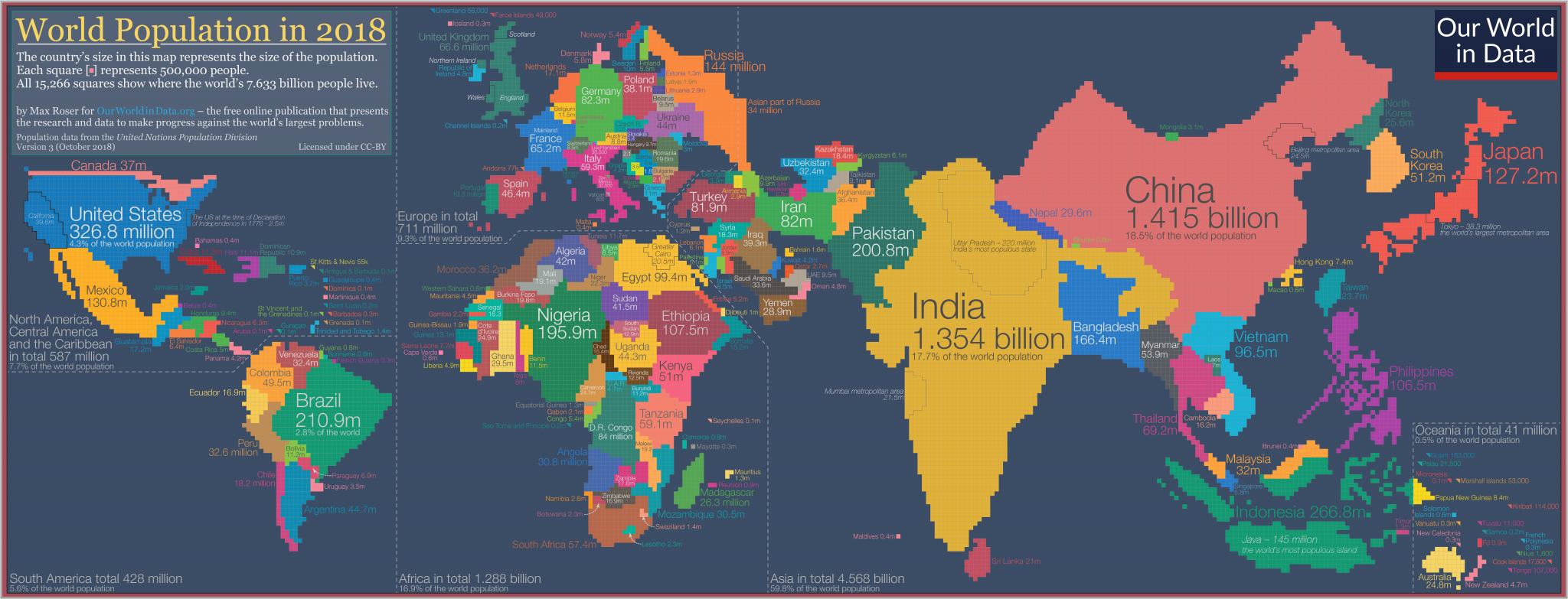
You may have seen cartograms like the
one by ourworldindata.org
or by worldmapper.org, in which
countries’ sizes represent the size of the population.
Danseiji VI is doing basically the same thing, with two differences: It
reduces the scale difference between the most and least densely-populated areas,
and it does not refer to the population of countries but of areas.
This is why some parts of e.g. China are inflated while others are deflated.
The result is a compromise between a map and a cartogram, which conveys information like
a cartogram does, but where all countries are still recognizable by their shape like on a map.
I don’t know whether such hybrids are really needed or useful. But maybe that’s just my lack of imagination and it surely can’t hurt to have something like this available. Remember that the Danseiji VI is just an example for what Kunimune’s approach is able to do.
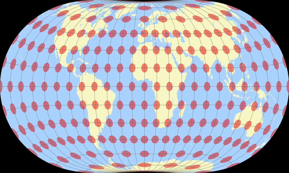
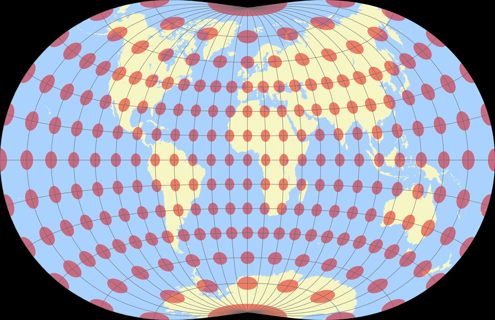
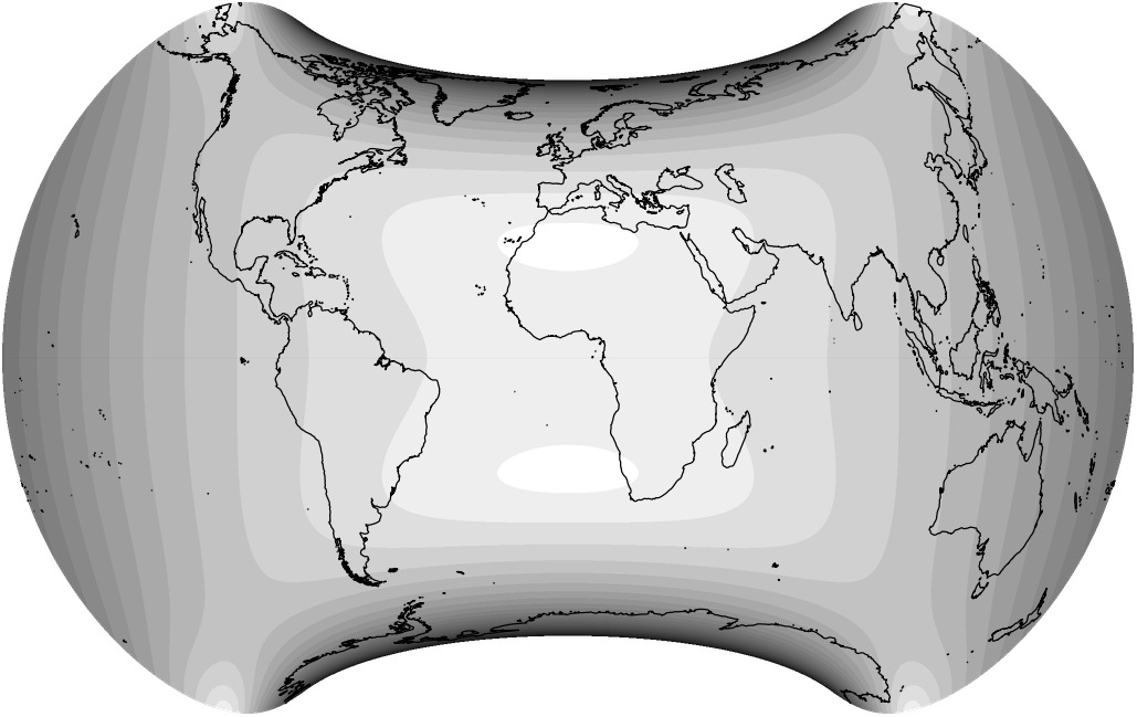
Distortion Visualization
For the visualization of distortions I used Justin Kunimune’s own map projection software. I think the graphics are a bit hard to read – especially on the Danseiji projections where the distribution of distortions is very irregular due to the construction method. Nonetheless they are helpful. For comparison, I’m also showing other projections that were mentioned above: Robinson, Winkel Tripel and Wagner VIII (to compare to Danseiji N); Equal Earth, Tobler’s Hyperelliptical and Strebe 1995 (for Danseiji I); and the Dymaxion map (for Danseiji IV).
Blue areas indicate areal inflation, red areas deflation, grey areas show angular deformations. Darker hues mean more distortion.


Résumé
Justin Kunimune introduced a new method to create map projections and showed seven examples of its utilization. Danseiji N, I and II are nothing spectacular – because they are not supposed to, they are designed as alternatives to conventional projections. They have realistic pointed poles and their slight telophasic shape creates a pleasant apperance. Personally, I think they’d all benefit from a moderate horizontal stretch – but you can do that by yourself, either by entering appropriate width/height settings in the export dialogue of Kunimune’s aforementioned map projection software or by simply using a graphics editor.
Danseiji III is a projection with pleasantly low distortions on land areas. Its shape is unusual but the arrangement of the continents makes it suitable for many purposes nonetheless. Purely aesthetically speaking, I find the irregularities of the graticule more disturbing than the twofold asymmetry. Oh well… nobody’s prefect, and that goes double when you happen to be a map projection. 😉
Danseiji IV has even lower distortions on land, yet it’s probably too unusal for most cases. The author himself recommends is usage or “all cases where Dymaxion is used today—that is, artwork and maps of human migration” – a recommendation which I support.
Danseiji V has the potential to be used in many thematic maps – I’d love to see it frequently in appropriate usage. And Danseiji VI… well, it remains to be seen whether such hybrids will be accepted. I have to admit that I’m a bit sceptical here.
As for Kunimune’s new method – he proved that it can be used for conventional and totally unusual projections both, although I think it plays to its strengths at irregular, asymmetric projections. Kunimune is providing technical details and source code (read the preprint of his paper) so that anyone can dive into it. this approach. It will be exciting to see if other people will also use it to create new projections…
References
-
↑
Justin Kunimune:
Introducing the Danseiji Projections
The link leads to Justin’s blogpost, which in turn contains a link to his scientific paper (fee required) and a freely downloadable pre-print version.
Comments
Due to spam posts, comments are now subject to moderation, which means they remain hidden until they are approved by a moderator.
2 comments
baba wasichana
Milan
Thanks for the beautiful and informative site. Besides being a map nerd, too, I also create unique maps for Civilization series video game, and your site has been a great source of ideas and references.
I wanted to kindly ask you to point me where on your site you wrote about Strebe 2011 map. On this page, under the "Danseiji IV" section, you wrote: "see below an example of the Strebe 2011 which I used in my 2018 map projection calendar."
I cant find the 2018 calendar, nor Strebe 2011.
Can you help me, please?
Thanks,
Milan
Tobias Jung
I’m glad that you like the site and that it was helpful for you! :-)
About the Strebe 2011 image – sorry, I put that quite misunderstandable! I didn’t publish anything of the 2018 calendar here, I only had it printed for a few people I know and myself.
However, you should see the image in the article – at least, it’s there in the browsers that I use. But here’s a link:
https://blog.map-projections.n…
Kind regards,
Tobias
Milan
Yes, I saw that picture, and was very intrigued by it. I was just wondering is there more info about that projection on your site, or a few more images of it.
Google wasn't very helpful about that projection or more images itself.
Thanks.
Tobias Jung
Well, actually I did talk about Sterbe 1995 and 2011 here:
https://map-projections.net/st…
… and it is also listed in my Projection Collection:
https://map-projections.net/im…
although on both accounts, I used the standard aspect and not the oblique aspect shown in this blogpost.
Back when I prepared the 2018 calendar, I was looking for a nice unusual projection, and I came up with the idea for this oblique aspect, which shows all continents incl. Antarctica uninterrupted.
 Except where otherwise noted, images on this site are licensed under
Tobias Jung
Firstly, if you lie, then you will try to conceal the truth. However, ALL map projection creators have been very straightforward about the kind and amount of distortions (which includes the areal inflations) in their works. Regrettably, it is true that on many wall maps and even in many atlases, this piece of information is missing. But that’s not the map creators’ fault – and fortunately, there are also atlases which devote a page or two on the on the matter of distortions.
Secondly, there are MANY equal-area projections which show the countries’ sizes accurately. Currently, I’m listing 124 examples – see the thumbnail list at https://map-projections.net/si… (untick all properties except “Equal-Area”)
Some of the have been around since the 16th century – see the table at https://map-projections.net/pr… – sort by year and look at the “property” column.
It is also true that some creators of equal-area (or close-to-eqal-area) map projections made rather bold claims about their works, but none of them conveyed the impression that there were no previous examples of maps showing the true proportions.
The claim that “all maps lie” is usually spread by journalists, bloggers or Youtubers little to no clue about map projections and who, apparently, never have looked at a single globe in their whole life.
Kind regards,
Tobias
Alexandre Canana
Tobias Jung
In a 1967 speech, he mentioned “the almost 200-year-old projection by Johann Heinrich Lambert and its improvement by Walter Behrmann in 1911”.
In 1974, he extended that list: “An examination of equal-area world maps (Sanson, Bonne, Lambert, Hammer, Behrmann, Goode), which had been known for centuries and were available in several variants, showed that the advantage of equivalence was gained at the price of other serious deficiencies.”
– Quoted from (German) transcriptions of his presentations:
https://www.heliheyn.de/Maps/U… (1967)
https://www.heliheyn.de/Maps/L… (1974)
Translated to English by me.
Alexandre Canana
Tobias Jung
Alexandre Canana
Alexandre Canana
Tobias Jung
https://web.archive.org/web/20…
“cartographers were especially aggravated by Peters's suggestions, at least initially, that his was the first equal-area projection.”
However, in “Flattening the Earth” Snyder has a very similar Peters quote (to the one I posted above), and adds:
“The existence of the equal-area property of these and many other projections is not mentioned in the more popularly oriented literature by promoters of the Peters approach.”
So I guess Mr. Furuti had access to the mentioned promoters’ work only, not to Peters’ original texts.
Of course you’re also right that Peters made some claims about his map that are plainly wrong.
And yes, Furuti’s excellent website is sorely missed. *sigh*
Alexandre Canana
Alexandre Canana
Alexandre Canana