Sun Jan 01, 2023 13 Projections for 2023 (Intro)
Updated on Mon Jan 09, 2023
A collection of projections for political world maps
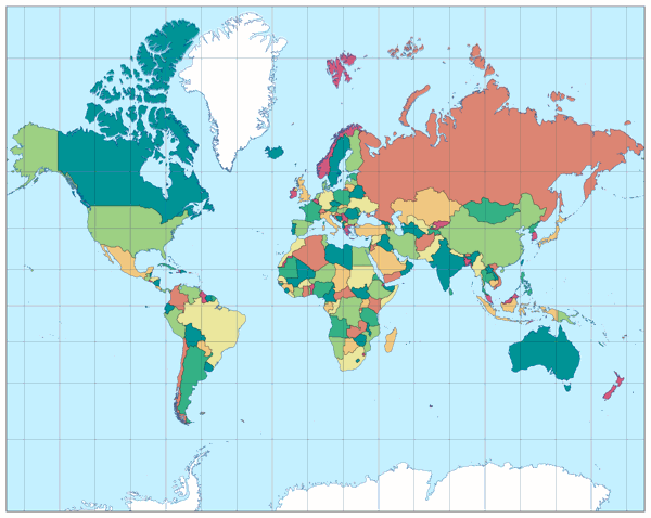
Frontispiece: Mercator Projection
| Mercator | |
|---|---|
| Creator | Gerardus Mercator (1569) |
| Group | Cylindric |
| Property | Conformal |
| Other Names | — |
| Remarks | Projection truncated at 84° North / 75° South |
Each year, I build a small map projection calendar – three years ago, I wrote about it in greater detail. Two years ago, I began to use a leitmotif on each year’s calendar, to have an excuse for repeating projections that I’ve already showed in previous calendars. And about ten weeks ago, I added political map images for all entries of my Projection Collection. So what could be more obvious than to equip this year’s calendar with map images of this kind?
So, this year you’re going to see projections
– that I have seen used on political maps (in atlases or on posters);
– that I have not seen so far for this use but would be a good choice (in my opinion);
– and three that may seem a little “daring” for this purpose but also have some benefits.
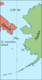
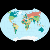
Almost all maps of the calendar will be centered to 10° East, so the left and right boundaries run along the 170° West meridian. This almost avoids interruptions on the visible landmasses (except for St. Lawrence Island, which is roughly cut in half, and a few pixel of easternmost tip of Siberia; see figure), but allows a symmetrical graticule. The graticule spacing is set to 20° – on my usual 15° the graticule would be asymmetrical again, and 10° seemed a bit too tight for these images.
Each month, the respective projection will also be shown in a second representation. I’ll come back to this in a moment.
Once I have decided on the leitmotif, I start selecting possible candidates. Usually, I end up with a list that includes more projections than I need, so I discard a few. This year a few decisions were particularly close, so in some months I will also show projections that were thrown out at the last minute – literally, because I was in a big hurry when I finished the final version to be sent to the print service provider.
🌐
The frontispiece of the calendar shows the well-known Mercator projection, which is often criticised for its gargantuan areal inflations: From the equator to the poles, the magnification increases exponentially, so that Greenland appears larger than Africa, while in fact Africa is about fourteen times larger. And therefore I too would not recommend the Mercator projection for most political world maps! There is one exception, however, which has been pointed out by John G. Savard[1]:
Using a large wall map, you can step close to it to inspect a single country
– usually, you even have to step close in order to read the labels –
and you’ll see it with the correct shape, because the Mercator is a conformal projection.
It doesn’t matter, at that moment,
that it isn’t shown at the right size (relative to most of the other countries).
Moreover, North is always on top of the section you’re viewing (unlike on another
conformal projection we’re going to see later this year).
So in that case, yes, I have to agree that the Mercator projection is useful
for a political map, despite its dreadful amount of areal inflations.
But I really wouldn’t recommend it for world maps in atlases, newspaper articles,
or for a smaller kind of posters.
Speaking of the different kinds of publications …
For the images in the calendar I chose a representation of a kind that
you’d usually find in an atlas or on a wall map: With a graticule,
a blue tint for the ocean, and a boundary marking the edges of the map.
But in newspaper articles or similar publications, these elements
are often omitted – moreover, Antarctica is left out completely.
So I thought it may be interesting to see all the included projections
in a suchlike manner. For the lack of a better term, I’m going to call this
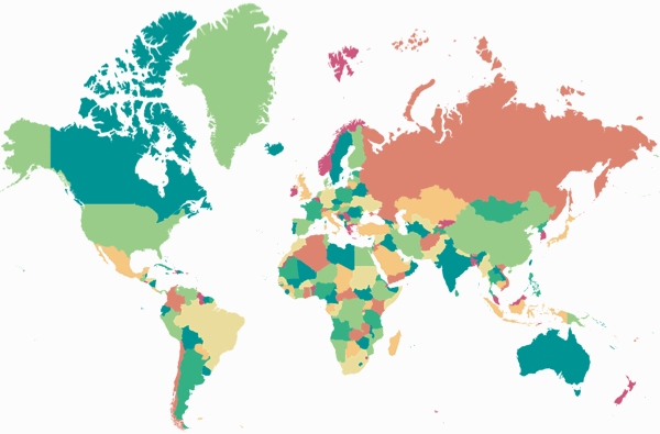
the OGABO version – for “Omit Graticule, Antarctica, Boundary, Oceans”.
And here it is for the Mercator projection :
Apart from the problem with the areal inflations, the Mercator works well in this representation, just like probably any other cylindric projection. In my opinion, however, the problem is intensified here by the fact that the graticule lines – which at least point at the North-south stretching – is missing. In the course of the year I will show another cylindrical projection, which is therefore more adequate in my eyes.
The image in the calendar is truncated at 84° North and 75° South, which shows more of the polar areas then in most examples that I have seen. The Mercator projection has to be truncated somewhere, because the poles stretch to infinity. And you should really cut it no later than somewhere in the mid-eighty latitudes, because… well, you can show it up to, say, 89.999° North/South, but usually, you will not want to do that:

The Mercator projection, truncated at 89.999° North/South
🌐
Last year, I had a calendar full of my own experiments.
So I’m holding off on that this year. The only projection of
that kind (and at the same time, the only projection that
currently is not listed in my Collection) will be shown
around mid-January.
Happy New Year!
🌐
Update Jan 9th 2023:
As I’ve announced in my blogpost
Minimizing the Severing of Land,
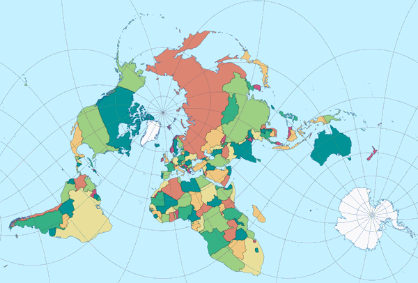
most of the projections of this year’s calendar will also be shown in a certain plagal aspect.
This version can be truncated even more, cutting off the most enlarged regions. Nonetheless, serious inflations remain, and Africa looks quite dubious. I think I would not use this aspect on the Mercator projection. More appropriate projections will be presented in the course of the year.
References / Footnotes
- ↑ See on John’s great website the chapter covering Mercator, as well as the last section in the chapter about the Equal Earth projection, subtitled “Closing Comments on the Projection Controversy”.
My 2023 Map Projection Calendar
To read another part of my 2023 map projection calendar series, select the desired month.





 Except where otherwise noted, images on this site are licensed under
Comments
Due to spam posts, comments are now subject to moderation, which means they remain hidden until they are approved by a moderator.
More info
One comment
Alexandre Canana